
Mobile first theming isn’t just about making your site work well on mobile devices: it will also make your site faster and so enhance SEO.
A mobile first theme includes far fewer style declarations for layout than a traditional responsive theme that works desktop-first, mainly because it eliminates the need to declare 100% width for elements on small screens.
Making your site fast and mobile friendly are two of the most important things you can do to boost your search engine rankings and it will make your site visitors happy, too.
Here are some facts and figures which should convince you to start looking for a mobile first theme:
- Mobile first design means a smaller stylesheet, with fewer declarations. You can see this in action in a tutorial I wrote on converting a theme to make it mobile first.
- Mobile first design enhances performance when it comes to downloading images. By designing mobile first, you ensure that devices won’t download an image larger than they need. If you use a responsive design which is desktop first, the larger image may download first, slowing things down.
- A mobile first theme, because it has less code, will have less places where it can go wrong and be faster to load.
- A mobile first theme will ensure your site loads faster on mobile devices, where bandwidth is more likely to be an issue than on desktop sites.
- A mobile first theme will boost your SEO. Since April 2015, Google’s algorithm has favoured sites that are fast on mobile.
- Designing mobile first isn’t just about how your site looks. Don’t just install a mobile-first theme: think mobile first too, considering what’s essential on your site and cutting out what’s not needed. Website visitors are more interested in content than pretty design elements these days.
However there is a caveat to some of the above: many mobile first themes use the bootstrap framework for their layout. If you don’t need a sophisticated grid system for your site, you might prefer to use a theme with its own media queries, meaningless code. I’ve identified which themes in the list below use bootstrap.
There are hundreds of responsive themes out there: pretty much every new theme is responsive these days, but there aren’t so many that are truly mobile first. And disappointingly, there are themes on the WordPress theme directory advertising themselves as mobile first which actually aren’t. So finding a true mobile first theme can be tricky.
In this post I’ve found 15 of the best mobile first themes you can use on your WordPress site. They vary from simple themes with minimal styling or customization options, to full featured themes and theme templating systems:
Twenty Sixteen

Twenty Sixteen is an old default theme that comes preinstalled and activated when you first install WordPress is itself mobile first. It’s one of my favourites of the default themes, with a clean black and white design and open layout. But it’s a bit ubiquitous, so you might want to switch to something else to avoid your site looking like everyone else’s.
Sydney

Like many mobile first themes, Sydney uses the bootstrap grid system. It includes some nice customization options including colors and fonts (using Google fonts) as well as a full width header image and grid-based front page.
evolve
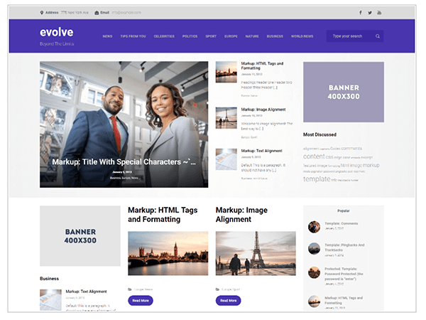
The evolve theme uses its own mobile first grid system for layout. It includes customization options for front page elements, fonts, colors and much more, as well as a bootstrap and parallax slider plus a post slider.
This is one to use if you want a flexible grid system and are prepared to spend some time tweaking it so it looks exactly as you want.
Responsive

The Responsive theme includes lots of customization options and uses its own mobile-first grid system. It provides no less than 11 widget areas in the home page and elsewhere on the site which you can use to add custom content; great if you’re using WordPress as a CMS rather than a simple blogging platform.
Responsive isn’t very pretty out of the box in my view, but once you’ve spent some time customizing it you can make it look more modern and sleek.
Silk Lite

The Silk Lite theme’s design is less masculine than some of the other grid-based themes out there, with attractive fonts and a layout that shifts from three columns on larger screens down to two and then one as the screen size gets smaller, using mobile first media queries.
The only downside is that the site title isn’t very legible, although that will depend on your site title!
Veggie Lite
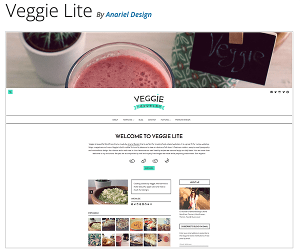
Veggie Lite’s theme’s name did make me worry that it might be some relic of the 1990s with a vegetable-themed backdrop or similar. But no, it’s a clean, modern theme with plenty of white space and some nice fonts. It’s a free version of a premium theme called Veggie, which was designed to power food-based blogs (hence the name).
It’s such a simple design, however, that you could easily use it to power a blog on any topic, and the mobile first styling and simplicity will enhance your site’s performance.
Graphy

Graphy is another theme with a clean layout and plenty of white space, with the option to add a header image. It has a single column design but if you use the sidebar widget area you can create a two column layout.
The focus of this theme is on typography and its clean design lets the fonts take centre stage without any distractions.
Altitude Lite

Altitude Lite is from the developers of Responsive and Responsive Mobile. It’s a full width design with the option to add a striking parallax header image and it also includes widget areas and customization options if you want to vary the layout.
Components
Components is a project from the Automattic theme design team. It’s based on the underscores starter theme and is designed to provide you with one of a range of themes you can work with, including classic and modern blog, portfolio and magazine themes.
What you get is still very much a starter theme (with not much difference between the different styles of theme), so it would only be useful if you were comfortable adding your own styling. But it gives you a mobile first framework to build on which could save some work coding your own: an option if you want something to start you off but don’t need all of bootstrap’s features.
Do You Use a Mobile First Theme?
The number of mobile first themes will continue to grow, especially as more and more theme developers use the bootstrap grid system to underpin their themes.
Hopefully, the list above should include something suitable for your site: I suggest trying them out, seeing which works for you with the customization it lets you make, and going for it!
Tags:


