Landing pages are integral to increasing your conversion rates. If you are not investing much time in developing your landing page, you may be missing out on a lot of conversions.
On average, the conversion rate for a B2B landing page is 13.28%. It is important to test and optimize your landing pages to see what works better for your business.
When a reader lands on your page, you have only a few seconds to gain their attention. This is why it is crucial to know what makes a high-converting landing page.
Studying other websites and their landing pages will help you learn from their mistakes and create the perfect landing page for your site.
In this post, we will talk about the most common landing page mistakes that are hurting your conversion rate and what you can do to avoid them.
Ready? Let’s dive in!
Common Landing Page Mistakes
When creating a landing page, you need to have a proper strategy in place. Just creating landing pages that ‘look good’ or ‘serve a purpose’ can greatly decrease your conversions.
Let’s take a look at the top landing page mistakes that businesses make so you can learn how to avoid them.
Mistake #1 – Having Unclear CTAs
There’s nothing more uninviting than a generic call-to-action (CTA) button that says ‘click here’ or ‘submit’.
Although it may seem unimportant, the words you add on your CTA button greatly influence your conversion rates. This is why you need to invest in good copywriting for your landing pages, especially your CTAs.
Using certain keywords in your CTA helps your users have an expectation of what comes next. These expectations immensely help in building strong customer relationships.
If your CTA is vague or unclear, it can put off your readers and prevent them from proceeding with the action you require them to do. Always be specific in your CTAs.
For example, instead of generic words such as ‘download’ or ‘submit’, you can use more specific phrases such as ‘Get Your Free Ebook’.
Here is a great example of a CTA from Spotify:

Spotify’s CTA is prominent, clear, and tells customers exactly what they will get once they click the button (the free version of Spotify).
You need to also pay attention to the positioning of your CTA and what you want the user to accomplish (and when).
I recommend running what is commonly referred to as a “first-click test” by website developers:
“When visiting a website, the first click a user makes may well determine whether they are successful in completing their task.”
To do this, you can open Google Analytics and look at the Behavior Flow report:

Here you’ll be able to see exactly what people click on upon landing on your landing page or homepage.
This gives you direct insights into the actions taken immediately. If you notice clicks on the wrong CTAs or headings, you’ve failed the first-click test and can use this data to improve CTAs, placements, and removing distractions.
Mistake #2 – Not Optimizing Forms for Conversion
Not every person that lands on your landing page is ready to buy something from you. Usually, first-time visitors are just browsing the internet and realizing that they have a problem.
Since they are still in the awareness stage, they have no clue about your business or the solutions that you are offering them. They are looking for information, and that is what you need to give them.
You could offer a valuable resource to them such as a free eBook or an educational video, but be careful to optimize your signup forms. Do not place lengthy forms that have a dozen fields to be filled – your readers are not ready to dedicate so much time and effort to your business yet.
People are wary of giving away their personal details, so just ask them for their name and email address in the beginning. When you provide them valuable information they haven’t found anywhere else, they start to trust you more, and that’s how you initiate a strong customer relationship.
Here is an example of Vimeo’s signup form:

Keep it simple. Your customer’s email address is all you need to nurture your bond with them and slowly offer them your products and solutions.
Mistake #3 – Having Poor Website Design
People don’t like to search for stuff. Whether it’s searching for a particular page on a website or for a call to action button so that they can download the resource they need quickly, everything needs to be clear and easy-to-find.
Your website should be built in good taste. There’s no need to go overboard and hire the best graphic designers to design your webpages, but you need to keep your readers in focus when you create them.
You can also design your site to be an eco-friendly site.
Keep your web pages simple, neat, and clutter-free. Make sure that the navigation bar can help them find other pages easily and place CTAs in positions that are easily viewable at a glance.
Here is Shopify’s landing page:

It has limited copy, a clear CTA, and helpful visuals.
Focus each landing page on only one specific action. This means you should not add multiple offers or CTAs on the same page, but ensure that each page has a central focus.
Designers use many techniques to improve website usability and to draw the user’s attention to certain crucial elements on the page such as the CTA. Some of these website design techniques are position, imagery, negative space, color, and size.
People usually scan text on webpages without reading it completely. Keep your text simple, font easy-to-read, and place a lot of white space so that the page is not cluttered with text or images.
Mistake #4 – Slow Page Load Times
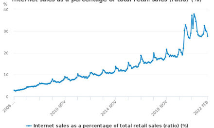
90% of people may leave a site if it takes five seconds to load. That means, for every additional second you make your users wait for a page to load, you are losing out on conversions and customers.
Page speed has a huge impact on your conversions.
It doesn’t matter how perfect your CTAs are, how beautiful your website design is, or how convenient your signup forms are. If your landing pages take more than three seconds to load, users won’t even stick around to see your page!
Use tools such as Google’s PageSpeed Insights to monitor the speed of your site both on desktop and mobile. The tool helps you figure out what you can do to fix your site speed – such as optimize your images.
Host large files such as videos externally and compress your images so that they don’t weigh down your site.
Switch to a faster website hosting service or use a better website builder if you feel that is the issue. Minimize page redirects and make sure to run regular speed checks to ensure your landing pages are loading smoothly.
Mistake #5 – Having Weak Headlines
We spoke about having strong and clear call-to-actions to make readers perform certain desired actions easily. On that same note, let’s now talk about your headlines.
Your headlines can be on the top of your landing pages or on your signup forms, and they grab the attention of the reader, pointing them to your offer.
Slack has a crisp and clear headline that gets your attention:

Having poor copy on your headlines discourage readers from converting because that’s the first impression they have of your business.
Summarize your offer in a few captivating words, and avoid using jargon. Your headlines are not the place to show off your complex vocabulary, so keep it plain and simple, yet compelling.
Mistake #6 – Offering a Poor Mobile Experience
Mobile optimization has been proclaimed as crucial to the user experience, but it’s surprising how many businesses fail to do it successfully.
People are accessing the internet on various devices, and 62% use their mobile phones. People want information on-the-go, and your business is losing out on a huge number of conversions if you are not paying attention to mobile optimization.
Ensure that your website code is lightweight, and use a good website builder for your landing pages.
Avoid having multiple column layouts on your landing pages and leave enough white space so that the page is easily viewable across all devices without appearing cluttered.
Optimize your images so that they perform well on all types of devices and make your forms responsive so that they adapt to various screen sizes.
Here is how BuzzFeed’s homepage looks on desktop:

..and on mobile:

Conclusion
Your landing page is vital in increasing your conversion rates, as it is the first thing visitors see when they click on your website links.
Make sure that you spend enough time developing your landing pages so that customers are able to enjoy the experience and find whatever they are looking for on your site.
Use clear copy when creating your CTA buttons so that visitors know exactly what to do and what to expect when they click them.
Optimize your signup forms so that they are short and sweet, and help visitors get their hands on the information they want quickly.
Design your website well so that the pages do not look cluttered and unorganized. Make navigation simple to enhance the user experience.
Optimize your landing pages to load quickly and be responsive on various devices.
Create clear and compelling headlines to hook your readers as soon as they land on your webpage.
Following these tips will help you avoid common landing page mistakes and help skyrocket your conversion rate.


