We recently published an article on eCcommerce UI design. In it, we mentioned that when talking about eCommerce website design for mobile devices, you could fill an entire separate post with it.
In the following, we will go over best practices to create a mobile friendly experience on your eCommerce website. We will start off with some statistics why it matters and research on common UI issues that keep mobile users from completing their purchases. We will follow that up with different techniques how you can make the design of your eCommerce website more appealing for mobile users.
Why Care About Mobile Design for Ecommerce Websites?
To be honest, if you have to ask the question above, you may as well have been living under a rock for the past seven years or so. But, because I am having a good day, and because TorqueMag has a strict policy not to discriminate against anyone, regardless of their living situation, I will humor you for a moment.
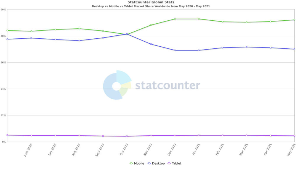
Fact #1: More than half of Internet traffic is coming from mobile devices.

If that is not enough reason for you, be aware that 65% of eCommerce traffic and 53% of sales also come from mobile users.

What’s more, during the 2018 holiday season, almost 40% of all eCommerce purchases were made on a smartphone and 80% of shoppers use their mobile phone to look up product reviews, compare prices, or find alternative store locations – even inside of a physical store. Finally, 61% of shoppers say they will never return to a website if it’s not mobile adaptive.
In short, if your ecommerce website is not up to snuff in terms of mobile design, you are actively turning away visitors.
What Keeps Shoppers From Completing Their Purchase
However, what exactly is it that mobile shoppers expect and value in order to make a purchase from a website? After all, mobile conversions are not that different from those on desktop. In fact they are highest on tablets. However, at the same time, the overall order value continues to be higher on desktop.

So, what is it that keeps mobile shoppers from completing their orders?

As you can see security concerns, the inability to see product details and difficulties navigating, comparing products, and inputting details are major concerns.
All rock dwellers caught up? Cool, then lets talk about how you can knock your ecommerce mobile website design out of the park.
1. Cover the Basics
The first step is to make sure your site is generally mobile friendly. We have plenty of articles on this website to help you achieve that:
- Here’s What It Takes to Make a WordPress Website Mobile Friendly
- The Google Mobile First Index and What It Means for Your WordPress Site
- All You Need to Know About Responsive Design for WordPress
- How to Speed Test Your Website (Metrics, Tools, Optimization Tips)
- 14 Ways To Speed Up WordPress And Decrease Page Load Time
In addition, you might want to look into our article on core web vitals.
Factors you definitely have to take care of are responsive design, fast loading times, and using HTTPS. Visitors should absolutely not have to do pan and zoom (unless zooming into a product image to see details). They also want to see your site quickly and not worry about whether their credit card information is safe while shopping on their mobile phone.
2. Put Important Elements in Thumb-Friendly Positions and Sizes
Next, let’s talk about usability. It might come as a surprise but most people use their thumbs to navigate the screen of their smartphones. This fact makes some parts of the screen more accessible than others.

Therefore, it’s a good idea to place essential controls that users will interact with often in those parts where they can easily reach them. That can be a menu, call to action, or important buttons. Twitter does this very well.

However, it’s not just important to think about the thumb reach, you also have to consider sizes. The thumb is usually thicker than other fingers (I know, you are learning so much here today) and fingers in general are definitely bigger than a mouse cursor. This makes it more likely that mobile users will missclick or tap elements.
You have probably been in the position yourself where you kept missing a link, button, or other element because it was too tiny. It’s annoying, isn’t it? Others think so, too.
For that reason, make sure they are big enough. For example, Apple recommends a button size of at least 44x44px or the same size in points for retina displays.
3. Minimize the Amount of Scrolling Necessary
Another thing that is different on mobile devices is that, mobile users are used to scrolling rather than clicking/tapping. Therefore, you are better off providing information on one longer page that they can scroll down than have them go through several pages to get what they want.
However, just because scrolling is more natural, that doesn’t mean they love it and want to do as much of it as possible. In fact, most don’t make it past the beginning of the page.
81% of the viewing time is spent in the first three screenfuls of information.
For that reason, you should strive to minimize the amount of scrolling they will have to do and keep the most important parts of your page close to the top. Here are some ideas for that:
- Make the header, navigation, and filter options sticky (more on that below)
- Provide a back-to-top button
- Include a table of content with jump links
- Allow users to bookmark items to see them all in one menu later
4. Provide an Omni-Channel Experience
If we look at statistics above, it’s clear that, while mobile users don’t shop as much on their devices as their desktop counterparts, one thing that they do a lot of is research. The role of handheld devices is to compare products, collect information, and make decisions.
You know where they complete the purchases in the end? Correctomundo, on the desktop.
You know how you can make it more likely that the shop where they will complete their purchase will be yours? By making sure that products that they add to a shopping cart on the phone are still in their shopping cart when they log in on their desktop machine. This is also called omni-channel selling/retail/commerce.
5. Add a Sticky Header With the Most Important Elements
Making your header sticky, meaning that it will stay on top of screen while users scroll down, is an easy way to give visitors steady access to it. Why should you do so in the first place? Because on mobile, it’s often the element that contains some of the most important information like:
- A link back to the homepage (via the site logo)
- Access to the navigation menu, search function, shopping cart
- Other central elements such as language switchers

If you want to get it out of the way a little more, you can also make it so that it turns invisible but reappears when you scroll back up.
The point is to give users access to frequently-used features without needing them to scroll back and forth. This also means improving the usability of the search function:
- Use predictive search so that they have to type less on a small-sized keyboard
- Likewise, include an x button to make it easy to clear search
6. Provide Comfortable Navigation
Speaking of navigation, naturally, on mobile, it’s very different than its desktop counterpart. First of all, due to space constraints, it’s necessary keep it out of the way, yet accessible. There are several ways to design mobile friendly navigation menus. The most common solution these days is the so-called hamburger menu.

You can have it move in from the side, pop up as a full-screen menu, expand it like a harmonica, and more.
Then, as we mentioned in the original UI article and as is visible above, keep the hierarchy flat. This means include key categories and subcategories right in the menu so that shoppers can get quickly to the products they are looking for.

Furthermore, provide filter options and keep them visible. This is something your visitors will use a lot, especially if you have many types of products.

Finally, consider providing breadcrumbs on your mobile site as well in order to help them navigate your site better.

7. Create Mobile-Friendly Product Pages
The general rule for online product pages is to provide the most important information at a glance. Due to the lack of real estate, this is harder on mobile. One thing that helps is to allow people to do the things they already do with their phones all the time: swipe, pinch, and double tap.
How do you take advantage of that? Here are some examples:
- Use sliders for product images
- Add the ability to open an image in a lightbox and zoom in
- Include additional information as an accordion to save space
- Make the ‘add to cart’ button sticky
Aside from that, it’s similar to desktop product pages:
- Provide the most essential information at the top
- Offer a clear and easy ways to pick varieties
There is an excellent article on this here and a good example for much of the above advice in action below:

8. Don’t Neglect the Checkout
In the article on general ecommerce UI design we talked about how overly complicated forms can lose you conversions. Well, filling out forms on a mobile phone is even more annoying, so you need to make sure it is as easy as possible, like so:
- As usual, keep form fields to a minimum, e.g. try to contract the first and last-name fields to “full name” instead
- Use native scrolling tools for entering the date of birth and other numbers
- For password fields, allow to turn visibility on and off (because retyping long passwords on small keyboards is extra annoying)
- Provide the right keyboard, meaning a numbers block when users need to type in a number
- Let customers scan their credit cards to autofill the data and enable mobile payment options like Google and Apple Pay
- Use a one page checkout, or, if not, provide clues as to where the user is in the checkout process
- Remember information that has already been entered when the page reloads after an error
- Use trust indicators like trust seals and social proof
While it’s important to have a guest checkout, you should also be able to register and log in to your account in order access previously used payment options. As mentioned, users don’t want to enter it every time with a device that is less suitable for typing. You might also consider allowing sign in via social accounts.
9. Be Careful With Popups
Popups and other interstitials are annoying enough on desktop where they are relatively easy to close. Simply click outside of the popup or navigate the cursor to the close button.

However, they can be even more annoying on mobile, where it’s even harder to hit the right point. For that reason, if you absolutely have to use popups:
- Don’t make them full-screen so they hide the rest of the content, use the lower third of the screen for example
- Avoid having them pop up right away, instead, wait until a visitor hits their second page or so
- Display a small call to action that opens the popup so that customers can choose to see it

For more excellent tips check this article on WisePops.
10. Consider Using a Progressive Web App
A lot of companies are starting to go for a sort of middle ground between a standalone app and a website. That middle ground is called progressive web apps, which have become a bit of a trend.

They provide very similar functionality as a native mobile app but are completely browser based and built with native technology. As a consequence, they load fast and offer a great user experience.
If you are interested in more information, we have an entire article on this topic.
Final Thoughts: Mobile Website Design for Ecommerce
Thinking through your mobile ecommerce website design is definitely a worthwhile endeavor. Not only are the majority of Internet users on mobile devices, online shopping is also increasingly happening on phones and tablets.
While the overall principles are not super different from general ecommerce UI design, there are some things you definitely have to keep in mind to create a pleasant mobile user experience. Besides the obvious requirement to make the design fit any screen without zooming and panning, the most important part is to pay attention to the small details that produce extra friction for mobile users.
Limitations in space and more fiddly usage with fingers and thumbs have to be accounted for. However, you can also use these limitations as a reason to innovate and make it work for users. The tips above will hopefully help you do so.
What do you consider the most important factors when it comes to mobile design for ecommerce websites? Share your opinion in the comments!


