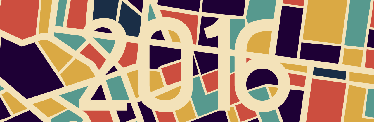
WordPress Twenty Sixteen theme is actively used on over 1,500 sites hosted by WPMU DEV. This guide looks at the theme that has been described as “a modernized approach of an ever-popular layout.”
Yes, it’s a blog theme. With its horizontal header and optional right sidebar, it’s reminiscent of the Twenty Ten theme. But while Twenty Sixteen’s design is certainly not unique or groundbreaking, it does offer a clean, polished and minimalist design that’s perfect for bloggers.
- About WordPress Twenty Sixteen Theme
- Key Design Elements of Twenty Sixteen
- Customizing Twenty Sixteen
- Excerpts, New Widget Areas, and Social Icons
- Technical Changes and Community Reaction
- New Directions in WordPress Theming
- Sweet Twenty Sixteen – A Solid Theme
In this article, we’ll take a look at Twenty Sixteen’s primary features and how you can customize it to suit your own website.
About WordPress Twenty Sixteen Theme
Twenty Sixteen was designed by Automattic’s Takashi Irie, who also designed the Twenty Fourteen and Twenty Fifteen default themes.
Anyone taking an initial glance at the Twenty Sixteen preview page on WordPress.org could be forgiven for coming down hard on this offering. Without much actual content to display, the theme looks minimalistic to the point of being rudimentary.
But as Takashi points out in the theme’s release notes, the Twenty Sixteen is organized around a relatively small set of core concerns:
“Twenty Sixteen is a modernised approach of an ever-popular layout — a horizontal masthead and an optional right sidebar that works well with both blogs and websites. It has custom color options that allow you to make your own Twenty Sixteen. The theme was designed on a harmonious fluid grid with a mobile first approach. This means it looks great on any device.” – Takashi Irie.

However, a quick look at the rather more polished demo pages for Twenty Sixteen over at WordPress.com starts to show some of the theme’s power.
That initially off-putting black surround border, for example, starts to look more like a tip of the design hat to popular blogging sites such as Kottke rather than a continental European death notice.

With some high-quality images and decent blocks of text to work with, it soon becomes clear that, while stripped down, Twenty Sixteen is indeed a clean, powerful take on modern blogging, which holds up well against the typographic excellence that competitors such as Medium have brought to the table.
Key Design Elements of Twenty Sixteen
If we fire up a local install of WordPress, we can start stepping through some of those points.
For this review, I simply downloaded a fresh copy of WordPress 4.4 and imported some test content from the Theme Unit Test page, which is available to download from the WordPress Codex.
As you can see, Twenty Sixteen is installed as the default theme:

The first thing you notice is that the horizontal masthead, which disappeared from Twenty Fifteen’s blog-focused layout, is back and in this case is framed by the black colored border I mentioned above.
I added in a few menu items, a header image (you’ve got dimensions of 1,200 x 280 pixels to play with here), and a tiled background image to our demo content below to give you an idea of how this looks in action. As you can see, the designers didn’t hold back on white space this time around:

Twenty Sixteen gives you the choice of whether to go single-column or include an optional right-hand sidebar. If a single column is more to your taste, just leave the sidebar widget blank. Doing this will also give you the option to include an extra large featured image per post, which can be up to 1,200px wide.

As you can see from the image above, these larger images (anything over 840px width) will overflow naturally to the left and create a pleasing bit of vertical rhythm in the main column. You’ll also see that post meta details have been nicely integrated in what is essentially a faux column inside the main content area that works particularly well on larger screen sizes.
You’ll find the same effect in evidence with pull quotes – these have been elegantly styled and can be easily positioned by adding a class of either alignleft or alignright to a blockquote element. Aligning left will cause the text to overhang the main column and visually set your quote off a little more. Aligning right will nestle the quote nicely within the text block.

Speaking of text, the default typography and grid layout employed by Twenty Sixteen really starts to shine when you add longform content to your site.
There’s plenty of room for text to breathe and it maintains its legibility admirably across all screen sizes. A line length of around 80 characters is in evidence on larger screens, and shrinks down well to around the 40 character mark on smaller devices, meaning your content should scan nicely regardless of what device it’s being read on.
Customizing Twenty Sixteen
Twenty Sixteen ships with five default color schemes, which you can quickly switch between via the Customizer: default, dark, grey, red, and yellow.
Depending on personal taste, the yellow and red defaults may be a bridge too far for many sites, but the default and dark options certainly look clean and crisp right out of the box.

As you’d expect from a default theme, the number of items available to tweak using the Customizer is relatively limited. In addition to the various color schemes, you’ve got options for including header and background images, along with basic color control and menu and widget settings.
Excerpts, New Widget Areas, and Social Icons
Twenty Sixteen gives you a handy way of teeing up your posts with the addition of post excerpts. These enable you to follow up on the promise of a headline and introduce your main content in a visually distinct manner, something I’m personally a big fan of.

Pop into preview mode and you’ll see your excerpt nicely tucked in underneath the main headline on the page, as shown in the image below.

Moving further down an individual post, you’ve also got two new widgets to play with below the content area in Twenty Sixteen. These offer a natural place to include specific information such as related articles or content-specific calls to action such as content upgrade offers.

Finally, when it comes to encouraging your readers to engage across various social media, Twenty Sixteen has excellent support for including a full range of pre-made social icons in your footer via the Social Links menu.
Setting this up is as simple as going to Appearance > Menus, creating a new menu, filling it with links to your social profiles, and assigning it to your Social Links Menu.

Facebook, Flickr, Instagram, Twitter and Pinterest are all supported, and you can find a full list of further destinations that the social menu will automatically assign icons for over at the theme’s WordPress.com page.
Technical Changes and Community Reaction
As with the release of any new default theme, there’s been a considerable amount of development under the hood, which might not be initially apparent when looking at Twenty Sixteen in action.
Developer Matt Cromwell has a useful listing of some of the main items he came across as part of the process of contributing to the theme during its development. Standout points include integration with Travis CI for developers, ongoing accessibility improvements, and optimized JavaScript handling.
At the time of writing, Twenty Sixteen had already clocked up an impressive 200,000+ active installs and is maintaining a steady four star rating, indicating that initial community reaction is generally positive so far.
The reaction from industry sites such as Torque has also been broadly positive, and the theme has even won over some diehards who were previously very much averse to considering default themes.
New Directions in WordPress Theming
With the arrival of the WordPress REST API, much of what we know about WordPress as a platform is in a state of rapid change, and theming is no exception. It will be extremely interesting to see which direction Twenty Seventeen takes things.
Without falling too far into the realm of crystal balls, it seems likely that the REST API will be at the core of future theming efforts and that JavaScript may well be the primary language employed down the line.
Developer Tim Nash made the case for using Twenty Seventeen as a showpiece example of this approach in mid-2015, and mooted the possibility of stepping away from default themes entirely in future releases.

In the meantime, developer Chris Hutchinson from The Times has already shown one possible path into the future by rebuilding Twenty Sixteen as a React-powered application.
The launch of Automattic’s desktop app Calypso has shown just how much can be achieved via JavaScript on even the largest scale WordPress installs, and Twenty Sixteen may well go down as the last of its particular kind.
Sweet Twenty Sixteen – A Solid Theme
Default WordPress themes won’t always be a natural fit for many site owners, but they play a crucial role in showcasing the platform’s potential to old and new users alike, and often point towards where things are trending on the design front.
Twenty Sixteen is a solid addition to the string of default theme releases, and the open nature of its development is an encouraging sign of the core team’s approach generally.
Tags:


