
Gorgeous (yet highly practical) analytics graphs/charts, easy-to-interpret breakdowns in one place, customizable page-by-page stats. Meet your new and improved Hub Analytics.
The Hub Analytics recently got a makeover, featuring stunning analytics that monitors your site’s top pages, traffic, bounce rates, and referrals.
The new design is for web agencies, freelancers, and site owners to monitor analytics — all in one convenient place.
In this brief article, we’ll cover what’s all included in The Hub’s Analytics section. This includes:
- Monitoring Site Visits, Unique Visits, and Traffic Sources
- Viewing Your Top Pages and Posts
- Customizing Metrics to Display What You Want
- Creating White Label Client Reports
- Viewing Analytics From Your WordPress Dashboard
You’ll see why we’re so happy with Analytics’ slick new look and you’ll also get an overview of how it now makes monitoring web analytics easier and more convenient.
As long as you have the WPMU DEV Dashboard plugin installed and you’re a WPMU DEV member, you’ll be able to take advantage of all that analytics has to offer. All of this is done without a 3rd party app. Our tracking is enabled through our dashboard plugin.
Let’s begin!
Start by heading into The Hub. Once there, go to My Sites and click on the Analytics icon associated with your site.

Also, you can gain access to the Overview of your site in The Hub by clicking the Analytics area, or Analytics from the menu bar.

Now that you’re into Analytics let’s have a look around! We’ll start with…
Easily Monitoring Site Visits, Unique Visits, and Traffic Sources
The Hub makes it easier than ever to monitor your site & unique visits, plus traffic sources. It’s all in one area and easily customizable.
Right away, when entering the Analytics Statistics area, you’ll get a detailed overview of all that’s going on when it comes to monitoring your site.
You can instantly get a look at site visits and individual page stats. You’re also given an overview of the number of visitors and the dates of the visits.

From here, you can adjust however you’d like to view specific information. For example, you can change the Graph options by showing all Visitors or Unique visitors.

Also, you can pick the timeframe of Yesterday, Last 7-Days, Last 30-Days, and Last 90-Days.
Plus, you can organize the graph by Visitor Type, which includes All Traffic, Search, Referral, and Direct Traffic.
Choose what type of traffic information you want by selecting the individual options.
As you can see, this vital information is all in one place and is quickly customizable in just a few clicks.
Viewing Your Top Pages and Posts
Below the graph, you can view the analytics for individual pages and posts. Here, you’re able to identify the pages visitors are engaging with the most, see page views, check out the average time on pages, view bounce rates, and more.

You can see the percentage of what has changed for each individual page and post.

Want to view the specific page or post that the analytics are referring to? Just click on the icon, and that will open up a new tab in your browser and take you to the actual WordPress page or post.
All the analytics are color-coded whether your numbers are up or down (red for down and green for up). It immediately displays your top pages, and if you need to see more, just click on the Show More button.

Plus, you can always search for a page or post in the search bar.
As you can see, by default, the analytic information for Pageviews, Unique Page Views, Average Time on Page, Entrance, Bounce Rate, and % Exit is on display.
However, all of this can be changed by…
Customizing Metrics to Display What You Want
It’s easy to switch between default settings and custom metrics to display what type of analytical information you want. You can customize this from the Settings tab.
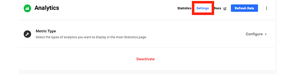
Once you click on Settings, you have the option to select the types of Metrics you need to display on the main statistics page.
It’s just a matter of selecting or deselecting the various data you want in view.

You can also Deactivate your analytics from the Settings area. It will ask you if you’re sure you want to delete it before confirming. Plus, you can always get them back if you want to.

It’s as simple as that to customize your analytic information!
Creating White Label Client Reports
You can transfer raw data into valuable insights with professional-looking white label analytics reports in a matter of minutes. You have the option of sending clients basic or detailed information regarding a site’s analytics.
Like everything else we’ve covered, this is all done from the Analytics dashboard under the Reports tab.

Once you click on Reports, you’ll see any existing reports you have (it will be empty if you don’t have any). Clicking on New Report will get you started.

You’ll see that you give the report a name. For this example, I’m naming it “Analytics.”
Then you can choose the General information (e.g. Language). Also, you’ll include the Email Content (e.g. Subject, Email Text, etc.).

You can then pick what information to include. Since we’re focusing on analytics, we’ll just keep that selected for this report.

Create your white-labeled Cover Pages. Add your logo, font color, and brand color.

Schedule the report (or have the report run immediately), add recipients, have an opportunity to edit the sender’s name, and enter the email to reply to.
Once you have it scheduled and it goes out, your clients or users receive a detailed analytics report delivered straight to their inboxes.

There is a lot you can do with reports that go beyond even analytics. For more detailed information, be sure to read our documentation.
Viewing Analytics From Your WordPress Dashboard
Though the WordPress dashboard is obviously not in The Hub, it’s useful to point out that you can obtain analytical information from the dashboard with our WPMU DEV plugin.
It’s the same information provided in The Hub that’s convenient to view if you’re working in WordPress.
When in WordPress, go to WPMU DEV>Dashboard. From there, you’ll see an area called Analytics. This gives you a snippet of your basic analytics.

For detailed information, you can click View Full Report.

Once clicking View Full Report, you’re able to get an overview of your analytics by Visits and Unique Visits. Plus, you can click on Top Pages & Posts and Authors, to see who has been contributing to your site if you have more than one author.

You can also pick a timeline for the display of analytics and choose whether you’d like the analytics to be for the full site, or a specific page or post.
If you just want a specific page or post, once you start typing in the bar for data, a dropdown of all the titles that match your search pop-up. You can then click on a specific page or post to get the analytics.

These detailed analytics also show you Visits, Pageviews, Visit Time, Bounce Rate, and Gen. Time.

Clicking on the individual categories will show you a graph of analytics in the set timespan.
There are individual data for each category.
The WPMU DEV Analytics section can come in handy while in WordPress and not The Hub. It’s a quick option that provides the same information in The Hub’s Analytics area.
Your All-In-One Analytics
Keeping tabs on your analytics has never been easier thanks to The Hub! Having everything in one spot simplifies everything for you and your clients when it comes to staying on top of your traffic.
If you’re a WPMU DEV member, be sure to check out the new analytics section today. And if you’re not, give us a try! We have a 7-day free trial that gives you all the access to our premium plugins, The Hub, 24/7 support, and everything we’ve covered.
For more information, be sure to read our article on how to get the most out of The Hub.


