On the Internet, web design tips are a dime a dozen. Many people have opinions on what the perfect website looks like. That’s because, to a certain extent, design is subjective. What one person likes, another might find hideous.
At the same time, design is one of the most important factors for the success of a website. In fact, almost half of all users say that the website design is their main factor for judging a company’s credibility. As a consequence, it also influences conversions, bounce rate, and more.
Sigh, if only there was a way to find some objective data on how to create successful web design. Wait, there is! And we have compiled a bunch of it in this article. Stick around for some web design tips backed by science. Stop relying on your gut feeling and start doing things proven to work.
Science-based Web Design Tips to Crush Your Next Website Project

In the following, you will find some research-based tips and tricks on how to improve your web design.
1. Make Site Speed an Absolute Priority
It’s probably one of the least debated facts in the web design sphere that page loading speed matters.
Research has shown that it influences everything from bounce rate over user satisfaction to conversions and revenue.

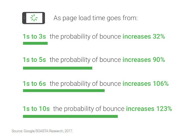
This is especially true for mobile site speed. According to a 2020 Google study an improvement of just 0.1 seconds can improve checkout, conversion, and bounce rates.

Considering the fact that the majority of Internet users surf on mobile devices and that Google has switched to a mobile-first index, that’s definitely something you should pay attention to.
If your site is slow, visitors will not stick around. Period. Plus, search engines will punish you in their rankings. For that reason, it’s paramount that you invest in making your site as fast as possible.
How? The articles below will put you on the right track:
- 10 Reasons Website Performance Matters To Your Business
- 14 Ways To Speed Up WordPress And Decrease Page Load Time
- 13 Performance-Boosting Site Speed Tips for WordPress
- 10 Easy Ways to Speed Up Your WordPress Website [Case Study]
2. Leverage the Fold
Whether or not there is still such a thing as the fold is a heated debate. Some say that because of the multitude of screen sizes these days, the fold doesn’t matter anymore. Others are of a different opinion.
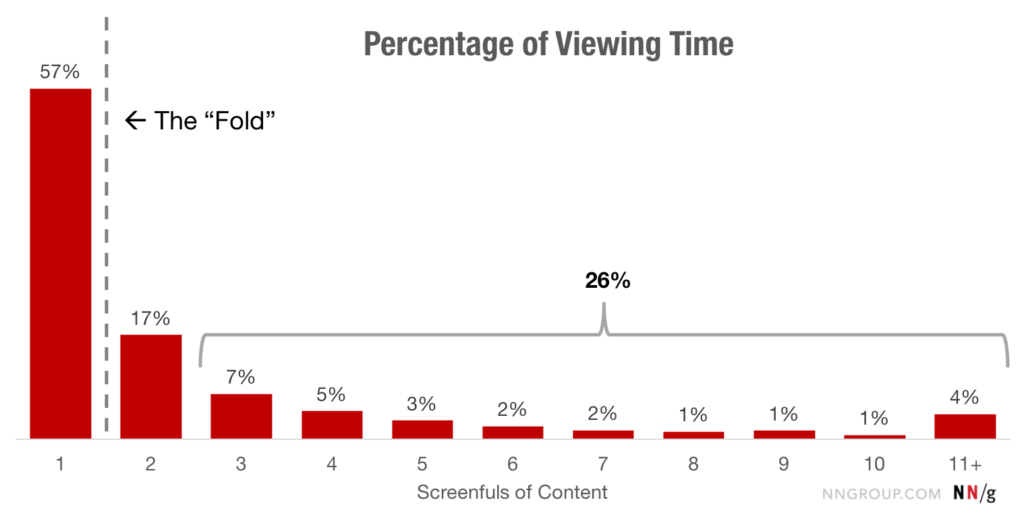
On that note, according to a 2018 study by Nielsen Norman Group, people spend 57 percent of their time above the fold with a sharp decline afterwards. 74 percent of their time is dedicated to the first two screenfuls.
So, it seems like the fold still matters. For your website that means you need to prioritize your content and use the available space to hook users in so they continue. Here are some tips on how to do that:
- Use a clear and descriptive headline — Explain what your site can do for visitors and highlight the benefits. Be brief and use words that evoke emotions. For more advice, look into our copywriting tips.
- Include your main call to action — To improve your chances of converting your visitors, the fold is the time to start the user journey. Make sure your CTA is clear and visible. Use our tips for how to write a great call to action if you are struggling.
- Include media — Images, videos or audio help emphasize your point. We will talk more about visual content further below.
In addition, to encourage users to continue scrolling, be sure to avoid the illusion of completeness or “false bottoms”. This describes design that can easily appear as if you have have reached the end of the page, thus dissuading visitors from continuing.

3. Take Advantage of Hick’s Law
Hick’s Law states that the more choices an individual has, the longer they will take to make a decision.
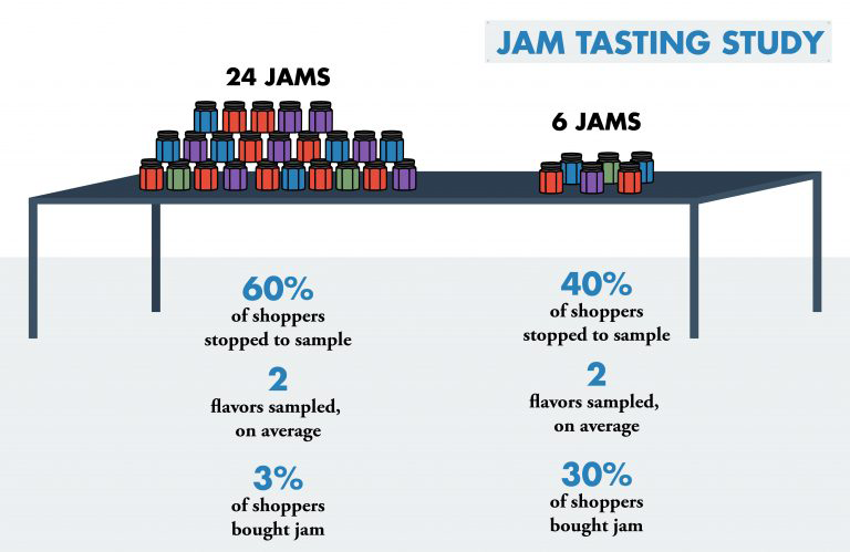
There’s actually a fascinating study on this phenomenon in which people in a supermarket were given more or less varieties of jam to try. In the end, those who had more choices were much less likely to end up buying some jam than the ones that had less variety to choose from.
How’s that important for your website? Well, it means you might be able to boost your conversions simply by limiting the number of choices you give users. Here are a few examples of what that can look like:
- Reduce the number of menu items
- Limit form fields
- Focus on one call to action
- Only display social buttons for networks you are actually active on
- Stick to one goal per page
There are plenty of other ways you can reduce overwhelm on your site and move users towards the choices you really want them to make. We actually have an ebook on that.
4. Keep it Simple
Continuing with the theme of less, this also applies to your design in general. A huge study by Google has shown that visitors don’t like visual complexity. The gist: the more complicated your design, the less beautiful they perceive it to be.

What does that mean for your site? Besides the point above about limiting choices on your site, here are a few ideas:
- Rethink that sidebar — More and more websites are ditching the sidebar in favor of single-column design (for example, the one you are on right now). It means fewer distractions and puts the focus clearly on the content.
- Stick to standard layouts — People love familiarity and can get weirded out by non-standard site designs. Therefore, it may be a good idea to follow familiar design tropes and layouts. You can still find ways to stand out through other means.
Speaking of standard layouts, Orbit Media did a study on web design standards in 2021. From a sample of the homepages of 500 B2B websites, they found the below to be the most and least common standards and conventions these websites adhere to:

Use the information above to improve your own homepage, plus, read the accompanying article for additional tips on how to nail each part, from the header down to the footer. Norman Nielsen did a similar study with findings mirroring those by Orbit Media.
5. Avoid Carousels, Sliders, Tabs and Accordions
Website owners love carousels. It’s probably one of the most client-requested features and a common compromise when different teams demand equal real estate on the company website. Unfortunately, the research says that they are pretty useless, at the very least on your homepage.
One of the most mind-blowing pieces of data comes from Notre Dame University. The webmaster there noticed that the first slide on a carousel received almost 90 percent of the clicks while the rest went largely ignored.
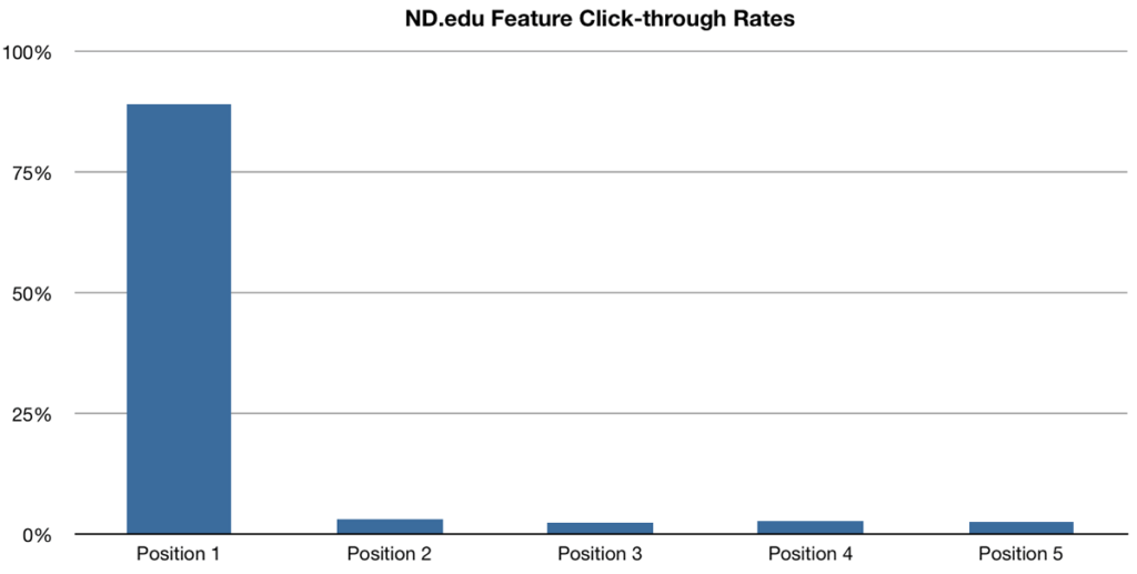
90 percent! That doesn’t sound like the other slides are even worth being there, does it? Seems like web designers who talk their clients out of using a slider had it right to begin with.
Similar findings come from the University of York.

However, the case may be different for mobile product images as this study published in Smashing Magazine shows.
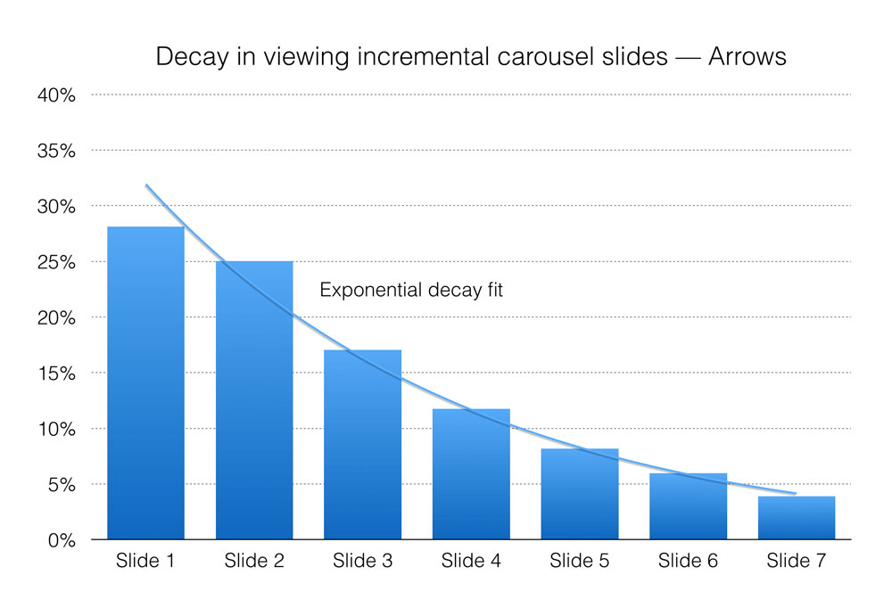
Here, the interaction on subsequent slides was higher than in the previous studies. So, for providing additional information in a particular context, slideshows do seem to have their use. However, they seem less suitable as a site navigation tool.
Tabs and accordions have the same problem as sliders and carousels – they often go ignored. This is compounded by the fact that few visitors actually read the entire page. Most people merely scan and are, therefore, not very likely to do any extra clicking to see your content.
However, what if you need to include the information placed in those areas somehow? We are getting to exactly that right now.
6. Prioritize Scrolling Over Clicking
If you shouldn’t compress information into sliders and/or accordions, how do you present it? The answer: just put everything in one long page, including the stuff usually tucked away. Seriously, it works.
There is a fascinating case study by Crazy Egg to prove this point. They went from having a simple, short sales page to one that was 20 times longer than the original.
The result: conversions went up 30 percent! That’s certainly nothing to scoff at.
Seems like users like scrolling a lot more than they like clicking. Therefore, if you are currently spreading the information about your product across many different pages, it’s time to reconsider.
7. Direct Attention with Visual Cues
One of the main functions of web design is to guide users. You can do that by giving different weight to various elements, thereby directing focus where you want it to go.
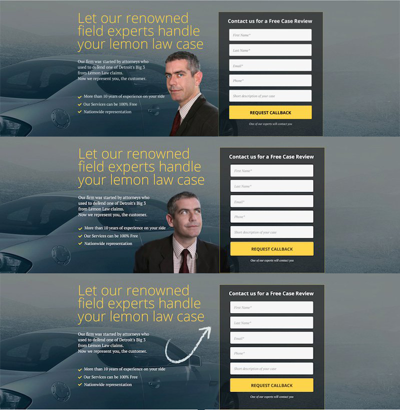
However, you can also use more direct visual cues to achieve this. One is by taking advantage of the fact that humans tend to look in the same direction as people they see in ads.
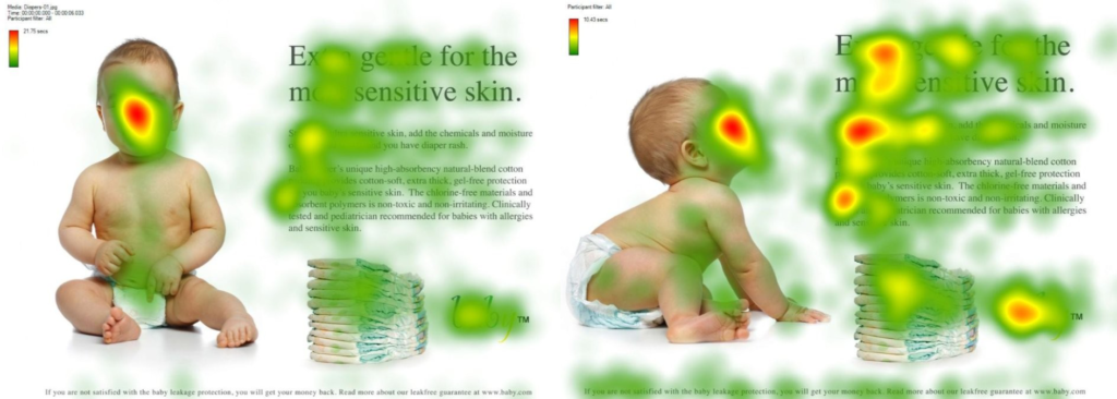
Notice how in the image above, more people read the text the baby is gazing at than when the baby was looking at the camera? This is a real thing and you can use this to direct attention on your site where you want it most.
However, you don’t have to be that subtle about steering visitor attention. Sometimes it helps to be blunt about it. For example, in one study, researchers tested the effects mentioned above against a simple arrow pointing at elements they wanted to draw attention to.
Funny enough, the more direct method outperformed the subtle cue.
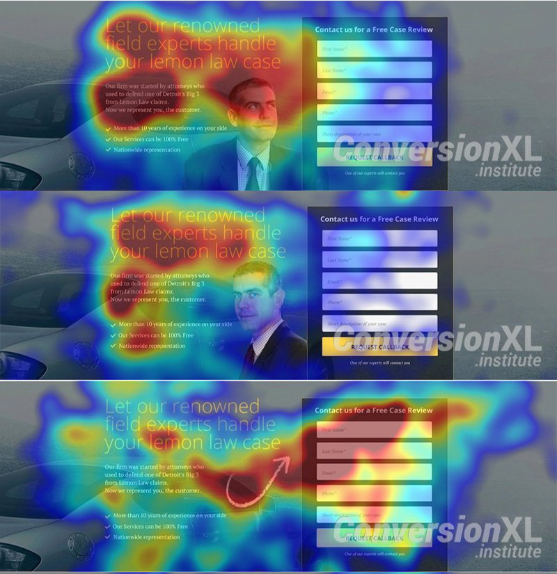
Let that be a lesson to you.
8. Use People in Pictures (But Avoid Stock Photos)
Besides using them to direct attention, including other people in images on your site is generally a good idea. Humans like to connect to other people, in real life as well as on the web. It’s why, for example, we have about pages on blogs.
You can see this at work in one case study by Basecamp. They managed to increase their conversions by 102.5 percent by changing from a text-based landing page to one with a large photo of a person in the background.
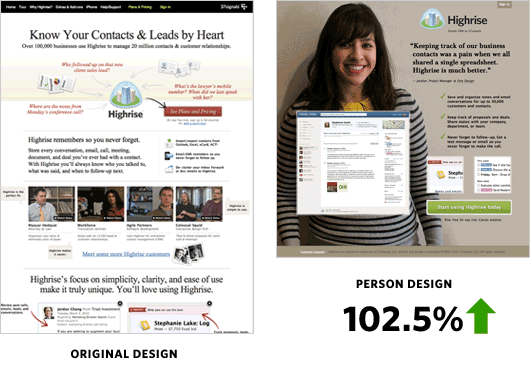
Simple but effective. However, one caveat: the whole effect is easily negated by stock photos. A Nielsen Norman Group study found that we are very adept at recognizing these generic images and tuning them out.
For that reason, if you are going to use images of people on your site, make sure they are genuine and real. Include your staff or customers.
Two case studies that show this in action come from Marketing Experiments and Visual Website Optimizer. In both cases, switching stock imagery for authentic and relevant pictures improved conversion rates by 35 to 45 percent.

If there is absolutely no way around using stock photos, at least follow some best practices:
- Use TinEye and Google Images to find out who else uses the same picture. Avoid images that appear on a lot of other websites and sites you don’t want to be associated with.
- Use stock photos only as a basis to create your own images. Adjust their color, add text, typography, and other effects to make them more exciting and unique.
9. Use the Right List Order
Using lists, both ordered and unordered, is a great way to make information more accessible and increase readability. However, it turns out that here, too, human attention is fickle.
This is because of the so-called serial-position effect. It basically says that in a list, you are most likely to remember both the items in the beginning and at the end. The middle section, on the other hand, goes largely forgotten.
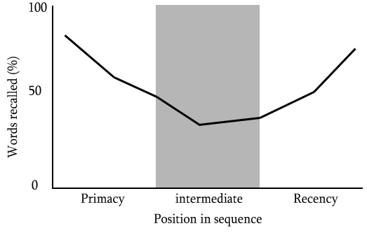
The lesson here: When listing attributes of your product or service, make sure to put the most important where they are likely to make an impact.
10. However, Forget About the Order of Your Navigation Menu
The exception to the importance of ordering your lists seems to be website navigation. An eye-tracking study from 2010 wanted to find out if the order of menu items influences how quickly users find what they are looking for. For the results, let me simply quote the study itself because it couldn’t be clearer:
- When designing a web menu, or advising on its design, do not spend much time deciding the order of menu items on the basis that it will help users find the items more quickly. Continue to adhere to cultural expectations such as the “Home” link always being on the far left.
In short, put your Home button on the left side of the menu but don’t worry about the order of anything else.
11. Leverage Social Proof
The last one of our web design tips is about the so-called conformity bias. This is the tendency of people to do as others do. That means, if a group of people approve of something, others are more likely to do the same.
One way of leveraging this on your website is to show social proof. If you can demonstrate that others have a positive opinion of your site, content, product or service, new visitors are more likely to come to the same conclusion.

You can most easily show this with counts of social shares, media mentions and/or testimonials. In case you want to dive deeper into this topic, we have a whole article on how to increase social proof for you.
What Are Your Favorite Web Design Tips?
Web design is a complex topic that has a lot of bearing on the success of your website. For that reason, it’s best to know what you are doing. Relying on research for advice instead of random opinions is a good way to ensure that.
You can use the above techniques to make your website more effective, serve your visitors better as well as improve conversion rates and other success markers. Let’s summarize them one more time:
- Invest in fast page loading speed
- Use the fold to hook visitors in
- Reduce choices to improve conversions
- Simplify where you can
- Avoid using carousels, sliders, tabs, and accordions
- Prioritize scrolling over clicks
- Direct attention via visual cues
- Use images of people (but not from stock)
- Prioritize the order of list items
- Don’t worry about the order of your navigation menu
- Use social proof to make your site more attractive
Hopefully this helps you improve your own web design. If you have additional tips, studies and information, please feel free to share.
Do you have additional web design tips based on research? If so, please share in the comments below.

