Ecommerce is tough business. From increasing expectations online shops have to fulfill to cart abandonment, it’s not always easy to convert visitors into paying customers. A central element here: checkout page design.
Think about it: you probably invested a lot in sourcing products, web design, and building traffic. Yet, in the end, the checkout page is the last part of your website that customers will interact with. After making a huge effort to get them there, it can literally make or break whether someone goes through with their purchase or not. If they don’t, all the work you did before is in vain.
To give you the best chance of moving them from one camp to the other, in this post, we have compiled a number of best practices for checkout page design. Below, you will find tips how to create a checkout page that, while it won’t eliminate cart abandonment, at least can increase the number of people you convert to paying customers.
But First, Some Statistics
Before talking about improving your checkout page design, let’s talk some numbers that show why it’s a good idea.
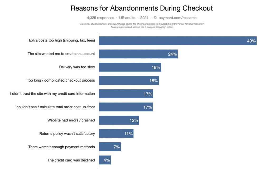
According to the Baymard Institute, the overall rate for shopping cart abandonment is at about 70%. While that sounds like a lot, you need to factor in that some amount of abandoned carts is normal. A lot of users simply window shop, compare prices, and look for inspiration instead of seriously considering to buy something.
However, of those that did really want to make a purchase and decide not to, here the main reasons they leave:

We already talked about a lot of this in our article on cart abandonment. One thing that is especially relevant for this post, however, is that 20% of shoppers abandon their cart due to the checkout process being too long or complicated. Almost as many leave due to lack of trust and because they couldn’t see the total order up front. Finally, 7% didn’t find the number of payment methods satisfactory.
What stands out is that pretty much all of these are solvable via changes in checkout page design. Consequently, that’s where we will try to make a difference.
How to Design an Effective Checkout Page
In the following, let’s go over how you can make this crucial page the best it can be.
1. What Should Be on a Checkout Page?
First of all, let’s talk about what elements customers should find when they try to check out.

There are a number of ingredients that should definitely be present to make this page effective and usable. Some of it is about information you need to collect for a successful sale and some of it is important for customers.
- Ways to input billing and shipping information
- A list of the products in the shopping cart
- Available delivery methods
- The ability to input payment information
- Support options to get help if needed
Of course, you can add a lot more (and we will also give you some tips about that) and the devil is in the details. However, these are the basic five things your checkout page should contain.
Depending on what kind of checkout process you use (one-page, multiple page), these might also be spread out over several stages. More information for those cases below as well.
2. Basic Checkout Optimization Tips
We already have two articles on eCommerce UI design and eCommerce mobile design. They already contain a few tips for better checkout pages:
- Offer guest checkouts – Nobody wants to be forced to open yet another account for a potentially one-time purchase. It’s the second-most common reason for cart abandonment and should, therefore, be optional.
- Keep information to enter to a minimum – Only ask for information you really need to complete the transaction. For example, reduce the number of form fields to just essentials. This keeps the amount of effort low on the part of your customers.
- Show the progress – People are impatient, if they don’t know how long it will take to get to the end of their purchase, you might lose them on the way. Therefore, either go for a one-page checkout (where they can see all the steps they will have to complete at once) or give them an indicator for the progress they are making.
- Emphasize security – A common worry of online shoppers is having their information stolen. Consequently, your job is to put their mind at ease. You can do that with the help of trust seals, social proof, and the use of HTTPS/SSL.
- Make it mobile friendly – Over half of traffic comes from mobile devices. Mobile users need special assistance to make the checkout suitable for them. This includes things like using native tools for entering information (e.g. a picker wheel for date of birth or showing the number keyboard for credit card number), the ability to scan credit cards, and more.
3. Highlight Benefits and Support Options
To make it more likely that a customer will complete the checkout, point out things you offer that make your their lives easier. This can, for example, be free shipping and returns.

Doing so can function as the final nudge for them to decide that they actually want to go through with their purchase. Other examples are links to your privacy policy, shipping details, FAQ, return policy, etc.
You might also consider a live chat option. This way, if customers have pre-sale questions, they have the ability to clear them up with a representative right then and there.

For those who might not be comfortable with live chat, provide a phone number or email address. Also display any pertinent information like an order number so they can easily pass it on to a support person.
4. Make Things Easy
Friction is the enemy of the sale. The more annoying your checkout process is, the less likely it is that customers will complete it. For that reasons, one of the mottos when you design your checkout page is to make it as simple as possible.

How can you do that? Here are some ideas:
- Remove or minimize your header and footer — Remove the usual header and footer as they can be distracting and move customer away from what you are trying to get them to do. Look also what other distractions you can eliminate.
- Allow customer to use their billing address for shipping — Because nobody wants to have to input the same information twice.
- Use data validation and autocomplete — It’s super annoying to find out that you entered something incorrectly after you have already tried to complete the purchase. You might also allow autofilling form fields for quicker checkout.
- Offer express checkouts, one-click purchase — This is especially suitable for repeat customers who are logged in so you have their information available. Hey, if it works for Amazon, why not you?
- Save information in the checkout — If customers hit the back button in their browser to add more to their cart, the worst thing you can do is make them enter all of their information again.
- Provide a variety of payment options — The more possibilities you provide, the more people have a chance to complete their purchase. Start with major providers like credit cards and PayPal but also mention smaller ones you accept. You can also use something like Adyen to automatically display the most popular payment solutions for certain locations.
Remember, you want to make it as easy as possible for your customers. If they get too annoyed by your checkout page, they will have no qualms going to your competition.
5. Display Cart Contents and Provide the Ability to Modify Them
We have already mentioned above that showing customer what they have in their cart before checkout is important. However, the way in which you convey this information also matters.
If it’s a drab, text-only list of SKUs or product numbers, it’s not going to be very helpful. Instead, give them all the details they need to ensure that they made the right choice. This means details like size, color, and other variations as well as images.

This all allows clients to check if their order is correct. In addition, allow them to make changes then and there if they find that something is wrong. They should be able to remove merchandise from the cart, change the product quantity, and other details. Most importantly, don’t force them to hit the back button to make these changes or you might lose them!
In addition, it can also be helpful to allow customers to save items to lists. Many people use their cart as a glorified wishlist to begin with, so why not enable them to create an actual one? This might also result in more sales in the future.
In addition, offer a review page where they can see all their information, the products in their cart, etc. one last time to make sure everything is as it’s supposed to be. A nice touch is also a gift wrap/message option, particularly around certain holidays.
6. Make Sure to Follow Up
Part of checkout page design is also what happens after the customer leaves it, either by abandoning their cart or going through with the purchase. In the latter case, you might try one last time to get them to register for your site and/or sign up to your newsletter.
You already collected all the necessary information, so it’s basically just about having them set up a password (which can also be auto-generated and changed later) and collecting consent. Try to do this on the page itself instead of an interstitial, as exit popups don’t always work.
As for those customers who started entering their information but ultimately decided not to buy, you might follow up via email, and give them an extra incentive like a one-time discount.

7. ABT – Always Be Testing
The problem with all design is that nobody knows what will work in the end. Sure, there are proven conventions that you can adhere to but that’s still no guarantee your customer base will respond to them. In the end, we are all just making educated guesses — the only way to be sure is to test.
For that reason, it’s important that you regularly try out modifications of your checkout page design. Make one of the changes above or something else you have in mind and run an A/B test against your current version.
This will show you if there is a way you can further improve the customer experience so that they are more are willing to purchase from you.
Important: don’t test too many things at once. Only make one or two changes and run a test on those. If you do more, you won’t know what tipped the scales and will be none the wiser.
Last Thoughts: Checkout Page Design
Checkout page design is a central consideration for anyone running an online shop. It’s the kiss-off page for site visitors and last thing they interact with before becoming customers – or not. Use the tips above to make sure it’s not the proverbial kiss of death.
Let’s review what we covered above one more time:
- Include all necessary elements on your checkout page
- Follow basic guidelines for ecommerce UI design (incl. mobile)
- Highlight benefits you offer and methods of support
- Make your checkout page easy to use
- Show cart contents and make them simple to modify
- Follow up on purchases (both completed and incomplete)
- Run A/B tests to keep improving your checkout page design
Hopefully, by now you have plenty of ideas to improve the makeup of your own checkout page. We wish you all the best with implementing them.
What’s a common feature of checkout page design that you think should change and why? Let us know in the comments!


