
Are you a beginner in CSS and constantly asking yourself if you are doing things right? Do you ever wonder if your markup is up to par? If so, it’s clearly time to learn some CSS best practices.
By adhering to basic guidelines for writing CSS, you can make sure you produce clean, legible, and easily supportable code. You know, the kind that lets others understand what it does and that makes you proud to look at.
If either (or both) of these things are something you aspire to, let’s talk about CSS best practices that allow you to do so.
1. Make Your Code Readable

Proper formatting makes sure code is legible for you and other human developers. While it’s not necessary for machines (i.e. browsers) to execute, it’s simply good practice to make your CSS easy to read. Doing so makes it more comfortable to understand, maintain, and work with.
We have written an entire article about code formatting and comments, so we won’t repeat all of it here. However, here is a quick overview (check the article for the entire thing):
- Indent your code — Whether you use tabs or several spaces (decide how many!), make sure you indent your CSS value pairs. When using media queries, nest them within one another to show dependency.
- Use line breaks — Separate distinct CSS properties with line breaks and put the value pairs on their own line.
- Arrange rules in alphabetical order — This it easier to find what you are looking for.
- Use comments — Include comments to separate different style sheet sections from each other. In addition, consider including a table of contents at the beginning of the file. You can also leave comments with important information that you might forget later or that is important to understand the presence of some markup (e.g. fallbacks for older browsers).
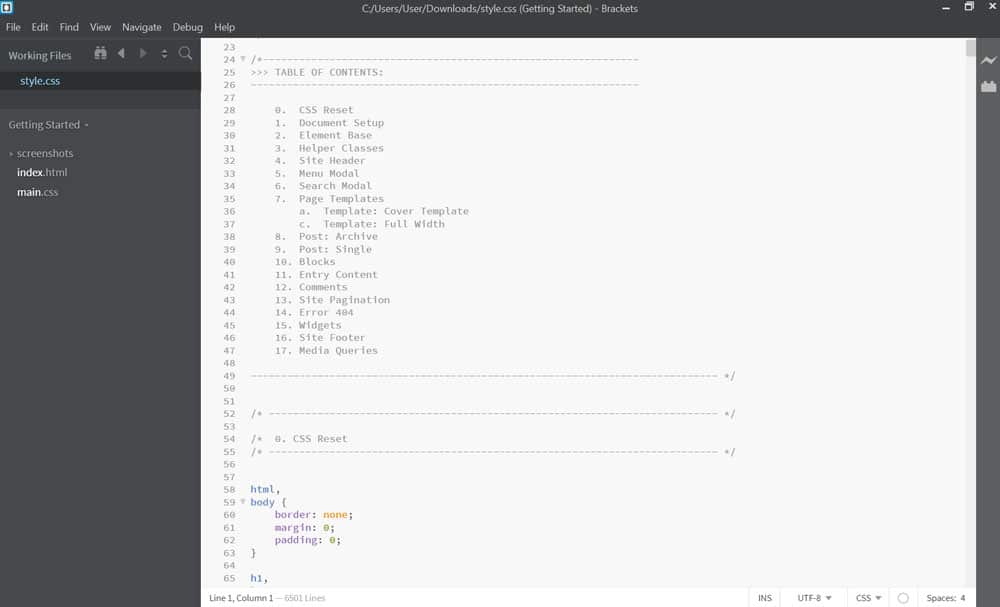
Here is an example of some well-formatted CSS code:
.search-submit { border-radius: 0 2px 2px 0; bottom: 0; overflow: hidden; padding: 0; position: absolute; right: 0; top: 0; width: 42px; } @media screen and (min-width: 56.875em) { .site-header { padding-right: 4.5455%; padding-left: 4.5455%; } }While there are different conventions for formatting CSS markup, the important part is that you stay consistent. Nothing makes a CSS file or its author look messier than inconsistent formatting. So, settle on your preferences and stick with them. If there is an existing style guide, stick with that.
When you stay consistent, even if you mess everything up, it’s much easier to correct all the same mistakes at once (thanks, search and replace!).
2. Format Your Style Sheet Well
Not only should you make your code readable, but also make sure your CSS style sheet(s) are easy to handle and well organized. Here are some tips and best practices for that:
- Use a top-down approach — Order styles in your file as they are rendered in the browser. That means, go from more general rules to more specific markup. For example, start with
body,a,p, then headings, then more specific elements. - Break files down into sections — Group styles into topical areas: typography, links, navigation, etc. Even single pages can have their own section if they come with their own styling. See also the earlier advice about comments and creating a table of contents. In addition, you can also comments to mark particular sections.
- Use separate style sheets for large projects — If your markup will include thousands of lines of codes, it might make sense to break it down into several files for different sections of your site. That’s especially true if those sections have very different styling (e.g. an online shop vs an about page). In that case, one larger sheet for global styles and separate smaller files for specific site sections make more sense.
3. Rid Yourself of Redundancy
Redundant code is code that takes up more space than it needs. It loads slower and is also harder to maintain and troubleshoot. Therefore, it’s important to avoid redundancy where possible. Here are a few tips for that:
- Use DRY (“Don’t Repeat Yourself”) — Check for repetitions in your markup. They make your code slower and harder to read. Define things once, then overwrite them further below as necessary.
- Take advantage of CSS shorthand — CSS offers many possibilities to define several properties at once. For example,
margin-top,margin-bottom,margin-right, andmargin-leftcan all be defined with a singlemargindeclaration. It takes up less space, uses less code, and works just as well, resulting in better performance. - Combine selectors where possible — If several elements, such as the typography definitions for headings and paragraphs, will all share the same styles, make sure to combine them all in one call rule set. There is no need to repeat the same markup separately.
- Avoid redundant selectors — Be as specific as you need be with your selectors to achieve your outcome but not beyond that. Adhering to this also makes it easier to overwrite markup with more specific CSS if necessary. Conversely, avoid very broad selectors as that uses more processing power.
4. Important: Avoid !important
Next up in our CSS best practices is to try and avoid using the !important tag as much as possible.
You are probably aware that this is the nuclear option to have a CSS declaration propagate all the way down the cascade without being overwritten. The problem is, if you rely on it too much, you might need many of them, which will result in your CSS code ending up what we call a goshdarn mess (to use the technical term).
The truth is, if you are relying on !important to make your markup work, you probably have to spend some more time learning about CSS specificity. If you know how specificity works, it’s usually not that hard to create a more targeted selector to overwrite what you need overwritten.

Other cases where !important is often used are inline styles or external style sheets. If you encounter these, you should use it as an opportunity to think of a better organization and structure of your styles instead of going nuclear.
In short, reserve !important for testing purposes but avoid it in production environments.
5. Consider Using a Framework
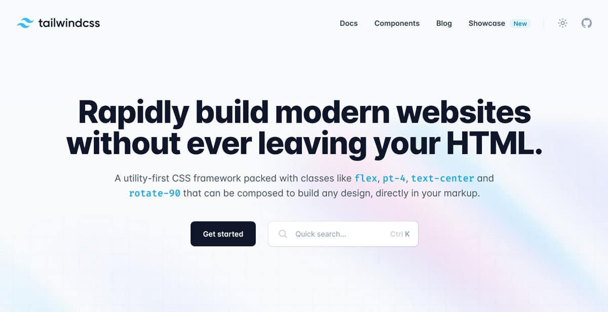
CSS frameworks can be very useful and help you get up and running quickly. Like other frameworks, they come with pre-configured elements that you can use to create layouts quickly and without having to start from scratch. If you want to learn more about CSS frameworks, you can look into Tailwind, Bootstrap, or Bulma.
At the same time, there is a big caveat: only bring a framework into your project if you are actually going to use it. Otherwise, it will probably hurt your performance. If you commit to a framework for only one feature, it still needs to load its entire style sheet to work. As you can imagine, that’s often a lot more code than is worth it.
So, if you find yourself overwriting your framework styles or hacking it otherwise, you probably shouldn’t be using it.
6. Use a Reset/Normalize Your CSS
Resets appear at the beginning of a style sheet and define a number of default properties like line height, margins, background colors, etc. for your website. Doing so helps eliminate design inconsistencies across different browsers and creates a common baseline. Here is an example:
/* http://meyerweb.com/eric/tools/css/reset/ v2.0 | 20110126 License: none (public domain) */ html, body, div, span, applet, object, iframe, h1, h2, h3, h4, h5, h6, p, blockquote, pre, a, abbr, acronym, address, big, cite, code, del, dfn, em, img, ins, kbd, q, s, samp, small, strike, strong, sub, sup, tt, var, b, u, i, center, dl, dt, dd, ol, ul, li, fieldset, form, label, legend, table, caption, tbody, tfoot, thead, tr, th, td, article, aside, canvas, details, embed, figure, figcaption, footer, header, hgroup, menu, nav, output, ruby, section, summary, time, mark, audio, video { margin: 0; padding: 0; border: 0; font-size: 100%; font: inherit; vertical-align: baseline; } /* HTML5 display-role reset for older browsers */ article, aside, details, figcaption, figure, footer, header, hgroup, menu, nav, section { display: block; } body { line-height: 1; } ol, ul { list-style: none; } blockquote, q { quotes: none; } blockquote:before, blockquote:after, q:before, q:after { content: ''; content: none; } table { border-collapse: collapse; border-spacing: 0; }The above is from MeyerWeb, one of the most popular solutions. You can also look into Normalize.css.
7. Built Accessibility Into Your Design
Making your site accessible means making it usable for as many people as possible, regardless of abilities. Your CSS plays an important role in that, so let’s go over some best practices for this:
- Provide enough contrast — Make sure you have enough variation between your foreground (e.g. text) and background colors so that visually impaired people are able to read it. You can use a contrast checker for that. Similarly, make your links colorful so that they are recognizable. In addition, use a big enough font size (at least 18-20px).
- Keep the
outlineproperty — Outlines are crucial for people who navigate your site with a keyboard or screenreaders. They help keep track of which element is active. If you don’t like the way your outline looks, you have the possibility to style it. More information on that here. - Keep hover elements visible — In a similar vein, make sure that tooltips or other elements that appear when hovering over an element also appear when selected via tab. Look into ARIA roles for that.
For a lot of the above, knowing about pseudo elements is very useful. More on CSS and accessibility here.
8. Avoid Editing Theme Style Sheets in WordPress Directly
WordPress comes with plenty of CSS, most of it residing in theme style sheets (unless you are using a block theme that is). If your plan is to make changes to your theme’s styling, the worst idea is to edit style.css directly.
Why?
Because next time you click the Update now button for your theme (or next time your automatic updates kick in), all your modifications will be erased.
So, what to do instead?
If you are planning only smaller changes, you can use the Additional CSS section in the WordPress Customizer.
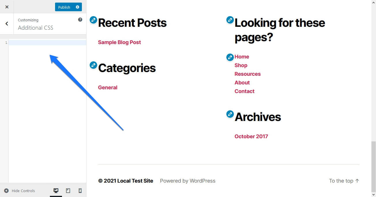
It is update proof and injects your CSS directly into your site’s section.
Otherwise, for larger modifications use a child theme. Anything you put in its style sheet will overwrite what’s in the parent theme and also sticks around at a theme update.
9. Quick Tips for CSS Best Practices
Alright, for the final section, we’ll give you some rapid-fire CSS best practices to keep in mind:
- Learn about classes vs IDs — Classes and IFs are used in very different ways. Classes are for repeating elements, IDs for unique elements. For more information, we have an entire article about this.
- Go for flex and grid instead of float — Floats used to be main way to arrange web elements to the left and right and create layouts. By now have solid systems for that in place with flexbox and grid, so get with the time and use them.
- Take advantage of preprocessors — Preprocessors help organize your markup, avoid repetition, add modularization, provide automation, and more. In times of custom variables they are not as necessary anymore but still useful. The most popular ones are SASS, LESS, and Stylus. You might also look into postprocessors like PostCSS and autoprefixer.
- Use relative units — In the days of responsive design and websites displaying on wide range of screen sizes, you should usually rely units like
em,rem,%, and other relative sizes. Fixed sizes likepxare only for certain scenarios. - Minify your CSS — Minifying removes all the things from the code that are necessary for human reading (i.e. everything we told you to put in earlier). However, browsers don’t need special formatting and minimizing makes for smaller files and faster loading, so go for it! Autoptimize is a great plugin that can do this automatically.
- Remove unused markup — For similar reasons as above, check your code for markup that is not actually being used in your pages and remove it. This will further shrink your files. We have an entire article on that topic as well.
- Use a CSS validator — Validate your CSS to check your markup for correct usage. There are enough online tools for that.
CSS Best Practices Are a Great Basis for Further Learning
When you first get into CSS, it can be a bit overwhelming. There is so much to learn and a lot to wrap your head around. By adopting CSS best practices early, you give yourself a good basis to stand on and continue learning from.
Above, we have covered a number of the most important practices to adopt. This is by far not everything there is to know in terms of CSS best practices but it’s a good place to start. We hope you enjoy your onward journey!
What other CSS best practices do you consider absolutely essential to know? Let us know in the comments section below!


