Ecommerce UI design poses a specific set of challenges because it’s oriented towards one particular goal: selling products. Leading visitors to that destination is more complex and a lot less linear than, say, on a landing page.
Customers can get to the end point in many different fashions. They might arrive on a product page directly from a search engine or via your product categories, navigation menu, related products, or filter functions.
There are also more steps involved: from customizing products to their needs (colors, size, etc.) to going to the checkout (if they don’t abandon their shopping cart), entering payment information, and reaching the confirmation page.
In order to make sure they have the best experience and you better your chances of completing your sale, in this post, we will go over best practices in eCommerce UI design and how you can make the most of it.
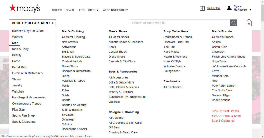
Optimize Your Site Navigation
The navigation menu is one of the most central design elements on any website. It’s most likely that users will rely on it to get around your site and there are many ways to customize it. Here’s how to make sure it serves your eCommerce clientele well.
Answer the Most Important Questions
There are some basic requirements that visitors have of your site navigation. At a single glance, it needs to answer some of the most important questions they will have on their mind:
- What brand or company are they interacting with?
- What does this shop sell?
- How can they navigate around the site?
- Which page are they on?
- How do they find the product they are looking for?
Even if they are not aware, customers will be trying to consciously or subconsciously answer at least one of those questions. So step one is to think about what needs your visitors have and how your site navigation can help address them.
Keep the Navigation Menu Hierarchy Flat
When giving people a navigation menu for your online shop, make sure they can get to their destination as quickly as possible.
That means, avoid too many submenus and sub-submenus. Instead, reduce the amount of clicks and effort on the way with clear signposts and direct access to your most important categories.

Note that it’s ok to highlight certain menu items like sales, gifts, or new arrivals with different colors, images, font variations, or else. In fact, that’s something customers actively look for. 92% of US shoppers search for deals before making a purchase , so pointing out where they can find them will be much appreciated.
The same guidelines extend to your mobile menu.

While you can’t pack quite as much information in there as on desktop, it’s important to limit its depth (and thus clicks) as well.
Give Product Results Their Own Filter Options
It’s very common for products of any kind to come in different variations. These can be sizes, colors, brands, materials, operating systems, or other attributes that set them apart.
If your site has a lot of them, a best practice in eCommerce UI design is to give buyers the ability to filter and sort your products.

That way, it’s much easier for them to find what they are looking for. It also reduces your risk of them losing interest while slogging the list of all products on your site. You can also do this in the form of a sidebar.

Offer Breadcrumbs, Search, and Pagination
Especially shops with many categories, subcategories and products can be overwhelming. In order to reduce customer confusion, it’s a great idea to offer them a breadcrumbs trail.

This makes it easy to go back a few steps in their journey without having to start again and go down the same path.
In addition, you should have a search option available on every page. It’s the best shortcut for customers who know exactly what they are seeking instead of window shopping, especially if it comes with autosuggestions.

Finally, you may want to consider paginating your product results. This helps them load faster, which is important for user experience in itself. It also cuts down on customer overwhelm, stress and effort.

Use Sticky Navigation on Mobile
Ecommerce UI design for mobile devices poses its own challenges, more than we can get into here. However, something that’s definitely helpful for your mobile customers is to make your header and navigation sticky.

That way, it scrolls down together with the user, making sure they always have access to it. It makes your site much quicker and easier to navigate.
As already mentioned, we could probably write an entire article on UI design for mobile eCommerce (and maybe we will!) so we won’t cover this extensively in this post. If want to educate yourself a little more, look at our post on what makes websites mobile friendly.
Create Pleasant Product Pages
Alright, after navigation, let’s now turn our attention to practical product page design.
Use High-Quality, Varied Images
One of the downsides of eCommerce is that customers have no way of trying out, touching, or seeing products in real life before purchasing.
A crutch we use to get around this are images and other visuals (though more advanced technology is on the way). Here, it is important to paint as complete a picture as possible.
That means, show products from various angles as well as in use and context, allow customers to zoom in on details, etc. This will help resolve questions marks consumers might have in their mind before clicking the buy button.

Sure, they can always send products back, but who really wants to go through that kind of trouble? Plus, returns usually happen at a loss for the shop (i.e. you) so why not try to avoid them?
Provide All Relevant Information Right Away
Shoppers don’t like negative surprises. The more hidden costs and details you spring at them, the more likely they will and leave. For example, unexpected shipping costs are the number one reason buyers abandon their shopping carts – by a long shot.

What other information do they care about? Additional fees, refunds and returns, payment and security. So, to make your shop as user friendly as possible, strive to make all of this available at one glance.

Make Selecting Product Variations as Simple as Possible
Web design has a number of standard tools to help users make choices. They include things like radio buttons or drop-down lists and can be a great choice to help customers select product variants they most like.

However, they are not always the best option. When giving customers choices, you should to do it in a way that makes picking as simple and clear as possible, even if it means departing from the standard tools.

Imagine the above selection of colors given as a drop-down list instead. Not very user friendly, is it? Also, make sure that the product image updates when customers pick different varieties.
Provide Next Steps
While it’s important to provide all crucial information as quickly and easily as possible, the buyer journey often doesn’t stop on the first product page. If customers want to keep exploring your shop or look for alternative products, you need to make that possible as well.
One good way of doing so is to show related products. This provides additional shopping stimulus, can work as an upsell, and makes browsing your shop that much easier. However, be sure to test that it serves up relevant articles!
You know the “people who bought this product also bought” section on Amazon? That’s exactly what this is about.

Offering additional relevant items is also a good way to keep people on your site longer even if they don’t find what they are looking for initially.
Finish Strong With Your Checkout and Payment Pages
When your customers have gone through the selection process and are ready to buy, you might think your work is done. However, there are still a bunch of hurdles they must take on the way.
In fact, the majority of shopping carts go abandoned. Here are some thoughts how eCommerce UI design can help lower that number.
Offer a Guest Option
There are many reasons to have people register an account on your website, faster checkout for repeat customers being chief among them.
However, as we have seen above, having to register to complete your purchase is the second most-cited reason for online shoppers to give up on their purchase. It’s just one too many hoops to jump through.
Therefore, creating an account should be optional, not mandatory. Make sure that checking out as a guest is not only possible but also prominently displayed.

Reduce Checkout Steps to a Minimum and Display Customer Progress
Another important step in designing your web shop interface is to reduce the friction on the checkout and payment form. Just like email sign-up forms, brevity is key here. The more information they need to fill in, the more chances they have to change their mind.

In addition, consider the use of one-page vs multi-step checkouts. One-page checkout pages make completing your purchase super simple and can be very effective. Yet, multi-step payment pages also have their place, especially if you need to collect a lot of information from your customers.
However, if you go for that option, make sure that they know where they are in the checkout process and can estimate how much longer it will take. You can do that easily with some sort of progress indicator.

Emphasize Security
As we have already settled, having their information stolen is one of the chief worries of online shoppers. For that reason, it’s important that the UI design of your ecommerce store addresses this somehow.
On the checkout page, you most commonly do this with trust seals. There are a few that customers find the most reassuring.

However, you can also establish trust in other parts of your website. One way to make users feel more secure is to leverage social proof. This can come in many forms.
A classic example is to prominently display logos of companies who use your product, media mentions, or well-known figures in your industry saying nice things about you.

However, it doesn’t have to be celebrities who demonstrate faith in your product. For example, MemberPress tries to persuade you by displaying messages of people (just like you!) who just bought their product.

By the way, reviews are also social proof so consider adding those to your product pages. Yet, avoid only showing people who like your merchandise and also include critical voices as it lends more credibility.
Ecommerce UI Design in a Nutshell
Website design should be attractive and pleasant to look at. However, especially in eCommerce, you can’t forget that it also needs to be functional. It has a job to do, such as moving customers through the sales process and it should do so efficiently and in the best way possible.
Above, we have gone over some eCommerce UI design principles you can use to make your shopping experience more attractive. Overall, it’s about making your site as easy, comfortable, and frictionless to use as possible. Apply that and your customers and bottom line will thank you.
What are your personal hallmarks of proper ecommerce UI design? Tell us your insights in the comments!


