Anne McCarthy announced the second round of testing for the Full Site Editing (FSE) Outreach program. The call for testing asks that users build a homepage from the Gutenberg plugin’s site editor. Feedback is open until March 5.
The first round of testing began in December 2020 and ended last month. Testers were able to identify several pain points with template-editing mode from the block editor. The program created actionable items that Gutenberg developers could work to improve.
This second round is similar. However, testing covers a much larger and more complex area. Users will be leaving the familiar block editor and moving to the site editor, which is still months away from being a viable product.
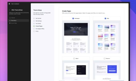
McCarthy listed a 22-step process for building out a homepage. While I followed it for the most part, I got bored before finishing. This is one of the reasons I make for a poor test subject. I like to explore and see what is possible on my own. If I have an idea, I want to attempt its execution. I primarily stuck to the overall script, even if it was a bit out of order.
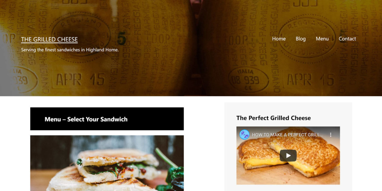
Eventually, I created a custom homepage for a restaurant called The Grilled Cheese — I would definitely open this restaurant in the real world if I ever leave the WordPress community.
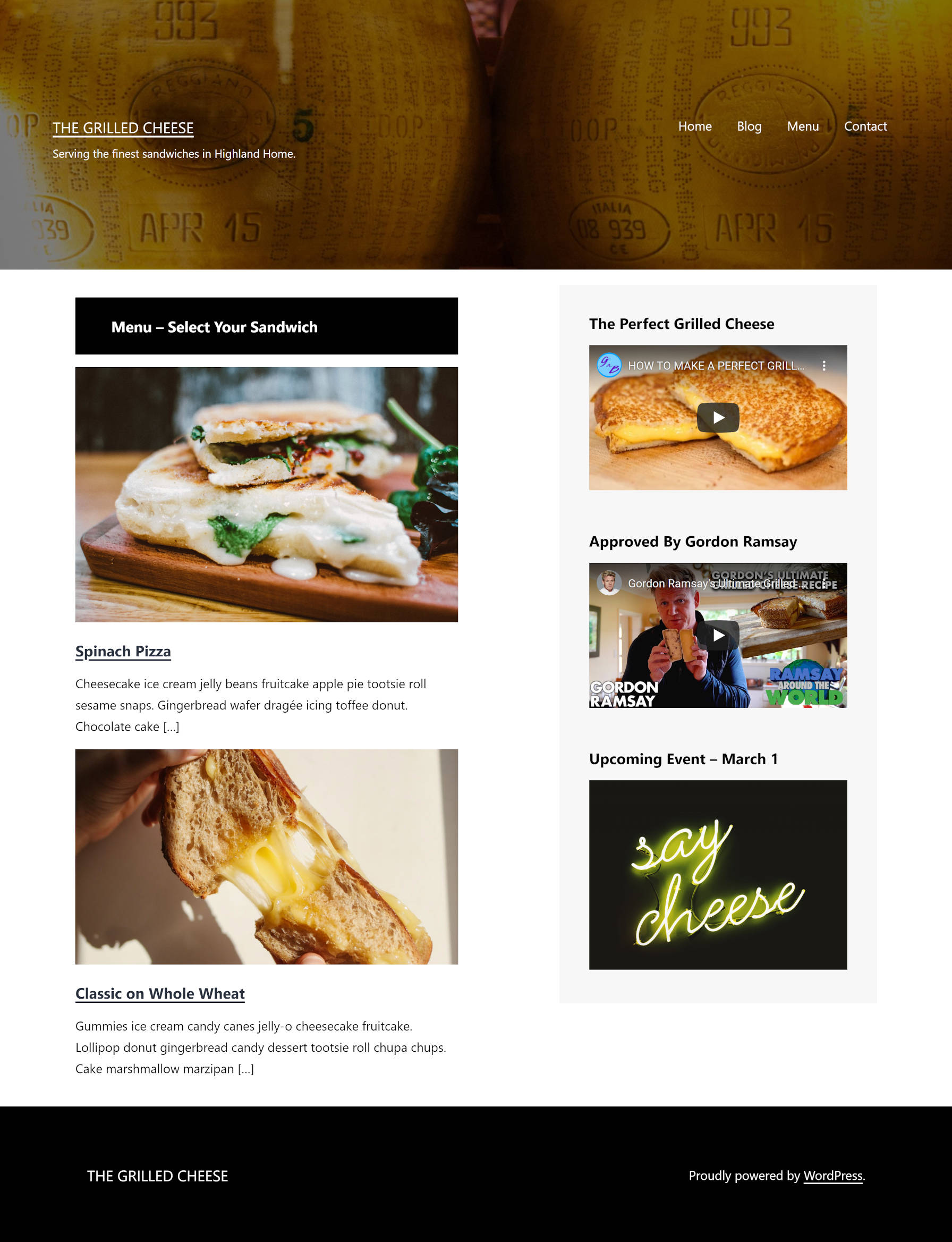
It is reasonably simple. All told, it took me around two hours of playing around with various concepts before arriving at this stage. To build something I would be happy with would have taken a few more hours.
Overall, I felt limited in laying out my ideal homepage. Each step was an uphill battle against the tools. I could have built this in less than half the time with HTML and CSS. I could do the same and more with other modern page builder plugins for WordPress.
Before diving into the results of my test, I have some brutal honesty. TT1 Blocks, which is the theme used for FSE Outreach testing, is not up to snuff. The theme does not reliably handle the multitude of possibilities the site editor sets in the hands of end-users. This entire experience could be made smoother with a better theme. However, the choices are limited, and I am not sure if there is a better block-based theme to work with at this point.
There were so many inconsistencies between the site editor and the front end that there is little point in listing them all. Spacing was grossly off. I generally see that as a theme issue. I spent much of my time in trial-and-error mode, making an adjustment in the editor and refreshing to see the front-end result. Rinse. Repeat.
Identifying Pain Points
While this post is critical of the site editor, it does not mean the experience was altogether poor. Seeing the improvement every week gives me hope that WordPress will have a site editor that rivals anything on the market. Eventually. However, my goal here is to provide real feedback that the team can use.
Outside of the general spacing issues mentioned earlier, I identified several stumbling blocks while building a custom homepage.
Maximum Widths
When designing a full-site page via the site editor, one problem stood out more than most. WordPress lacks a well-rounded “max-width” system. As a user, I was left with few choices in setting the width of the content area of my homepage. Currently, theme authors can set custom content, wide, and full widths. However, this system is horribly limiting. There is not much theme authors can do with this, and this problem directly limits what users can do in both the block and site editors.
I have previously written about the need for a design framework, one that is customizable by theme authors. Tailwind CSS has a max-width system that offers a boatload of flexibility. WordPress needs to start borrowing ideas from these modern design frameworks.
Add Block Icon
Getting the “Add Block” icon to appear when hovering in between elements in the default content area was rough. I had to position my mouse in a perfect position for it to appear. It was an exercise in frustration where even the slightest movement caused the icon to once again disappear.
Switching to Top Toolbar mode made this far easier. I am assuming the default block toolbar was hiding it to some degree. The problem with switching to this mode is that my toolbar-choice was not saved. Each time I returned to the site editor, I had to enable it once again.
Query Block
The most frustrating aspect of listing posts on a custom homepage was setting a limit. I wanted to set the number to three. However, the Query block has no option for doing this. Eventually, I created a faux limit using the category filter, choosing one that had just a couple of posts.
Update: It is possible to set a limit as noted by Nick in the comments. There is a “settings” icon in the toolbar for setting the number of posts per page, an offset, and max number of pages. I am unsure why these particular query settings are separate from the others in the sidebar. It makes more sense for them to be grouped together.

Another confusing aspect of the Query block is the keyword filter. As far as I am aware, WordPress has never used the “keyword” terminology. Outside of SEO plugins, there does not seem to be any context for what this filter does. I am guessing it works like a search keyword.
Global Styles for All Blocks
When switching over to the Global Styles panel, I noticed that some blocks were missing when applying styles on the block level. In particular, I wanted to adjust styles for the Latest Comments block.
I suppose that only blocks with typography, colors, and other design-related options appear in the list. This will likely confuse end-users when the site editor lands in WordPress. All blocks should have style options that users can customize.
No Full-Width Columns
For the content of my homepage, I attempted to create a full-width Columns block. However, the two individual columns were limited in size despite taking up 66.67% and 33.33%, respectively.
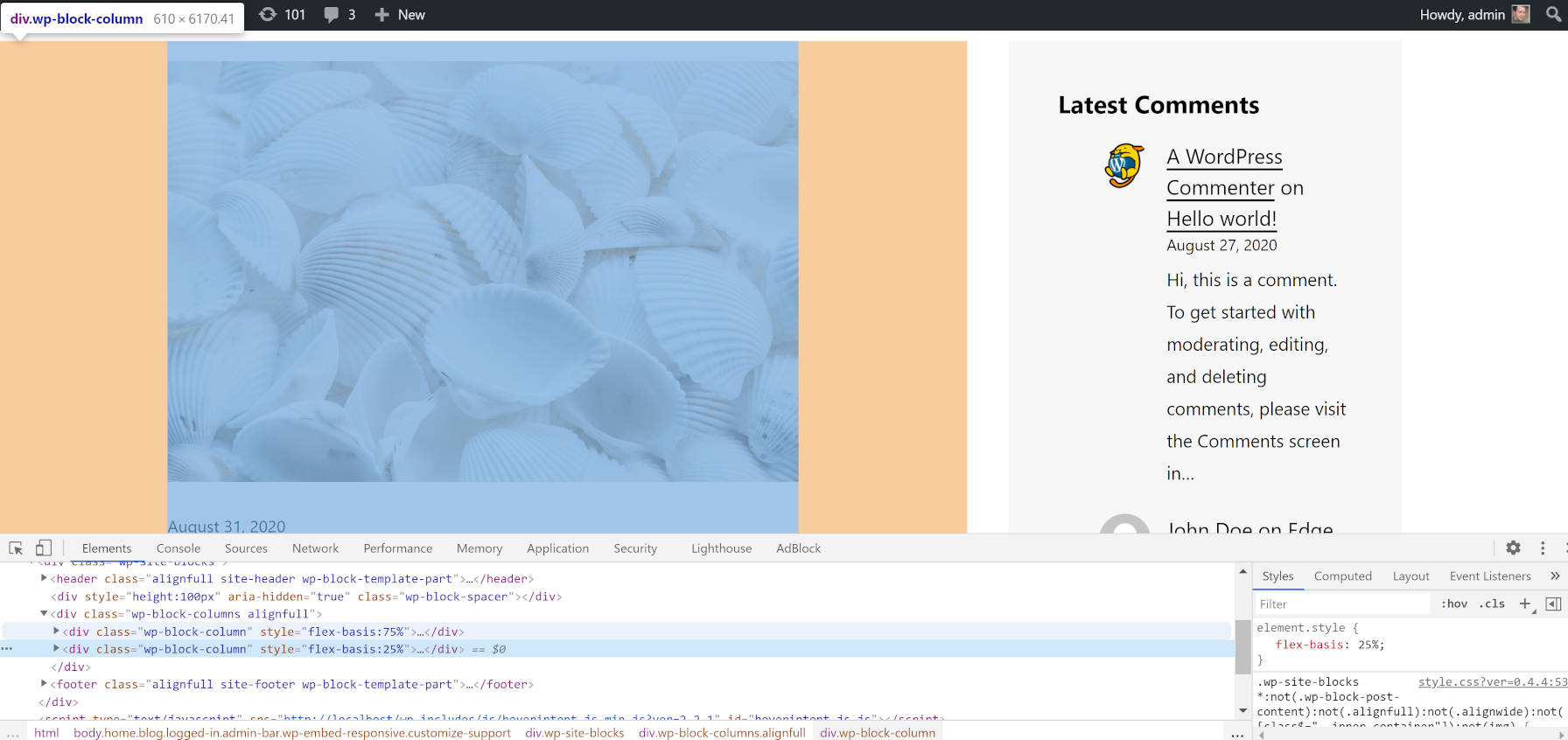
This seems like it is a theme issue. I would also argue that this is one of those times where having more direct control over the max-width would have helped. I really wanted something that was between the theme’s full and wide widths.
Featured Images
There is no way to set the size of the image output by the Post Featured Image block. The only way to get a uniform size at the moment is to pre-crop the images before uploading them to WordPress.
There is no reason this should not essentially be a variation of the Image block. The only thing featured images need that is different is the option to link to the post.


