Gutenberg 10.1 landed yesterday with several new features, many of which focused on improvements to the interface and user experience. Users can now control the justification of items in the Social Icons block. The new release also enhances the UX for creating reusable blocks, groups the Image block toolbar controls, and introduces categorized template parts in the site editor.
The development team corrected two dozen bugs for this release. As usual, they continued to polish the site-editing experience, which should land in WordPress later this year.
One of the better improvements to the UX is with the dragging performance for the focal point picker. Users can test the Cover or Media & Text blocks to see it in action.
Spacing Options for Social Icons and Buttons
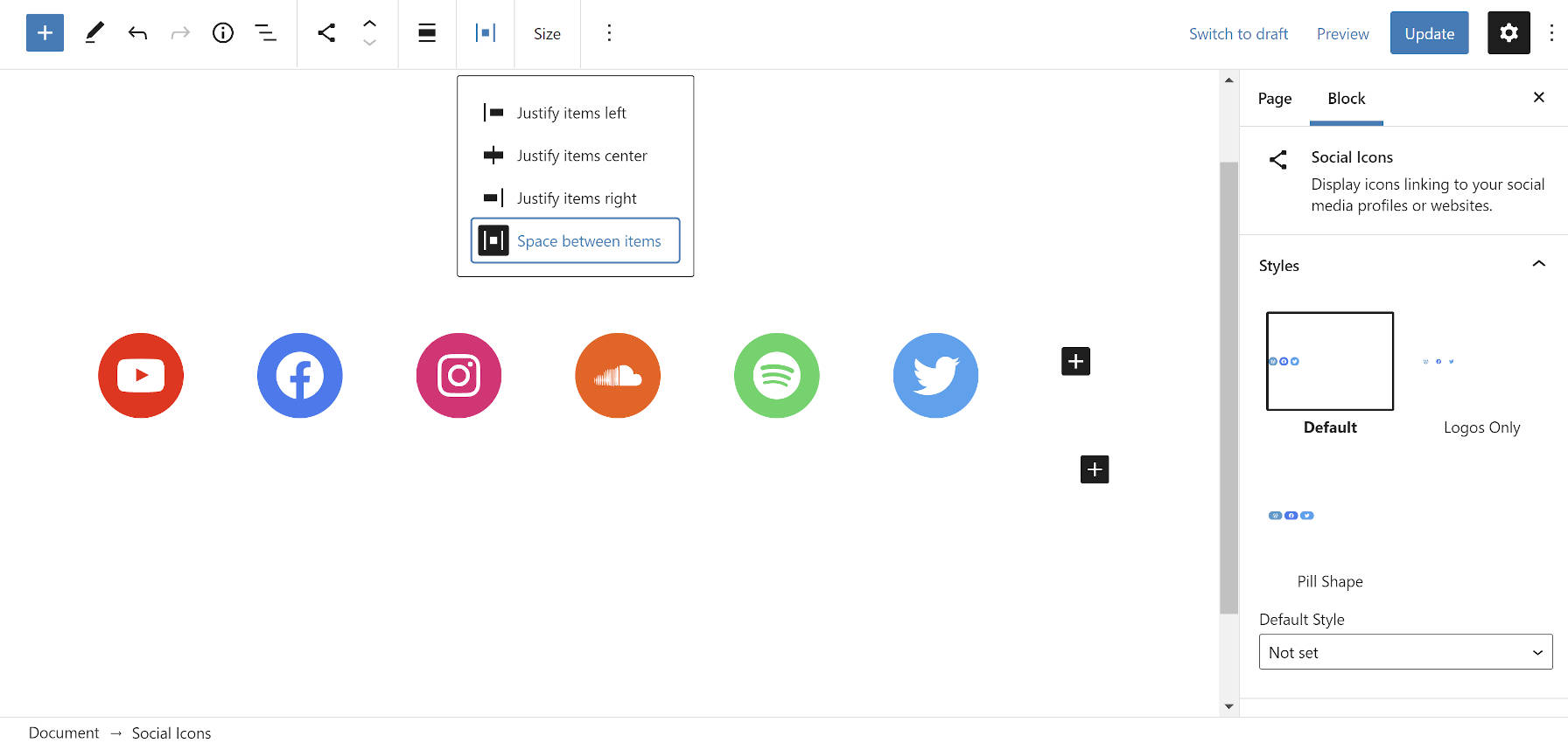
The Gutenberg development team added the justification toolbar control to the Social Icons block. This allows users to determine how they want their social links to display. The following are the current justification options:
- Justify items left
- Justify items center
- Justify items right
- Space between items
The Buttons block now has the space-between option, which gives it and Social Icons the same flexibility as the Navigation block.
The Social Icons block still has left, right, and center alignment options too. This is separate from the justification setting. In comparison, the Buttons and Navigation blocks only have wide and full alignments if the active theme supports them. However, the Social Icons block does not have those options. These blocks’ alignments should all have parity unless I am missing some crucial reason for the difference.
Reusable Blocks Updates

The development team continues to refine the reusable blocks feature. Version 10.1’s highlight is a new modal that pops up when first creating a reusable block. It has a simple title field along with buttons for canceling or saving. The cancel feature is also a new addition.
This modal clears up a problem introduced in Gutenberg 9.7. That release moved the title field for the reusable block into the sidebar panel. If users did not have that panel open, they could easily overlook it.
“Based on these changes, the UI for reusable blocks is most likely going to see some iterations in the upcoming weeks,” said Gutenberg developer Riad Benguella at the time. The team has delivered on this promise.
Gutenberg also uses this new modal as part of its template creation flow in the site editor.
The editor toolbar now displays a reusable block’s name when it is selected in the content canvas. This adds clarity and helps users better see what they are editing. Users can also update the name of a reusable block from within the editor sidebar.
One issue I still have with reusable blocks is when using wide or full-aligned elements. Once a block is saved, it displays at the regular content width, making it less of a WYSIWYG experience. There is an open ticket for this bug. However, it has seen little movement as of late.
Semantic Toolbar for Images
The Image block’s toolbar received an upgrade. Its controls are grouped, with each group separated by a border. The toolbar follows a specific order: meta, block-level, inline-level, and more options. The goal is for controls on every block to use this order, which translates to a standard UI that users can follow.
This improvement for the Image block brings enough clarity that I already want this across the board. There is an open ticket to normalize the toolbar for all blocks.
Categorized Template Parts

For the experimental site editor, a new patch to group template parts landed in the latest release. The UI change separates parts into four categories: headers, footers, sidebars, and general.
I could not get this feature to work. There are no clear instructions for theme authors to follow. Header templates named header-one.html went to the general category. Template parts in sub-folders, such as header/one.html, also failed. Even just plain header.html did not get grouped.
While there is obviously a bug, I am excited about the prospect of categorized template parts. It is a preemptive step toward decluttering the interface.
The problem with the current approach is that it is unnecessarily limiting. It assumes that headers, footers, and sidebars are the only specific categories of template parts needed. By defining them in core, we lose all flexibility. In past themes, I have built more content-related template parts than I have for those three groups. Under this system, all of these would be tossed into a “general” category with every other template.
This is not an argument for WordPress to have a category to meet my needs. Instead, put this into the hands of theme authors to make the best decision for their theme. Create a way for end-users to categorize their custom template parts as a next step.
Sure, create some defaults like headers, footers, and sidebars. That makes sense. Just hand over some of the control.


