With the advent of the WordPress Site Editor (aka Full-Site Editing) and block themes, the way WordPress users have to think about how to modify their websites and themes has changed dramatically.
These days, instead of style.css and functions.php, there is a new central file for block themes: theme.json. Plus, instead of CSS and PHP, you need to be familiar with a new type of markup to make changes to it. Its name is JSON.
While that might sound scary, the good news is that JSON is actually quite approachable. With a bit of technical understanding and tenacity, it’s not that hard to understand and to start making theme changes by yourself.
To help you get there more quickly, this post is an absolute beginner’s guide to JSON and how to use it in WordPress. In particular, we will cover what JSON exactly is, which function the theme.json file fulfills in WordPress block themes, and how to use it to modify your themes.
Take a deep breath and keep an open mind, it’s going to be fine, I promise.
What is JSON?

Let’s start off with elephant in the room. What exactly are we talking about when we say JSON?
You might have heard about it before, especially in connection with the WordPress JSON REST API. JSON, short for JavaScript Object Notation, is a lightweight data interchange format. That means, it’s a way to represent, store, and exchange data between different systems, applications, or platforms.
There are other such formats out there, such as XML or CSV. However, what’s special about JSON and the reason why it has become so popular in recent years is that it’s not only easy for machines to parse and generate but also for humans to read and write. More on that below.
Although it originated from JavaScript, JSON has become a language-independent format. Most programming languages now have built-in support or libraries for parsing and generating JSON data. That’s also one of the reasons why it is widely used in web applications and APIs for data transmission.
Basic JSON Syntax
As mentioned earlier, JSON is actually quite simple. It basically shows data in key-value pairs, meaning it gives you the name of something and displays what value it has, such as "color": "#ffffff". If you have ever worked with CSS, this type of format should look very familiar.
Aside from that, JSON markup has the following features:
- Keys are strings, meaning words, and the value can be a string, number, boolean (true or false), null, array (meaning, a list of values), or another JSON object.
- JSON objects are delimited by curly braces (“{}”) while arrays use square brackets (“[]”).
- Keys and string values are enclosed in double quotes.
- The data format is strict, and any deviation from the standard syntax will result in a parsing error.
Already feeling lost? Let’s go over an example to make things clearer:
{ "version": 2, "settings": { "color": { "palette": [ { "color": "#ffffff", "name": "Base", "slug": "base" }, { "color": "#000000", "name": "Contrast", "slug": "contrast" }, ], }, "styles": { "color": { "background": "var(--wp--preset--color--base)", "text": "var(--wp--preset--color--contrast)" }, } }The above first defines a version of a file. It is divided into a settings and styles section, both of which define certain colors. In the settings part, the colors are assigned to a subcategory palette and displayed as an array containing several colors as well as values called name and slug.
The styles segment defines two colors, one for background, one for text. Both are only specified as variables. You can see that all the formatting mentioned above applies and how it’s easy to understand which keys and values belong together.
Is that at all understandable? Because it it is, the good news is that the example above is taken directly from WordPress. So, if you feel like that wasn’t impossible to understand, you are ready to start using JSON to modify WordPress block themes.
What is the WordPress theme.json File?
Ever since the introduction of Full-Site Editing/the Site Editor and block themes, there is a technology shift going on in the WordPress platform. Instead of CSS and PHP, it is increasingly relying on JavaScript and JSON to get things done.
The best example for that is theme.json. It’s a configuration file for block themes that helps to manage global styles and settings. It allows theme developers to define default styling, options, and configurations for the entire site and single blocks across the theme.

That way, theme.json can change both how the theme looks and what options are available for users to make their own changes. This gives you a single, central way to build and modify block themes, especially since anything you configure here applies to both the front end of your site and the WordPress editor in the back. What’s more WordPress will read the markup in the file and create the necessary CSS styling for you.
Before, the editor and website front end used different style sheets that you had to maintain separately. In addition, theme developers offered settings in different ways, even when using the WordPress Customizer.
Now, with the new, unified approach, users will have a more congruent experience.
Of course, as the file ending suggests, theme.json is written in JSON. As a consequence, if you want to learn to work with it and block themes, you need to be familiar with the markup that it is written in. That’s what we’ll do in the rest of this post.
How theme.json Is Structured
theme.json file has three main parts: settings, styles and custom templates/template parts. Here’s what you can control in each section:
- Settings — Contains global styles, meaning available color palettes, font families and sizes as well as other text options, theme widths, spacing, and borders. Basically, the fundamental controls to change your theme’s look. It can also do the same for individual blocks and you have the ability to set custom CSS variables.
- Styles — Here, you define the default styling of the theme, meaning the default values it should use for many of the options mentioned above. For example, you can set the theme background color and font families it will use for headings and body text. Again, the same is possible for single blocks. This is basically what
style.cssused to do. - Custom Templates and Template Parts — Where you define the page templates and template parts that will be available in your theme and point the theme to the accompanying HTML files.
Using JSON to Customize WordPress Block Themes
To give you a better understanding how this is relevant to modifying WordPress block themes, let’s go over a number of practical examples.
Loading Local Custom Fonts to Change Theme Typography
The first thing we are doing is load some font files placed on the server to introduce a different kind of typography to your theme. We have a detailed article on that topic, in case you want to see more details, so here is a slightly shorter version.
The options for that are located in theme.json under settings > typography and then under fontFamilies.
{ "version": 2, "settings": { "typography": { "fontFamilies": { } } } }In block themes, you add new fonts using these values:
fontFamily— This is the name of the new font as it will appear in the CSS markup. It can include fallback fonts.name— The font name that will appear in the WordPress editor.slug— A unique identifier that WordPress uses to create the custom CSS property.fontFace— This corresponds to the CSS@font-facerule. It is the part that really enqueues the font.
In order to work, fontFace needs to include several other pieces of information:
fontFamily— The name of the font once more.fontWeight— A list of available font weights separated by spaces.fontStyle(optional) — You can set thefont-styleattribute here, e.g.normaloritalic.fontStretch(optional) — For example, for font families that have a condensed version.src— Path to the local font file.
Here’s an example of what that looks like:
{ "version": 2, "settings": { "typography": { "fontFamilies": [ { "fontFamily": "Advent Pro", "slug": "advent-pro", "fontFace": [ { "fontFamily": "Advent Pro", "fontStyle": "normal", "fontWeight": "400", "src": [ "file:./fonts/advent-pro-v20-latin-regular.woff" ] }, { "fontFamily": "Advent Pro", "fontStyle": "italic", "fontWeight": "400", "src": [ "file:./fonts/advent-pro-v20-latin-italic.woff" ] } ] } ] } } }Note that you can include several font files in fontFace, e.g. to load different styles. As mentioned earlier, you need to separate them with curly braces and a comma to do so.
For a way to add local Google fonts to your theme without manually changing the markup, you can also use the Create Block Theme plugin.

Modifying Hover and Focus Styles
Next, we want to deal with how to modify hover and focus styles for elements like links and buttons in WordPress block themes. Note that this is not yet in WordPress Core at the time of this writing. If you want to take advantage of it, you need to install the Gutenberg plugin so that you can use the latest improvements and features.
To make changes to hover and focus styles, can use the pseudo elements :hover, :focus, :active, and, for the outline property, :visited. The settings for this are located in themes.json under styles > elements > link or, alternatively, button.
{ "version": 2, "styles": { "elements": { "button": { }, "link": { } } } }Here’s how to define styling for your links:
"styles": { "elements": { "link": { ":hover": { "typography": { "textDecoration": "none" } }, ":focus": { "outline": { "width": "2px", "color": "#111", "style": "solid" } }, ":active": { "color": { "text": "var(--wp--preset--color--secondary)" }, "typography": { "textDecoration": "none" } } } } } The above markup does the following:
- It states that links should not be underlined when someone hovers over time with their mouse cursor.
- In the
focusstate, it adds an outline that is two pixels wide, solid, and has the color code#111111. - When active, the link text takes on a color defined by a CSS variable and, again, is to set to have no
text-decorationvalue.
Modifying Block Theme Colors
In this example, we want to introduce a custom color palette and also disable the option for users to make their own color options. You would do this, for example, to make sure that everyone on your website can only use approved brand colors and not introduce something else to your website design. We will also go over how to add colors to specific blocks or elements so that you can predetermine what they look like.
Understanding Standard WordPress Color Settings

To do this, you first need to know what color palettes are available in Gutenberg by default. These are:
- WordPress default color palette — This is always available. It provides colors that will prevail even at a theme switch. That’s why they are used for block patterns.
- Theme color palette — Ships with the theme and is custom to which theme you are using.
- User color palette — Colors added by the user via the available color picker. You can define them in the global styles under Colors > Palette.
One or several of these always appear when accessing the color options for any of the blocks or global styles.
Eliminating Color Options
Let’s first hide the default color palette and gradients. You can do this under settings and color like so:
{ "version": 2, "settings": { "color": { "defaultPalette": false, "defaultGradients": false } } }Like many other options, it’s also possible to do this for single blocks. For example, here it is for the heading block:
{ "version": 2, "settings": { "blocks": { "core/heading": { "color": { "defaultPalette": false } } } } }In addition, you can disable the custom color picker, so that website users won’t try to create and use their own colors.
{ "version": 2, "settings": { "color": { "custom": false, "customGradient": false, "defaultPalette": false, "defaultGradients": false } } }If you input the above markup, all the usual color options will not be available, except for the theme colors.

Adding a Custom Color Palette
Next, we want to add our own color palette. We do this in the same place in theme.json by adding a palette key and then adding an array with the slug, color, and name for each of the colors you want to include.
{ "version": 2, "settings": { "color": { "palette": [ { "color": "#1B1031", "name": "Base", "slug": "base" }, { "color": "#FFFFFF", "name": "Contrast", "slug": "contrast" }, { "color": "#FF746D", "name": "Primary", "slug": "primary" }, { "color": "#551C5E", "name": "Secondary", "slug": "secondary" }, { "color": "#FB326B", "name": "Tertiary", "slug": "tertiary" } ] } } } With this present in theme.json, you will find your own color options in the back end (and, in this case, also applied to your site).

You can also do the same for gradients and duotones. In almost all cases you can use pretty much any CSS color declaration. Hex, RGB/A, color names, whatever you want, even CSS variables. Only duotones strictly take Hex and RGB color values.
In addition, it’s possible to do the same for single blocks (be sure the names and slugs are different than in your sitewide settings):
{ "version": 2, "settings": { "color": { "blocks": { "core/paragraph": { "color": { "palette": [ { "color": "#1B1031", "name": "Block base", "slug": "block-base" }, { "color": "#FFFFFF", "name": "Block contrast", "slug": "block-contrast" }, { "color": "#FF746D", "name": "Block primary", "slug": "block-primary" } ] } } } } } }Setting Default Colors
Finally, let’s cover how to set default colors for blocks and page elements. Here’s how to change the background and text color of the quote block:
{ "version": 2, "styles": { "blocks": { "core/quote": { "color": { "background": "#222", "text": "#fff" } } } } }As you can see, setting default colors happens under the styles section. Here, we are targeting the core/quote block under blocks and defining a background and text color. Here is what it ends up looking like on the page:

By the way, if you want to find out what other settings you can tinker with in theme.json, refer to the developer handbook.
Introducing Additional Theme Styles
One of the best features of the Site Editor is that it offers style variations. These allow WordPress users to completely modify the look of their themes (colors, fonts, block styles) with the click of a single button.
Twenty Twenty-Three comes with a whole bunch of them.
How can you implement this in a theme? Simple, by including additional theme.json files.

A few notes:
- For WordPress to pick up the additional files, you need to place them inside a directory called
stylesinside your theme folder. - The extra files get loaded in addition to the main file and override the included styles. That means, you only have to include markup for what you actually want to change. This is similar to child themes.
- You can name the new files whatever you want, as long as they end in
.json. The Site Editor will automatically use the file name (without extension) as the display name in the back end. However, you can also include a custom name by adding"title": "[your preferred name]"at the top of the file.
For example, here is the (shortened) content of one of the style variations that Twenty Twenty-Three ships with:
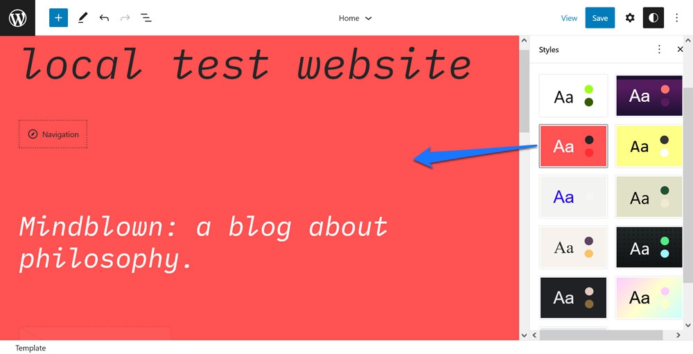
{ "$schema": "https://schemas.wp.org/trunk/theme.json", "version": 2, "title": "Canary", "settings": { "color": { "duotone": [ { ... } ], "palette": [ ... ] }, "layout": { "wideSize": "650px" }, "typography": { "fontSizes": [ ... ] } }, "styles": { "blocks": { ... }, "elements": { "button": { ... }, "h1": { "typography": { "fontSize": "var(--wp--preset--font-size--small)" } }, "h2": { "typography": { "fontSize": "var(--wp--preset--font-size--small)" } }, "h3": { "typography": { "fontSize": "var(--wp--preset--font-size--small)" } }, "h4": { "typography": { "fontSize": "var(--wp--preset--font-size--small)" } }, "heading": { "typography": { "fontWeight": "700" } }, "link": { "typography": { "textDecoration": "none" } } }, "typography": { "fontFamily": "var(--wp--preset--font-family--ibm-plex-mono)", "fontSize": "var(--wp--preset--font-size--small)" } } }This is the theme.json for the “Canary” theme style. As you can see, it introduces new duotone and color palettes, adjusts the layout width, and adjusts font sizes. It also adjusts the styling for several blocks and elements like buttons, headings, and links. At the end, it also changes the general theme font size.
All of this is enough to adjust the theme appearance quite dramatically:

At the same time, the theme variation file does all of this in about 250 lines of markup, while the original theme.json of Twenty Twenty-Three is over 700 lines long.
By the way, another option to create theme variations is to use the aforementioned Create Block Theme plugin. It has the possibility to export your current modified design as a variation to use on other websites.

Changing the Styling of Individual Blocks
We have already shown above how you can make changes to singular blocks. Just to formally mention it here more generally, you can modify singular blocks in settings and styles, each under blocks.
{ "version": 2, "styles": { "blocks": { "core/paragraph": { "typography": { "letterSpacing": "-0.019rem" "textTransform": "uppercase" } } } } } Here is what the markup above looks like in action:

It’s possible to target blocks via core/blockname, e.g. core/paragraph for the paragraph block. You can find the names of all of the core blocks here.
Adding Template Parts and Templates
The final thing we want to talk about in terms of modifying block themes via theme.json is the ability to add templates and template parts. You find those as options in the Site Editor when clicking on the WordPress logo in the upper left corner.

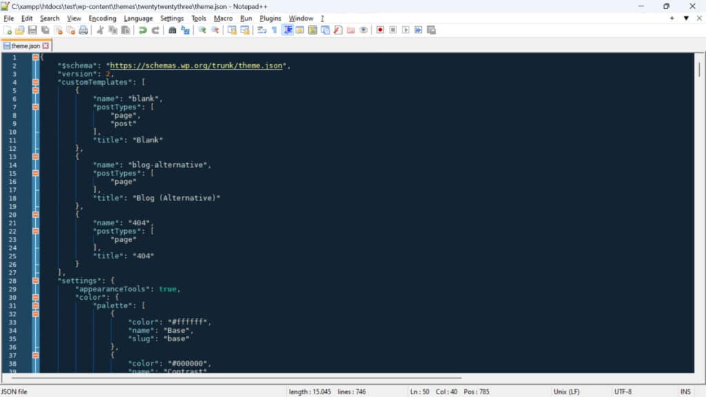
Naturally, in order to show up in the theme, you need to register them somewhere, which is another thing that happens inside theme.json. The exact location is under templateParts and customTemplates. These are placed at the base level of the file, meaning the same as version.
{ "version": 2, "customTemplates": [ { "name": "blog-alternative", "postTypes": [ "page" ], "title": "Blog (Alternative)" }, { "name": "404", "postTypes": [ "page" ], "title": "404" } ], "templateParts": [ { "area": "header", "name": "header", "title": "Header" }, { "area": "footer", "name": "footer", "title": "Footer" }, { "area": "uncategorized", "name": "comments", "title": "Comments" } ] } Each entry under templateParts takes three keys:
name— This is the name/slug of the file for this template part, e.g. if you input “small-header”, your file would have to be namedsmall-header.html.area— This matters so that the Site Editor knows where to assign each part.templatePartsknow three areas:header,footer, anduncategorized. If you don’t specify either of the first two, the template part will default to the latter.title— This is the name of the template part visible in the editor, make sure it is descriptive.
Objects under customTemplates also take three attributes:
name— Same as fortemplateParts. Needs to correspond to the name of the associated HTML file.title— Also same as above, appears in the editor.postTypes— An array of post types this custom template supports such aspostorpage.
Custom templates and template part files need to be placed inside the templates and parts folders in the theme directory respectively. You need to build them out of block markup, which you can also do by creating them in the visual editor and exporting them. More information on that here.
WordPress theme.json Generators

If you want to create your own theme.json, below are some helpful tools to make the process quicker. They allow you to simply pick settings and styles from a visual user interface and then download or copy the corresponding theme.json file to your theme.
Resources
For additional information on JSON and how to use it in WordPress block themes, check out these resources:
Ready to Modify WordPress Block Themes With JSON?
Modifying block themes is very different than working with classic themes. Instead of functions.php and style.css, a lot of the work happens in theme.json and HTML files.
This can be a bit intimidating at first, especially if you are not familiar with JSON. However, as you have probably seen above, the markup is quite simple to understand and get used to. It also offers a powerful way to make sweeping changes to the look and behavior of your theme.
Hopefully, with the examples above, you feel capable of implementing some of them yourself.
Have you modified your WordPress theme via JSON markup before? Please feel free to share your experience in the comments!


