
Studying examples of hyperlink design is more significant than you would think. Links are what turn the Internet into “the web” and connect otherwise unrelated pages and websites to each other. They also lead visitors around your site, allow them to discover more of it, and dive deeper into the topics they are interested in. Plus, as backlinks, hyperlinks are desired as an SEO signal.
In short, without links, websites and the Internet wouldn’t be what they are.
We have already talked about how to style links using CSS in a past article. However, just because you know how to apply it, that doesn’t mean you know what styling to give your links. For that reason, that’s what we want to cover in this post.
Below, we will go over examples of how different websites make sure their links are noticeable and good-looking. We will also examine the underlying markup and discuss how they achieved the design for their hyperlinks. Hopefully, together it will give you a good understanding and ideas for the links on your own website.
Why Think About Your Link Design at All?

Let’s first talk about why you should invest in the design of your site’s hyperlinks to begin with. Unless you are in the web design business, you are probably so familiar with using them, that you never really consciously thought the way they look before.
Yet, if you pay attention, you quickly notice that links appear very different from website to website. They use various colors, some are underlined, some not, yet, you still instinctively know that a piece of text is a clickable link. At least, in the best case scenario.
In the worst case, the link design is so bad that you are having a hard time identifying them and that is a problem.
Why?
Because, first of all, few people actually read your entire pages and articles, most of them scan. That means they jump from one anchor point to another to find only the parts of your content that interest and are relevant to them.
Along with headings or images, links are one of those anchors. If you don’t make them stand out and identifiable, it makes your content harder to understand for a large part of your readership. And that’s never a good idea if you want them to stick around.
Of course, you also need to think about link anchor text, which lets them know where the link will take them but that’s a topic for a whole other article.
Aside from that, your links are part of your web design, so you need to make sure they are consistent with the rest of your site.
How to Target Links
As already mentioned in the introduction, we have an entire article on how to style links via CSS that I highly recommended you check out. However, because some of the principles in it are important to understand the examples below, here are the cliff notes.
The first thing that is important to know is that, in HTML, links are created with the a or anchor tag.
TorqueMagAs consequence, that’s also how to target their styling in CSS:
a { color: #3af278; }Secondly, besides simply a, links go through several states when used.

You can style them separately using pseudo classes:
a:visited– A link that the user has visited before, meaning it exists in their browser’s history.a:focus– A focused link, for example, is one that a visitor has navigated to using the tab key.a:hover– The styling that is visible when users hover their mouse cursor over a link.hoverandfocusare often styled together.a:active– Briefly visible styling during the moment of a link click.
Hyperlink Design Examples to Inspire Your Own Choices
After this quick discourse, let’s have a look at the different ways you can design hyperlinks on your website.
Smashing Magazine
We are starting off with Smashing Magazine. As a well-known web design magazine, you would think their link-design game is on point. For that reason, it’s suprising to see that they pretty much went with the standard option, at least for their in-content links. They are blue, underlined, and they don’t even change when hovered over.
On the one hand, this is really good as it makes sure anyone can recognize them as links. On the other, it’s a bit disappointing because the rest of the website has a lot of microinteractions, but the links don’t.
But fear not, when set to focus, a little playfulness and branding does come through with a dotted line around the link in Smashing Magazine red.

How They Did It
If you want to use a similar outline effect as Smashing Magazine, here’s the CSS markup:
:focus { outline: 3px dotted var(--THEME_COLOR_HOVER,#d33a2c) !important; outline-offset: 2px; }It’s nothing too crazy. A simple dotted outline with a defined width, color (using CSS custom properties), and an offset to make it wider.
TorqueMag
Next up is how we handle link design here on TorqueMag. If you examine any of the links on this or other pages, you will find out the following:
- Hyperlinks are blue and underlined in a colorful way
- Hovering turns them black and also changes the color of the underscore
- When focused or active, a link gets surrounded by a box with a drop shadow

CSS Markup
How is all of this technically achieved? Let’s start with the obvious star of the show, the gradient used for underlining the links, both in their normal state and at hover and active. Below is the code that creates it.
a { color: #5568aa; text-decoration: none; font-weight: 700; background-image: linear-gradient(45deg,#ffc08c,#aa278c 30%,#0ecad4); background-position: 0 100%; background-repeat: repeat-x; background-size: 100% 2px; transition: background-size .3s; } a:focus, a:hover { color: #252d4a; background-size: 400% 2px; -webkit-animation: underline-gradient 4s linear infinite; animation: underline-gradient 4s linear infinite; text-decoration: none; }Here’s the breakdown: First of all, the CSS markup eliminates the usual underline (see text-decoration: none;) and then creates a background image with a gradient that uses three colors. This background image is then positioned fully at the bottom and set to repeat. Finally, it receives a size, which is 100% horizontally and 2px vertically.
There is also a transition property that’s needed for the hover effect, which, suprsingly, is achieved by increasing the size of the background image. That way, the colors stretch out, which, together with transition, give it a sense of motion. The latter is amplified by the fact that the hover effect also uses an animation that causes the colors to keep moving while the cursor is on the link.
Lots of stuff going on for a simple link, isn’t there?
In contrast to that, the focus design is quite simple with just an outline and a drop shadow to the outside:
:focus { box-shadow: 0 0 6px #75a1f2; outline: 1px solid #75a1f2; }WPKube
I have to admit, I really like this next hyperlink design example. While it’s quite simple, in my opinion, it’s also very tastefully done.
The initial design looks simple enough: links are colored in red with a grey line underneath.

When you hover over it, the grey line takes on the same shade of red, with just the slightest delay between the two states.

The Underlying Code
Naturally, the markup for this kind of look is not very complicated:
a { border-bottom: 1px solid #ddd; } a:hover { border-bottom: 1px solid #f05928; text-decoration: none; }The interesting thing is that they achieve it with the border property. This used to be a thing because it gave you more control over how to style the line. However, today have new CSS features that can target text-decoration properties directly, like text-decoration-offset or text-decoration-thickness, so hacking it via border is no longer necessary.
Notice that the transition effect is part of a catch-all declaration for many site elements, including buttons, etc. It is small but makes a difference.
Focused links on WPKube simply have a dotted line around them.

We have already seen this in another example, so there is no need to go into how to achieve this in CSS again.
Nerd Fitness
Next is one of my favorite fitness websites. They also do a good job making their links stand out by coloring them in the brand’s red.

However, I specifically chose this hyperlink design example because it has a subtle effect for the hover state. The link color becomes slightly desaturated to give users feedback.

Here’s How to Do It
This is a simple effect, so it also doesn’t need a lot of markup to achieve. You simply have a color for the anchor tag and another for a:hover while there is a sitewide transition property to make the change less abrupt.
* { transition: all ease-in-out .25s; transition-property: all; transition-property: background,color,border,opacity; } a { color: #c73737; text-decoration: none; } a:hover { color: #d35e5e; }Apple
I included this example to show you that even the biggest companies with basically infinite design budget can go with a very basic approach. On the Apple homepage, links simply appear in blue and become underlined when hovered over (properly, via text-decoration). The outline for the focus state is simply slightly thicker than usual.

The Markup
Here is the code if you want to do a similar thing:
a { color: #2997ff; } a:hover { text-decoration: underline; } :focus { outline: 4px solid rgba(0,125,250,0.6); outline-offset: 1px; }Men’s Health
This magazine website brings a new idea to the table. At first, it seems business as usual: links on the page simply have an underline. The only thing that is noteworthy is that the line is slightly thicker than usual.
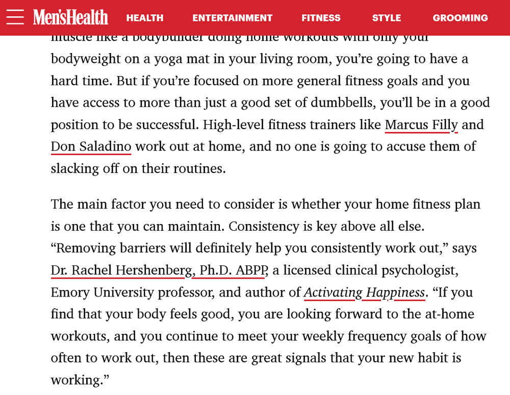
However, they have a trick up their sleeve for when you hover over the hyperlinks. To signal that, Men’s Health have chosen to use a background color as an indicator. The links turn yellow with just the tiniest of delays. A first among our hyperlink design examples.

CSS Code
The underlying markup for this is also noteworthy for another reason. To achieve the initial line for their links, the site uses the aforementioned and relatively new properties for controlling text-decoration.
a { text-decoration: underline; text-decoration-thickness: 0.125rem; text-decoration-color: #d2232e; text-underline-offset: 0.25rem; -webkit-transition: all 0.3s ease-in-out; transition: all 0.3s ease-in-out; }As you can see, both text-decoration-thickness, text-decoration-color, and text-underline-offset play a role in making the design look the way it does.
As for the hover effect, one thing that stands out is that it simply uses yellow as its color denomination.
a:hover { background-color: yellow; -webkit-transition: all 0.3s ease-in-out; transition: all 0.3s ease-in-out; }Outside of examples and test websites, this is a very rare way of declaring colors in CSS and it’s funny to see it out in the wild. Aside from that, you naturally find the transition property to make the appearance and disappearance of the hover background less abrupt.
National Geographic
National Geographic is going for a similar effect as Men’s Health, however, they achieve it very differently. Here, too, the hyperlink design is initially simple with thicker underlines. However, on hover, they go on to cover the entire linked word or phrase.

The interesting thing here is that the background appears to grow from the bottom up, so let’s look at how they did it.
How is This Possible?
First of all, here is the markup for the links in their normal state:
a { background-image: linear-gradient(120deg,#fc0,#fc0); background-position: 0 100%; background-repeat: no-repeat; background-size: 100% 0; border: none; border-bottom: 2px solid #fc0; text-decoration: none; -webkit-transition: background-size .125s ease-in; -o-transition: background-size .125s ease-in; transition: background-size .125s ease-in; }As you can see, like in other hyperlink design examples, they achieve it with a simple border-bottom declaration. However, at the same time there is a background image positioned all the way to the bottom but with zero vertical size.
That is actually how they get the impression of growth, as on hover, it goes to 100% vertical size while the ease-in transition takes care of the fact that it appears gradually from the bottom.
a:hover { background-size: 100% 100%; border-color: #fc0; color: #000; }Twenty Twenty-Two
For the last examples, let’s look at how two WordPress default themes handle hyperlink design. The first one is Twenty Twenty-Two. There is nothing too spectacular going on, the usually solidly underlined links have a dashed line underneath on hover.
However, we haven’t seen this kind of manipulation yet, so I thought it would be a good thing to cover.
This is How it Works
The theme handles this in the way you would expect. The anchor tags have text-decoration: underline assigned to them and also values for their thickness and offset. Upon hover, it turns to text-decoration-style: dashed. That’s it.
a { text-decoration-thickness: 1px; text-underline-offset: 0.25ch; } a:hover, a:focus { text-decoration-style: dashed; }Twenty Twenty-One
Our final example is Twenty Twenty-One. It has a similar hover effect as its predecessor, however, instead of a dashed line, it uses a dotted one.

But that’s not reason why I’m mentioning it here. Instead, the interesting part is its focus effect. Instead of the usual outline, the designers decided to use a contrasting background color to make it stand out.

The Accompanying CSS
How they achieved it is also interesting. As you can see from the markup below, the background color is basically white, however, it has its opacity set to 90%.
a:focus { outline: 2px solid transparent; text-decoration: underline 1px dotted currentColor; text-decoration-skip-ink: none; background: rgba(255, 255, 255, 0.9); }That way, you get this more subtle look that provides a clear contrast but is not too harsh.
Use These Examples for Your Own Hyperlink Design
Without links, what we call the Internet or World Wide Web would not be what it is. For that reason, hyperlinks deserve as much attention in your web design as other elements. After looking at the hyperlink design examples above, let’s summarize what we can take away from them:
- Mark your links clearly so that they are easy to recognize, the most common tools for that are colors, underscores, or both.
- Use hover effects to make sure that users can see their interaction with your links. There is a wide range of possibilities for that.
- Don’t neglect the
focusstate! Make it easy for users with different abilities to navigate your pages.
That’s it. Now you have a good basis to make design decisions about your own hyperlinks.
Which of the hyperlink design examples above do you like or dislike the most and why? What other design possibilities for links do you enjoy? Tell us in the comments below!


