Automattic-sponsored designer James Koster has a vision for taking WordPress’ Site Editor from its beta awkwardness and transforming it to become a more visual and user-friendly design tool. In a recent post titled Revising the presentation of key Site Editor features, Koster identifies unbalanced feature weighting as a critical design flaw that is negatively impacting users’ experience with the editor:
The Site Editor is a powerful tool, but the user experience lacks some coherence and a sense of hierarchy.
Template management and editing has central focus, despite the fact that it’s a product area that has proven difficult for some users to interpret.
Impactful features like style and menu management are hierarchically relegated, and consequently deliver a sub-optimal UX.
This week I’ve been ideating on how we might present site editor features with more appropriate weighting, so that the overall experience feels more like a design tool.
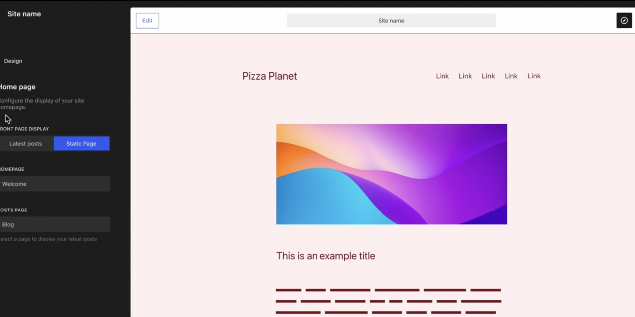
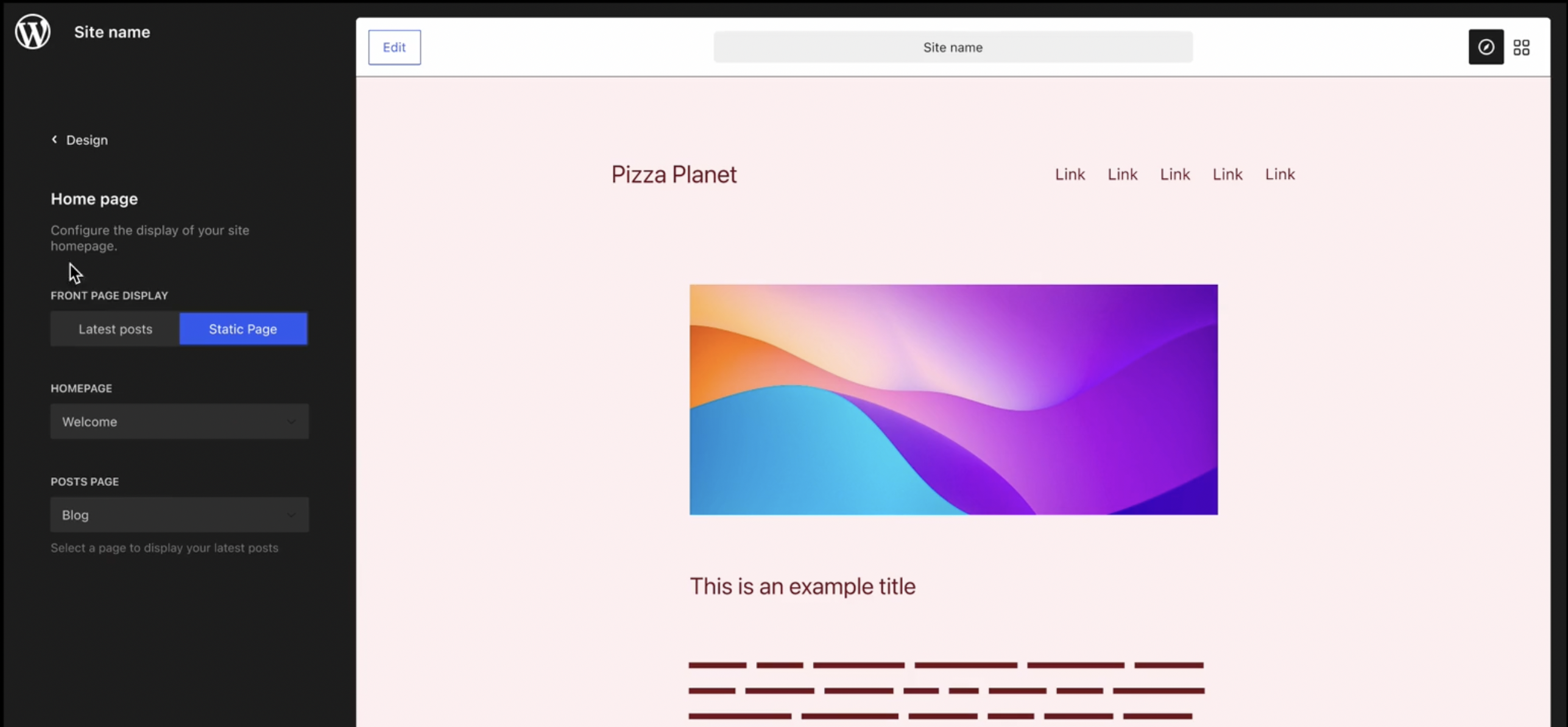
Instead of dropping users directly into editing the homepage, Koster contends that the Site Editor’s design should be updated to become a “navigable frame” where users can select from a menu of features and styles on the left. This is a radical improvement over the current experience, which feels like walking into a room with all the lights on and multiple features competing for attention.
“The combination of the site frame (Browse mode) and one-click editing helps to obfuscate some of the aforementioned confusion around template editing,” Koster said. “Now you simply browse to the page you want to update, and click ‘Edit’.”
Another idea Koster explored is a view that makes it easier to understand the interaction of styles and templates. The UI is much cleaner and drastically reduces the cognitive load for users who are struggling to grasp the concept of templates in the first place.
Identity and homepage configuration options haven’t found a place in the site editor yet. Koster proposed bringing them into the editor in a similar fashion to how it was previously presented in the Customizer, with live previews.
Koster also proposes organizing features like templates, template parts, reusable blocks, and patterns in a “Design Library” section, presented via a grid of thumbnails that would open the edit view. This would bring a new level of organization to a set of tools that are currently scattered throughout the site editor interface.
These are just a few highlights from his explorations. Although Koster articulates many of the Site Editor’s current pain points, his designs present an elegant solution for each. Check out the full post to see all the videos and other ideas for organizing features in the site editor.
The disparity between the current experience and Koster’s mockups is like a night and day Cinderella style transformation. It’s a powerful example of how thoughtful design can really solve problems. His explorations received positive feedback from those eager to see these designs implemented in Gutenberg. Koster said his next step is to prepare some simpler prototypes for collaboration on GitHub.
“The ideas are still formative, but with some pruning we can get things into a shippable state,” Koster said. “My next step is to refine and prototype a more stripped-back version, and take that to GitHub for wider thoughts and feedback.”


