
The Full Site Editing (FSE) Outreach program has launched its third testing call, continuing the effort to engage users in a structured testing flow focused on specific practical tasks. Previous rounds had testers building a custom homepage and exploring the distinction between editing modes (template vs page/post).
The challenge in round #3 is to create a fun, custom 404 page. This page is often an opportunity for brands and individuals to inject a little humor and creativity into their websites, transforming a potentially negative experience into a path back to working links. In the past, site owners not comfortable with code had to rely on plugins in order to design their 404 pages. The new FSE capabilities will open a whole new world of customization.
Testers who want to jump in on this challenge will need to set up a testing environment that uses WordPress 5.7, the TT1 Blocks Theme, and Gutenberg 10.1.1 (latest version). Nothing special is required so it’s easy to jump in and start testing right away.
Anne McCarthy, who is spearheading the FSE Outreach program, has published a detailed testing flow that provides a guided exploration of the 404 template and simple tasks like adding navigation and other blocks.
This challenge seemed like a good place to dip my toe into FSE testing and check out the progress the team has made in the past few months. Here is what I set out to do: add a funny gif, a search form, and a button to get back home.
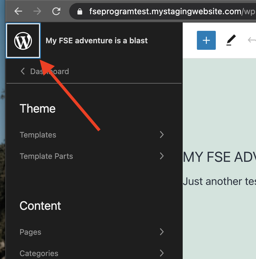
One of the first steps is to open the Navigation Toggle and head to Templates > 404. The “Navigation Toggle” refers to the WordPress icon in the top left corner of the page, but as a new user I would expect that to take me back to the dashboard. The naming doesn’t seem clear and I had to look up what was meant by Navigation Toggle.
Following the instructions, I selected the Header template part and removed it from the 404 page, but I don’t think it’s obvious to users that it’s possible to delete the entire template part in one go. Without the instructions, I probably would have started deleting all the blocks within the header template part before trying to figure out how to remove the entire thing.

The testing flow asks users to insert a Template Part Block, select the “New Template Part” option, and add a custom title like “404 Header.” While this feature technically works, it seems like power user knowledge and I don’t see less technical site owners having any idea that this is possible or understanding its purpose without reading tutorials.
One aspect of it that could be improved is that new Template Parts don’t save until you click “Update Design.” If you move away from the block and continue other parts of the design, it appears that it hasn’t saved and you may be tempted to create it again, as I was. Clicking “Update Design” will show you all the Template Parts you have created and requires confirmation to save them. This can get confusing if you don’t make a point to stop and save periodically.

Once the design is saved, there is no confirmation but the button is no longer operable. The interface could communicate this better.

I didn’t encounter anything that was broken, though several aspects of it could be significantly improved. Everything outlined in the testing flow seems to work as it should, if users can ever find it. It is going to be a real challenge to make the interface spectacularly simple enough for ordinary users to feel comfortable knowing when and how to create their own template parts.
Adding more blocks was easy enough when I customized the 404 page content. I skipped the part of the testing script that involved creating a menu.
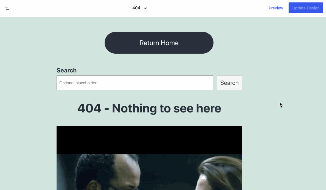
Unfortunately, the preview looked nothing like the display on the frontend, but I assume that is still in progress. After trying multiple sources, I found that embeds didn’t work and some of the block styles were off.

The testing flow for this challenge focused primarily on creating content within the new Template Part. That aspect of the test seemed to work, but there are a few things that could be significantly improved. The last part of the challenge is to answer the following questions:
- Did the experience crash at any point? No
- Did the saving experience work properly? Yes but it was confusing without any confirmation.
- Did the saving experience make sense when making changes to the Template Part vs the general content? It did after taking some time to explore it, but it’s not a concept that would be immediately evident to beginners.
- What did you find particularly confusing or frustrating about the experience? Saving template parts was confusing, and the previews are much better than what you get on the frontend.
- What did you especially enjoy or appreciate about the experience? I appreciated the ability to edit templates and template parts without jumping into code.
- Did you find that what you created in the Site Editor matched what you saw when you viewed your 404 page? No, it was far from similar to the preview.
- Did it work using Keyboard only? No
- Did it work using a screen reader? Did not test
My expectation when I began testing the 404 page design editing experience was that it would be a simple and enjoyable customization process with a few bugs. It ended up frustrating in the end because I could not trust the previews at all.
Is WordPress close to having an MVP of full site editing ready for 5.8? All the bones are in place. It feels like a rough prototype with enough momentum to reach MVP status in a few months. Editing and saving template parts works but the current interface design falls squarely within the realm of power users.
If you want to join this challenge, follow the testing flow and post your feedback by March 23, 2021.


