Laying out a webpage design and getting every element aligned perfectly can be a tough job. Even many developers rely on CSS grid frameworks. Granted, with the introduction of the flexbox and grid systems in the CSS language, such frameworks are becoming unnecessary. Whether it is getting the vertical and horizontal rhythm down or simply aligning an image next to a bit of text, page layouts are often done best via some sort of grid system.
This becomes even more apparent when building a page layout visually through the WordPress block editor. The current iteration of the editor does a fine job of being a general content editor while providing the ability to insert various elements into the page.
However, it is not by any means a page builder — yet.
The question is, before we engage in full-site editing, global styles, block patterns, and other upcoming tools, whether a grid system should be a part of the equation. If so, how should that system work? Will it be configurable by theme authors? How will it handle tablet and mobile views? Will the grid be visible to users or a hidden thing in the background?
As more block plugins are released, particularly with those that may have multiple elements that may need to be aligned, it might be time we consider a grid system. Such a system may benefit existing core blocks right now, such as Columns and Media & Text. Or, it may be better as a separate, standalone block.
Including a grid system also has the additional benefit of standardizing on layout-related class names that theme authors can use in their CSS, even outside the content editor. This would bring better compatibility across the board when users inevitably switch themes.
A Starting Point: Layout Grid Block

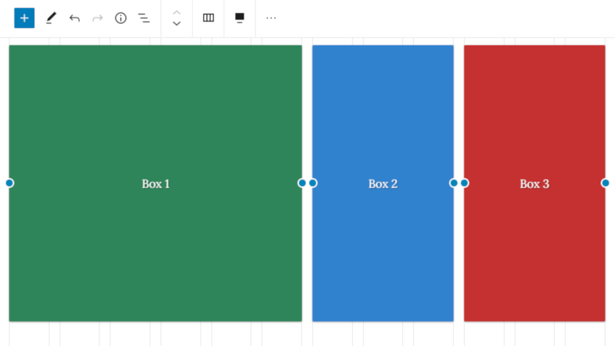
Automattic, as part of its Block Experiments project, has released the Layout Grid Block plugin. It is essentially a beefed-up version of the core Columns block. The major difference is that column alignment snaps to a specific point in the grid. This grid is also displayed in the background while editing the post.
The tricky thing with grids is not simple alignment in columns in desktop view. It is dealing with how those columns transform on smaller devices like tablets and smartphones. Sometimes that is a guessing game from a theme design perspective because the theme author is not privy to the actual content that needs to be aligned. In turn, designers make best-guess decisions and hope it works for most.
The Layout Grid block has a “Responsive Breakpoints” tab under the block options panel that allows users to configure this based on device. Users can decide how individual columns span the grid. The grid system is based on a varying number of grid sections based on the device:
- Desktop: 12 Sections
- Tablet: 8 Sections
- Mobile: 4 Sections
Imagine wanting to display a simple image with text to the next of it. There are various ways to do this currently in the block editor. Each has its pros and cons, depending on what you want to do. From a user experience and visual standpoint, I love seeing the grid lines in place as I determine how it should be displayed.

Another upside of having a grid system is consistency in design. If users can scale the width of columns based on arbitrary numbers, much like they can now do with the Media & Text block, there is no consistency with sizing items horizontally on the page. A grid system changes that.
Layout Grid Block still needs some polishing at this point. There are some trivial pain points in the UI that could be improved. On the whole, my experience with this block offered a compelling argument for including a grid system in core.
The plugin addresses simple one, two, three, and four columns right now. The grid system in CSS is much more powerful than basic horizontal columns. However, starting with the basics would give us a place to build from.
Should Core Include a Grid?
There is at least one open ticket on the Gutenberg repository for addressing a grid system. Mark Uraine, the author of the ticket, posted seven key questions:
- Should the grid system be responsive?
- Should there be a default Gutenberg grid system, but allow themes to register their own?
- Should the grid system conform to the current structure of Gutenberg blocks, or should it be its own thing that we need to restructure the blocks to in the editor?
- Should the grid include gutters?
- Should the grid include, or allow, any vertical alignment snaps?
- What should the grid be based on? (ie. 12 columns, pixel grid, etc.)
- Should the grid allow toggling on/off? And also include a setting to show, or not, when resizing objects in the editor?
The ticket had some solid discussion nearly a year ago but not much as of late. Would you like to see a grid system in the editor? If so, how would you want it to work?


