Oh man, does anyone else remember geeking out over Geometry class back in the day? Anyone? Anyone? Bueller? Is this thing on? Okay, maybe I was in the minority.
Anyway, like with many other things I enjoyed in that long-gone era, I find myself wondering how practical it was to even study geometry in the first place. I mean, when do any of us ever use it in our lives, professionally or personally? Well, if 2017’s design trends are an indication of anything, geometry is definitely going to make a play for my (and hopefully your) heart again.
Before I lose you (because I’m pretty sure most people hated Geometry), let me just quickly share this quote from Jason Mraz:
“I call it sacred geometry. When everything’s just right and it feels really balanced, so that when it unfolds to the next part, you feel totally familiar and at ease within the song.”
Okay, so Mraz is obviously talking about a song because he’s a musician, but that same essence applies to web design, too, when you think about it. There’s a feeling of balance, a natural flow from one part to another, and also a sense of ease. Those are all ultimately goals we have in mind when designing an experience for the web, right?
So, if we know that the inherent logic, order, and familiarity of geometry is something that works so well within our very nature as humans, why not put it to use? In all honesty, you’re probably already using geometry in your design work, whether you know it or not. What I want to do today is help you more effectively tap into this “new” design trend.
Why Should We Use Geometry in Web Design?
Geometry is:
“a branch of mathematics that deals with the measurement, properties, and relationships of points, lines, angles, surfaces, and solids.”
Sounds a lot like web design, right? After all:
- Measurements help you play within the right amount of space.
- Properties of elements give you the ability to make different parts of a site pop when you need them to.
- Relationships help you establish a hierarchy between various elements.
This is something you already do. Now let’s gain a better understanding of the why behind it all.
What Is Geometry in Web Design?
The most basic element in geometry is the point (basically, a dot):

Points are used in web design to direct focus. They can be literal spheres as in the example above or they can be a beautifully-designed call-to-action button that essentially has the same effect on visitors.
Lines are next. They can be used to connect two separate points to establish a relationship between the two or they can be used to draw visitors’ attention to somewhere else more pertinent.

Then, of course, you have shapes—which is what most of us think about when we think of geometry. Circles, squares, triangles, and so on.

Although shapes are the most easily recognizable part of geometry, their application in web design doesn’t always have to be so simple.
- They can be used in the foreground or background of a design.
- They can be empty, filled, or partially filled.
- They can exist in one dimension (as a line), two dimensions (as a flat shape), or three dimensions (as a shape that exists on multiple planes).
- They can be used in planning (think of wireframing and grids) as well as elements within an actual design.
- They can be permanent fixtures or fleeting transitions or animations.
- Geometric shapes can also serve as the basis for other elements in your design: fonts, photos, logos, icons, and so on.
Keep in mind that just because geometry tends to be organized and simplistic in nature, that doesn’t mean it won’t lend itself to creativity. You can put a unique spin on it once you understand the meaning behind the various elements.
The Benefits of Using Geometry in Web Design
There are a number of reasons your curiosity should be piqued when it comes to using geometry in web design:
- Geometric shapes and lines establish a sense of symmetry and balance, making websites easier to follow.
- Geometry naturally lends itself well to an organized state where each element fits within one another or within a specific order. There is something innately calming about that.
- Geometry is also great for establishing consistency and repetition within design, which helps train visitors’ minds quickly to make certain associations with those elements.
- Geometric shapes can be used solo or in conjunction with one another, and they can also be filled, outlined, or colored in endless ways. How you mix and match these elements is what will give your design its own unique and beautiful edge.
- Stronger geometric elements may be all that’s needed to give your content a major dramatic flare while you keep everything else surrounding them much more simple.
- Geometry also works well with minimalism, especially if you use them subtly as textures in the background.
- Geometric shapes also help establish the underlying structure of your site as everything essentially begins with a grid (usually a bunch of squares, rectangles, or triangles).
Each geometric shape has a built-in meaning, whether we are actively aware of it or not. It’s like with colors. By understanding the psychology behind how they make us feel, we can use them more effectively in design. For instance:
Rectangle or Square

With four stable sides and four right angles, these shapes are commonly associated with reliability, traditionalism, and honesty. They’re also the most formal of the bunch.
These are great for calls-to-action, text boxes, as well as the underlying structure of your website, in general.
Circle

Circles represent unity and wholeness. If you’re looking to make a powerful and yet safe statement with your web design, look here.
These can be used in logos, with icons, and with smaller elements that need extra emphasis.
Triangle

Triangles are similar to rectangles in that each of their edges is seen as providing a stable base. However, the meaning behind this shape is a little different as the natural arrowhead appearance of them often implies a sense of motion or direction.
These are perfect for directional cues to let you know when to drop open a menu, to jump back up to the top of the page, to look down below for more information, etc..
Rhombus

The rhombus isn’t necessarily an element you see a lot of in web design, which is why it can leave such a lasting impression when you do. It makes use of those solid lines; however, the body itself sits at a slant and creates a sense of movement similar to the triangle.
These work well in backgrounds as well as when you have related blocks of text or other elements that should flow into one another.
Hexagon

This six-sided figure is another rare shape in web design, though we are seeing it used more frequently now to convey a sense of unity.
These are great for team or company profile pages.
Obviously, there are other polygons and naturally occurring shapes that can be used in web design, but these are the ones that are the most common and that have a clear purpose behind them.
Inspirational Examples of Geometry in Web Design Today
Now, rather than spend time talking about how you can get even more into the mathematical applications of geometry in design (because that would be overkill), I’d rather focus on looking at the practical aspect of it. There are some really cool things going on with geometric design right now, and I think these highly stylized websites could serve as great inspiration.
Here are some of my favorites:
#1. Aark Collective

Upon first entering the products page on the Aark Collective website, you’ll notice that their watches almost look surreal, like they’re not really watches at all. Once you hover your mouse over them, however, you’ll get a side-view angle of the watches and realize they aren’t the two-dimensional geometric forms that they originally appear to be at first glance.
#2. Andrei Gorokhov

The portfolio site for UX designer Andrei Gorokhov is littered with hexagons. The entire website is actually covered in side-by-side hexagons; the ones the designer wants you to click on first are in full color and the ones he wants you to look at next are lightly shaded. It’s a really cool way to use the same geometric element site-wide without it seeming too overwhelming or even underwhelming.
#3. Built by Buffalo

The Built by Buffalo website is really cool. For the most part, it’s pretty bare bones aside from the use of strictly geometric shapes. They switch between hexagons and circles to show off their content, and they use the same thin line throughout the site to demonstrate when there is a section break. It’s a great example of how consistent use of the same shape or line element helps visitors become easily acquainted with what they’re looking at.
#4. Case 3D

Seeing as how the designers of Case 3D work for the real estate and architecture spaces, it makes sense that their website would utilize heavy geometric elements within it. It demonstrates that they speak the same language as their clients who rely on the clean lines, symmetry, and well-planned spaces that go along with geometry in their everyday work.
#5. Lacca

There’s really nothing too out there in terms of what Lacca has done with their site’s design, but you’ll find cool instances of geometric shapes all over the place. Start with their logo, for examples. The letter “A” found twice in their name is actually styled as a triangle. All of their stylized header fonts actually have a similar geometric feel to them as well. And the website is comprised of a number of rectangles, all different shapes, that come in from different directions.
#6. Mokhtar Saghafi

This is the first instance I’ve found of a website that uses the rhombus as their main geometric shape of choice, and I love it. Mokhtar Saghafi is a UI/UX designer, so it shouldn’t come as a surprise that he’s chosen a less commonly used shape to build his site around orthat he’s used it as a peekaboo element at that.
#7. WPMU DEV

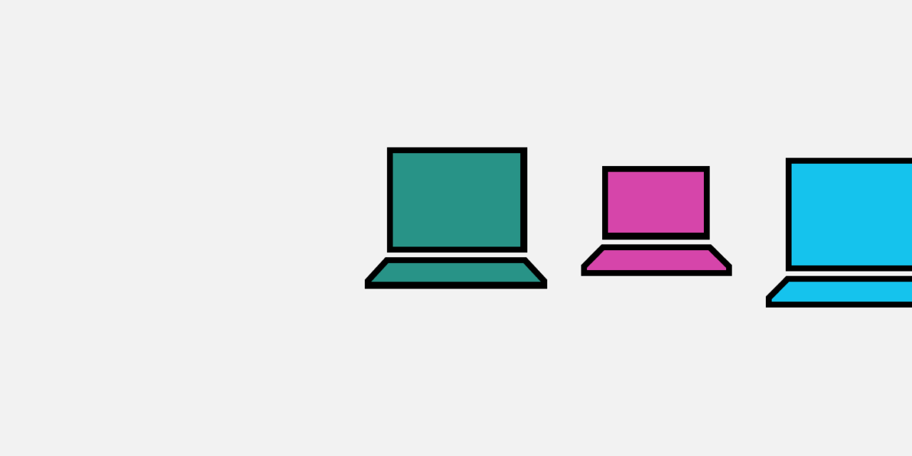
Has anyone else ever noticed the WPMU DEV website’s use of geometric figures? Within the internal pages, most of it consists of rectangles that house videos, images, and informational boxes. However, the home page is where their geometric really shines. This is the first time I’ve seen a website use a trapezoid, and it’s really well done! Not only does each trapezoidal box fit on top of the next one, but they each come with their own unique color so you’re never confused about where you are or what you’re looking at.
Wrapping Up
Geometry can be found in all things, including nature. Think of something like a bee’s hexagonal honeycomb design. It only makes sense that we’d want to take naturally well-structured elements found in everyday life and move them over to our digital world. Our audience instantly recognizes them (regardless of how subtly they’re included in the design) and they hold such powerful symbolism that can convey a lot about your website without uttering a single word.
Tags:


