It’s that time of year again when we’re presented with a new default WordPress theme to sink our collective teeth into. Twenty Twenty-Four is now out and offers new features, customization options, and details worthy of a thorough theme review.
In this post, we’ll look at everything the new default theme has to offer. We’ll examine what’s new, what’s carried over from Twenty Twenty-Three, as well as the theme’s pros and cons. That way, you can decide if it’s an option for a present or future website project.
Concept and Design Philosophy

Twenty Twenty-Four shipped with WordPress 6.4 and heralds a significant shift in the conceptualization of WordPress themes. It aims to be universally adaptable and suitable for any type of site and topic. For that, it delivers less of a single coherent theme and more of a large collection of design patterns and aesthetics you can combine according to your needs.
Departure From Past WordPress Default Themes
In the past, WordPress default themes often had a more niche or narrowly focused design. For example, in Twenty Nineteen, the focus was mostly on typography and the theme worked both for blogging or as a template for a static business website.

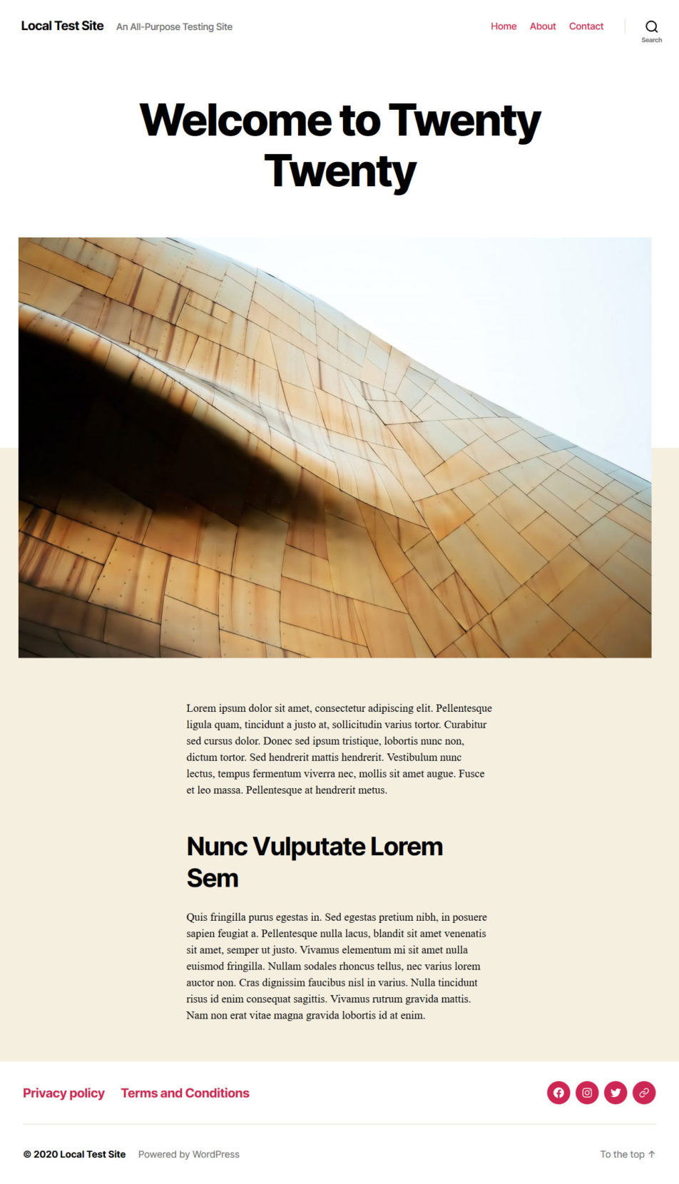
Similarly, Twenty Twenty, with its focus on readability and clarity, was perfect for writers and publishers. It provided an excellent framework for textual content and big visuals. On the other hand, it lacked the versatility needed for portfolios or multimedia sites.
Twenty Twenty-One embraced minimalism and was primarily aimed at bloggers and small businesses. Its simplicity was ideal for content-focused websites and a clean, straightforward layout. However, the default subdued color palette wasn’t really suitable for any type of website.
These themes, while effective within their specific scopes, were somewhat limited in their usability for a broader range of website types. Each had a distinct design philosophy that, while appealing, did not necessarily translate across other kinds of websites.
Twenty Twenty-Four Has a Wider Scope
Twenty Twenty-Four, on the other hand, caters to a broader range of use cases. It specifically targets three key user groups: entrepreneurs and small business owners, photographers and artists, as well as writers and bloggers. This tri-focus approach comes with templates and patterns that are versatile enough to suit various professional and personal website needs.

Comparing Twenty Twenty-Four to its direct predecessor, Twenty Twenty-Three, reveals a clear evolution in design philosophy. While Twenty Twenty-Three was a minimal version of Twenty Twenty-Two, focusing mainly on community-submitted style variations, Twenty Twenty-Four puts a spotlight on the latest WordPress design features.
Its approach is less about pushing a single overarching design. The focus is more about providing an invisible framework that empowers users to bring their creative visions to life.
Customization Options and Flexibility
Twenty Twenty-Four brings a rich palette of customization options to the table. It comes with seven distinct global style variations, offering you the freedom to choose and switch between different design aesthetics.
Default

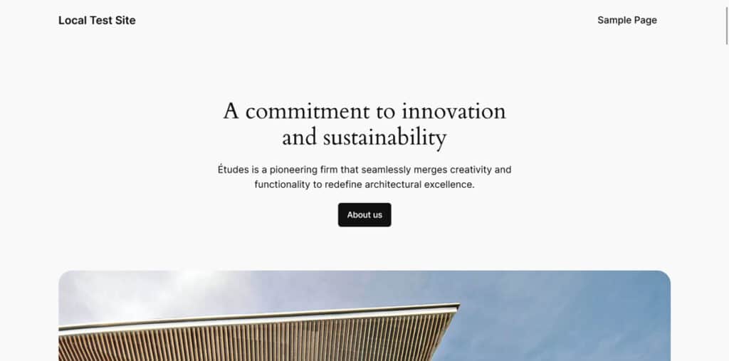
The default style of Twenty Twenty-Four comes in a light color scheme with a not-quite-white background color, dark grey accents, and a simple elegance. It uses two font families, Cardo for headings and Inter for body text. It also offers ten colors, twelve gradients, and five duotones as part of its options.

Ember

The Ember variation presents a fresh and dynamic appearance of the new default theme. It adds a bright orange overlay to images and switches to Jost and Instrument Sans, both non-serif fonts, while using soothing background colors to offset the lively color splashes.
Fossil

Next up, we have Fossil. It turns the original typography on its head by using the serif font for body text while using the serifless typeface for headings. Color wise, it goes with earthy hues (offering five different ones) and uses rounded buttons for a more organic outlook. I could see it as a great option for a wellness-related website.
Ice

This style variation closely aligns with the default theme design and uses the same color palette. However, it showcases a system font for headings and the Inter font for body text. Together, they create a clean and sharp aesthetic that echoes the theme’s original setting with a solid range of color and gradient choices.
Maelstrom

Maelstrom revolutionizes the default style with a multitude of enhancements. Using a blue and white color palette, it has a similar approach to typography as the Fossil variation. The only difference, it uses Jost for body copy. The result is a design that looks elevated yet modern.
Mint

The Mint style introduces a refreshing twist by incorporating changes in color palette and font families. It showcases Instrument Sans for headings and Jost for the body copy. This results in a distinct and contemporary visual aesthetic that sets it apart from other variations. It also makes you hungry for mint-chip ice cream.
Onyx

Onyx, the dark version of the default style, introduces a more elegant color palette (with a whopping ten colors) as well as gradient and duotone combinations. It caters to users who seek a refined and sophisticated online presence, with its classy color scheme and visually captivating elements.
Rust

Finally, the Rust style variation adds a sandy color scheme of just three hues while otherwise maintaining the original design. It’s a great theme variation for adding more lively colorization while maintaining the understated nature of Twenty Twenty-Four.
Twenty Twenty-Four: Available Page Templates

Twenty Twenty-Four comes equipped with a comprehensive set of built-in page templates, each designed to accommodate different aspects of website design and functionality. These templates are:
- Single Posts — A standard template for individual blog posts.
- Page With Sidebar — Similar to the Single Posts template but includes a sidebar, offering additional space for widgets or extra information.
- Search Results — This template is responsible for the display of searched content.
- Pages — A basic template for standard pages.
- Page With Sidebar — A variation of the page template that includes a sidebar.
- Page With Wide Image — This template offers a wider image at the top with the title and content in two columns below.
- Page No Title — A page layout without a page title, offering a cleaner look for certain types of content.
- Index — The default template for the home page or main blog roll. It also functions as the fallback template for all pages according to the template hierarchy.
- Home — Specifically designed for the homepage, this template can be customized to create a unique first impression. It’s also the sample homepage you’ve seen throughout this Twenty Twenty-Four theme review.
- Archive — This template neatly organizes and displays content in all archive pages such as for categories and tags.
- Page: 404 — A template for the 404 error page, allowing for a custom design instead of a generic error message
Patterns and Template Parts
One of the highlights of Twenty Twenty-Four is its collection of nearly 40 design patterns, which you can find under Patterns in the Site Editor. These are pre-designed blocks you can easily customize to create pages or posts without having to do so from scratch.
Patterns come in two flavors: section patterns and full-page patterns. The first variety includes things like banners, calls to action, different ways to display blog posts, and media galleries.

In addition, the theme also comes with eight full-fledged page patterns. They range from the Business home pattern that is visible on the default Twenty Twenty-Four homepage over a project overview to an about page and more.

In addition to these templates, Twenty Twenty-Four also includes template parts, however, they are few in number. There is exactly one header and two general template parts. Officially, there is also only one for the footer, however, you can find three additional footer designs among the patterns.

Nevertheless, with these templates, template parts, and patterns, Twenty Twenty-Four simplifies the editing workflow. The theme allows you to build entire websites with minimal customization if you want to, thanks to its comprehensive range of templates and the flexibility offered by its patterns and parts.
This approach not only makes it easier for beginners to create professional-looking websites but also offers experienced designers a solid foundation to build upon and customize.
Typography and Aesthetics
As we have seen earlier in the style variations, the Twenty Twenty-Four theme likes to play a lot with typography. One of the central pillars here, which is responsible for the sophisticated look of the default style, is the Cardo font. It’s an Old Style serif typeface that adds a bit of refinement to the site’s appearance.

This font choice reflects a contemporary design trend that prioritizes aesthetic sophistication while maintaining a classical touch. This makes it particularly suitable for sites aiming for an elegant and polished look.
For paragraph text, the Twenty Twenty-Four default style uses the Inter font, ensuring text is clean and easy to read. This choice enhances the overall readability of the website, making content more accessible and engaging for visitors. Inter complements the elegance of Cardo, balancing sophistication with practicality, and contributing to a modern and user-friendly interface.

In addition to those two typefaces, Twenty Twenty-Four also includes the Jost and Instrument Sans font families in some of its style variations. These fonts further allow you to choose typography that best fits your site’s personality and design objectives. Plus, you can also pick from a sans-serif and serif system font.

Overall, the default color palette of Twenty Twenty-Four is light, offering a fresh and inviting appearance right out of the box. This light palette enhances the site’s visual appeal, creating a welcoming and modern atmosphere.
The carefully curated style variations mentioned above all work beautifully with the theme’s patterns and templates. They provide you with plenty of choices for personalizing your site’s design, ensuring that Twenty Twenty-Four can adapt to a wide range of visual preferences and needs.
Challenges and Limitations
As seen in this review, the Twenty Twenty-Four theme brings a host of impressive features and capabilities to the table. Yet, it’s important to recognize that no theme is without its challenges or limitations. Here are some key aspects to consider:
- Comparative Complexity — Twenty Twenty-Four, with all of its customizable options and advanced features, might present a steeper learning curve compared to its predecessors. This could be particularly challenging for WordPress beginners or those accustomed to simpler themes.
- Balancing Flexibility and Simplicity — The theme’s flexibility, while a strength, can also create issues for some. With more options to choose from, some people might find it more time-consuming to set up their site exactly as they want it — or just not as obvious how to proceed. It’s a case of having too many options.
- Feature-Rich vs. Speed — While the theme offers a range of features and customization options, these could potentially impact the site’s loading speed and overall performance. This is especially true for those who may not be well-versed in optimizing site speed alongside feature-rich designs.
- One-Size-Fits-All Approach — While the theme aims to be multipurpose and adaptable to various niches, it may not meet the specific needs or preferences of all users. Certain niche websites might require more specialized themes to effectively convey their unique brand or message.
Performance and Optimization
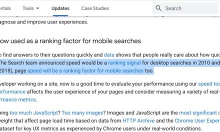
When assessing a WordPress theme, performance is a critical factor. A theme that looks great but loads slowly or hampers site efficiency can negatively impact user experience and SEO rankings.
With the forming of the Core Performance team, the WordPress project has recently re-emphasized the importance of making loading speed a front-and-center feature. This was also a consideration during the making of Twenty Twenty-Four. Contributors noted and addressed performance issues.
Apparently successfully so. A quick performance test on a temporary website did not reveal any glaring speed issues. GTmetrix gave it a B in performance with an ok Largest Contentful Paint of 1.8 seconds. For a pretty long, completely unoptimized homepage with numerous images, that is acceptable.

Sure, this isn’t really a representative sample since page loading speed depends on a variety of factors but it does point to a solid base for a well-performing website. It’s also important to note that even more performance enhancements and fixes are promised for the WordPress 6.5 release.
Put the Twenty Twenty-Four Theme to the Test
As we wrap up our review of Twenty Twenty-Four, it’s clear that this latest WordPress default theme is a bold step forward. It offers a blend of sophistication and versatility and legitimately stands out for its wide range of customization options.
The thoughtful use of fonts like Cardo and a flexible color palette add to the aesthetic appeal. The multitude of templates and template parts included cater to diverse website needs.
Overall, the theme is a great demonstration for the capabilities that WordPress offers for theme and website design. It invites users of all skill levels to take advantage of them.
Are you planning do your own review of Twenty Twenty-Four? Share your thoughts and plans on embracing this new default theme in the comments below!


