The modern web would not be possible without CSS. The markup language is responsible for the fact that websites look good, have a pleasant layout, and that every element stays where it belongs. Yet, did you know that new CSS features come out all the time?
Over the years, CSS has gone way beyond background colors, borders, text styling, margins, and the box model. Modern CSS is capable of a whole range of functionality that, in the past, you needed JavaScript or workarounds for.
To celebrate how far it has come, in this post we want to look at some of the amazing new features that CSS boasts in 2021 and that you might not be aware of. We will highlight cool things web designers and developers can do with modern CSS, talk about use cases, browser support, and also give you a quick example.
Let’s get going.
New CSS Features: What Modern CSS Can Do
Here are some of the amazing things that CSS is capable of these days.
Custom Properties/Variables
Custom properties basically allow you to define stand-ins for CSS properties in a central place to use for your design. The best way to understand the why that is useful is to go over an example.
Usually, when building a theme, you would choose a color scheme and then declare those colors every time it’s necessary.
a { color: #cd2653; } .social-icons a { background: #cd2653; } .wp-block-button.is-style-outline { color: #cd2653; }The problem with this approach is, if you want to make changes to one of the colors, you have to change every single instance of it. While code editors can easily do that via search and replace, it’s still annoying. Especially if you just want to do a quick test and have to reverse everything again.
There is a Better Solution
Custom properties do away with this. With their help, you can assign the colors in question to a variable once and then simply input that variable as the CSS property every time you use it like so:
:root { --global--color-primary: #28303d; } a { color: var(--global--color-primary); } .social-icons a { background: var(--global--color-primary); }That way, when you want to make change, you only have to do it in one place. Cool, right? In the past, you needed to employ a preprocessor such as SASS to use variables, now it’s a native functionality of CSS.
As you can see above, custom properties are also very simple to use. Define your variables at the beginning of the document under the :root selector (notice the double hyphen -- in front of the variables, this is what defines them as custom properties, also they are case sensitive!). After that, you can use them throughout document via the var() function.
If you want to change a variable, simply change the declaration under :root and you are good to go. A theme that takes a lot of advantage of custom properties is Twenty Twenty-One. If you want to see them in action, I recommend that you read our review.
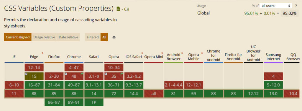
As for the question of how well adopted this CSS feature is, browser support is very good:

@supports
Next up, we have a CSS rule similar to media queries. However, instead of making CSS rules conditional on screen size or phone type, @supports allows you to do the same depending on what CSS properties and values the user browser supports.
What is this good for?
As you will see throughout this post, not all CSS features are supported in all browsers and devices. While you can often deal with this using fallback declarations, in some cases, if you don’t specifically include a support for older technology, it can seriously break your site.
In addition, you can use @supports to add extra features or styling for more modern browsers that can deal with them (which is why queries with @supports are also referred to as “feature queries”).
How to Use Feature Queries
If you are familiar with media queries, using the support check will be very easy. Here’s how to use it:
@supports (display: grid) { .site-content { display: grid; } }As you can see, it’s simply the rule followed by the property or property-value pair you want to check for in brackets. After that comes the usual CSS declaration for what rules to apply if the condition is met.
The above example states that if the browser supports CSS grid (more on that in a minute) it should apply display: grid; to the element with the class .site-content.
It’s also important to note that @supports understands the operators not, and, and or (that can also be combined) to create more specific rules, such as a fallback for browsers that don’t support that particular feature:
@supports not (display: grid) { .site-content { float: left; } }In order to use @supports properly, you need to be aware of which browsers support it (I know, this is kind of meta). The good news is that all modern browsers do.

However, since the goal of these queries is to enable or disable features that older browsers can’t deal with, make sure that you construct them properly. That means, if you are going to use a feature query, create it for browsers that understand feature queries. It’s no use telling a browser to ignore something in a way that it can’t understand.
Flexbox Gaps
Flexbox is another CSS layout module that we have discussed at length before. One of its weak points have long been flexbox gaps, meaning the possibility to define breaks between rows and columns.
Thankfully, browser support for this CSS feature is improving. You can now start using gap, row-gap, and column-gap to create space in layouts created with Grid, Flexbox, and Multi-Column Layouts.
Here’s a quick example of what this might look like in flexbox:
.flex-gap-test { display: inline-flex; flex-wrap: wrap; gap: 16px; } 1 2 3 4 5 6 And here it is on the page:

While it is possible to achieve the same layout via margins it needs a lot more markup and workarounds than simply declaring gap size.
content-visibility
content-visibility is a really cool new CSS feature to improve site performance. It basically works like lazy loading, only not for images but any HTML element. You can use it to keep any part of your site from loading until it becomes visible.
Usage is also super easy. Simply apply it to an element of your choice like so:
.content-below-fold { content-visibility: auto; }content-visibility takes three values. By default, it is set to visible, in which case the element loads as usual. Alternatively, you can set it to hidden, in which case the element is not rendered, no matter whether it’s visible or not. When set to auto, on the other hand, elements outside of the visible area will be skipped and then rendered once they appear on screen.
Pretty cool stuff, right?
One thing that might also be important in this case is contain-intrinsic-size. Since elements set to content-visibility: hidden; are effectively zero in size, this lets you apply a theoretical height and width to hidden elements so that the browser can take it into consideration from the get-go instead of at the point when the element is rendered. This way, you can avoid sudden layout changes during scroll.
Browser support for content-visibility is still a bit spotty but getting there. Same for contain-intrinsic-size.

Once more widely adopted, I predict that it will become one of the most effective tools for speeding up the rendering process.
Transitions, Transforms, Animations
In former times, if you wanted something to move on your website, you usually had to resort to JavaScript (or animated GIFs, for those who are part of generation MySpace). However, what you might not be aware of is that CSS has also had the ability to make things move for years. The three main tools for achieving this sort of thing are:
- Transitions — Allow you to make a change from one property value to another (e.g. hover effects) smooth instead of abrupt.
- Transformations — Lets you move, rotate, and scale elements both in 2D and 3D space.
- Animations — Set up simple or complex animations in CSS and configure how and when they should run.
Naturally, we don’t have the space to go over all three in detail here. Be sure to check out the links above if you want to learn more. However, let’s do some quickfire examples for each so you have an impression of what is possible.
CSS Transition
Here’s a quick example for a CSS transition:
div { width: 100px; height: 100px; transition: height 3s; } div:hover { height: 500px; }The above markup will slow down the increase in div height to three seconds when somebody hovers over the element.
CSS Transformation
Below is an example of a CSS transformation. It will rotate the element by 30 degrees clockwise when someone hovers their mouse over it:
div:hover { transform: rotate(30deg); }CSS Animation
And finally, a short snippet that shows off a CSS animation:
@keyframes color-change { from {background-color: blue;} to {background-color: yellow;} } div:hover { animation-name: color-change; animation-duration: 3s; }Notice how you use @keyframes to name the animation and define what it does and then apply it to an element using animation-name. animation-duration controls how long it takes to complete. There are other properties like this.
If you want to give all of these a try, the good news is that browser support is excellent (see here, here, here and here). Therefore, nothing stands in the way of you giving CSS transitions, transformations, and animations a spin.
Scroll Snap
Scroll snapping gives you the option to lock the user’s viewport to a certain parts or element of your site. It is very useful to create cool transitions and help users focus on the most important page elements while scrolling down the page. You can find a simple demo of it here.
This effect is visible in mobile apps a lot, yet, with scroll snapping, you can bring it to websites as well.
Usage is also relatively simple on the most basic level. You simply apply the type of scroll snapping to a container and define where its children should snap to.
.container { scroll-snap-type: y mandatory; } .container div { scroll-snap-align: start; }Of course, there is more to it. If you want to learn about it, CSS Tricks have great write up.
That only leaves a look at browser compatibility, which is pretty good.

However, be aware that support is a bit uneven across all available scroll-snap properties. Therefore, be sure to check for your particular use case.
:is and :where
The final entries on our list of new CSS features you might not be aware of are the :is and :where pseudo classes. They allow you to reduce repetition in CSS markup by shortening lists of CSS selectors.
For example, compare this:
.main a:hover, .sidebar a:hover, .site-footer a:hover { /* markup goes here */ }To this:
:is(.main, .sidebar, .site-footer) a:hover { /* markup goes here */ }The same thing works with :where:
:where(.main, .sidebar, .site-footer) a:hover { /* markup goes here */ }If the markup is the same, what’s the difference? The difference is that :is is a lot more specific. It takes the level of specificity of the most specific element in the parentheses. In contrast to that, the specificity of :where is always zero. Consequently, it is a lot easier to override further down the line.
Browser adoption is still a bit spotty but slowly getting there. So, feel free to start trying them out.
Any Other New CSS Features Worth Looking At?
Like all other web technology, cascading stylesheet markup is constantly evolving. That means, there are always new CSS features to discover and things to try out and experiment with.
Above, we have looked at some examples of things CSS is already capable of today that you might have missed. There’s more where that came from. We’d be delighted to hear what else you have to share. Aside from that, happy coding!
What’s your favorite feature of modern day CSS? Share it in the comments section below!


