One of my favorite activities each week is to peruse the latest themes to land in the WordPress theme directory. Often, there are intriguing design concepts. However, much of the time, I am disappointed to learn that homepage designs of many rely on theme options instead of the block editor.
While the editor has several design limitations, theme authors have tons of room to explore. It has enough power to pull off some of these custom homepage designs with far less code work.
Music Artist was one of the latest themes to catch my eye. I loved the large hero area and several elements of the theme’s design. After installing it, I realized the homepage layout was handled through theme options. However, the theme author could have built this page entirely out of blocks and wrapped each section or even the entire design into block patterns.
This is all doable with the block editor.
So that I am practicing what I am preaching, I took a couple of hours and recreated the homepage demo for the theme directly from the block editor. No code required. There were a few tricky pieces, which I will get into. However, it was not that hard to build and could have been made easier if the theme supported the block editor.
The plan was to replicate the custom page with the Music Artist theme installed. However, the theme’s lack of block support meant that some things were fundamentally broken. Instead, I activated a theme with design similarities, such as fonts and colors. Because I already knew Ariele Lite worked with the block editor, it made sense to see if I could build with it. It proved to be a solid foundation.
The following is a comparison of the original Music Artist theme homepage (first) and a recreation using blocks via the Ariele Lite theme (second):
-

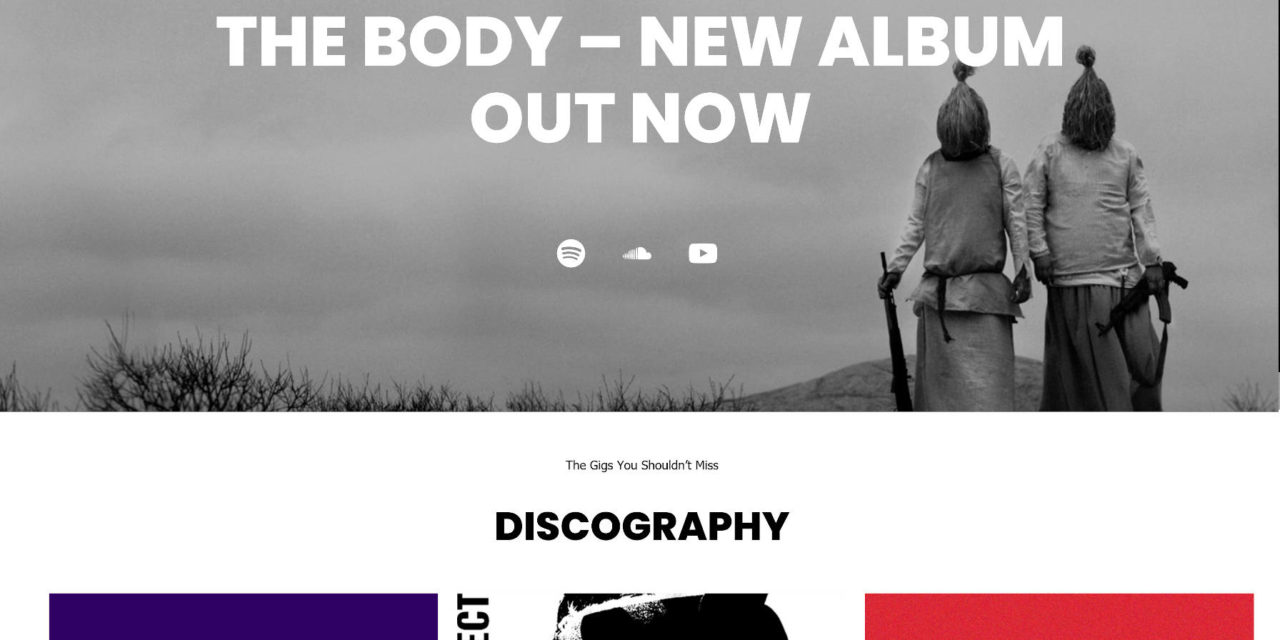
Original Music Artist Homepage -

Block-Designed Homepage
There are obviously differences in spacing, colors, typography, and other elements. Much of this comes down to stylistic choices by the theme designers. Given more time and modifications via a plugin like Editor Plus, I could have adjusted this enough to get a closer replica. However, my goal was to stick as close as possible as I could to core WordPress. Technically, I have the latest version of the Gutenberg plugin installed, so there might be a few items that have yet to land in WordPress.
For this experiment, I used:
- WordPress 5.7 Beta
- Gutenberg 10.1 Beta
- Ariele Lite 1.0.8
- Editor Plus 2.6
I only needed Editor Plus to make a couple of margin adjustments on the Group block. I could have left it alone, but I wanted to reduce some of the spacing between sections on the page to get a closer recreation. In the future, we will see more spacing controls in WordPress, so I considered this a fair trade-off.
This experiment is to show theme authors that they can build their custom designs with the block system. Dropping old-school theme options means a lot less code work for developers, allowing them to focus more on styling. End-users also benefit from more flexibility, such as adding custom elements or removing parts they do not want. That does not even include the style options on the individual block level.
The secondary purpose is to show users that they can create some of these homepages without code. The block editor and a well-rounded, block-ready theme can get you pretty far.
Recreating the Music Artist Homepage
Starting with a base of Ariele Lite meant that the design was boxed. However, the theme has a custom “Blank Canvas” page template that lets users design the entire page.
There were elements I could not recreate entirely because of limitations with the block editor. Other parts were issues or design choices coming from the theme.
The following is a general overview of how I accomplished building out each section of the homepage. I will skip over parts like adding colors and changing font sizes while focusing on the layout-related concepts.
Hero Section
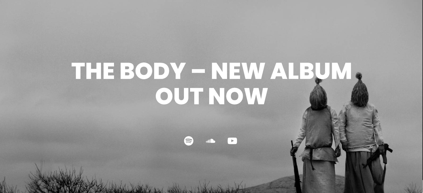
WordPress’s Cover block remains one of my favorite blocks. It allows users to create hero sections without much work. I grabbed the background image from the original demo and plopped it in. I had taken the first real step down this journey.
Then, I added a Heading block, adjusting its size a bit. I followed it with a Spacer and Social Icons block.
I immediately hit two snags. The first was that WordPress does not include an iTunes social icon. I was unable to find an open issue on the Gutenberg repository for this. Perhaps it is not an oft-requested feature. The second issue was that the Social Icons block does not output the social network labels, so I could not replicate that part of the design.
Discography Section
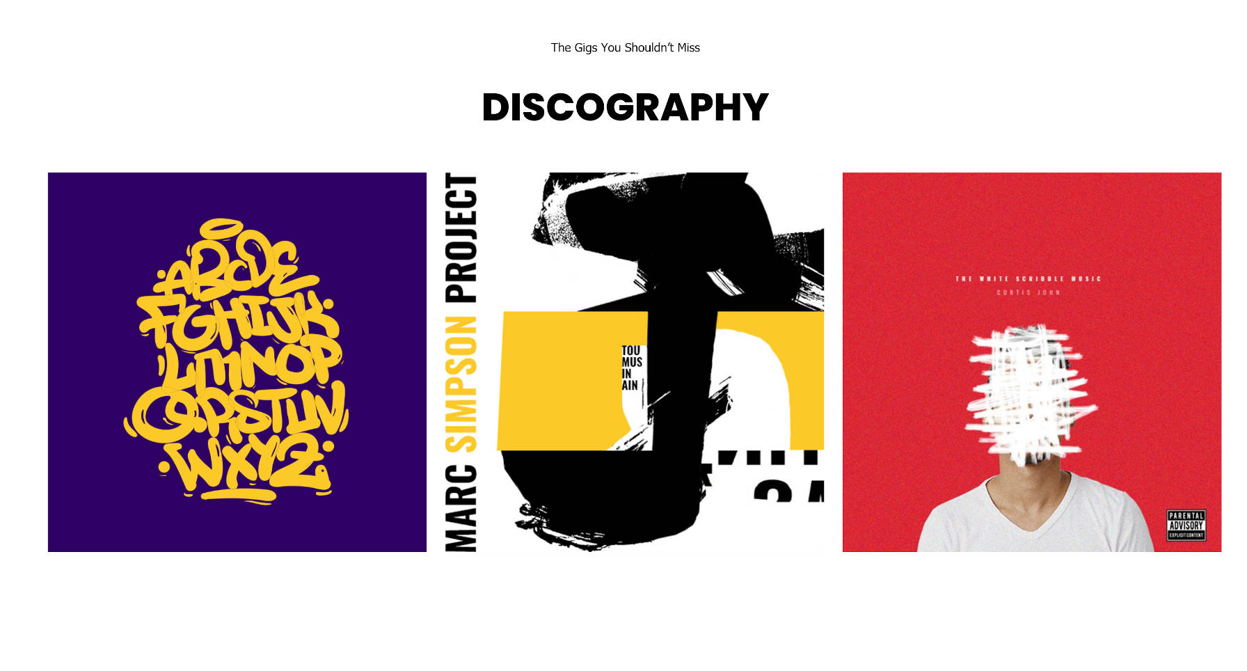
There are a few ways to handle this section. Assuming the albums listed are a custom post type, whatever plugin these albums came from would ideally have a custom block for outputting them. Users could also use the Latest Posts block if these are blog posts or the upcoming Query block.
For simplicity, I decided to add a Columns block and drop three linked images in.
Media and Text Section
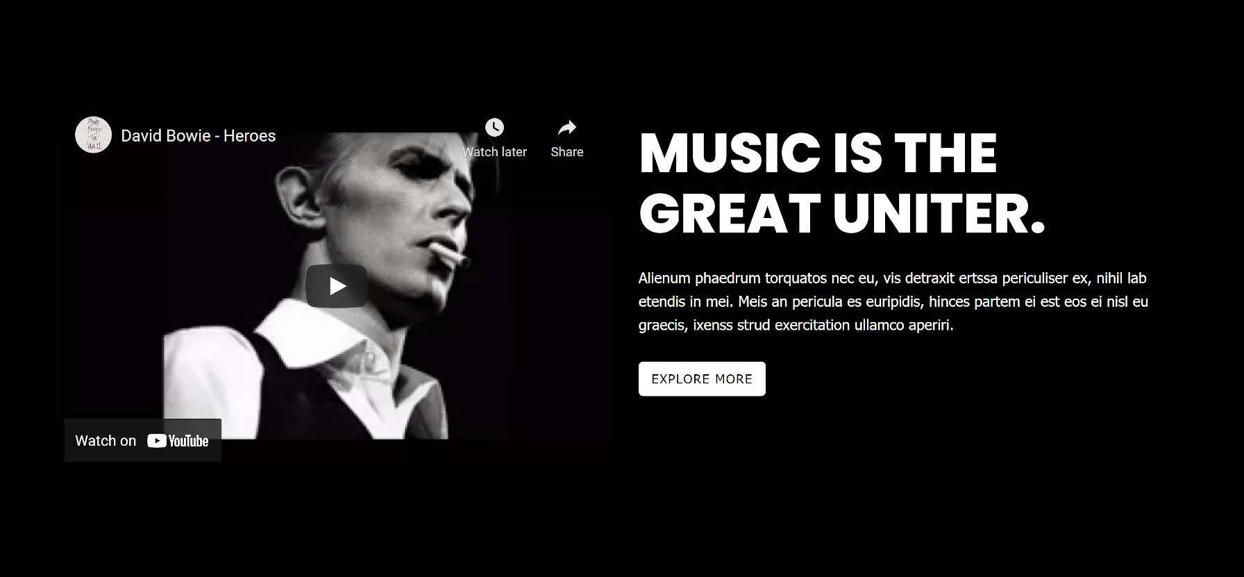
My plan for this section was to use the core Media & Text block. However, it only supports self-hosted media. There was no way for me to embed a YouTube video.
Instead, I went with a Columns block. In the left column, I dropped a YouTube video URL. On the right, I added Heading, Paragraph, and Buttons blocks.
Videos Section
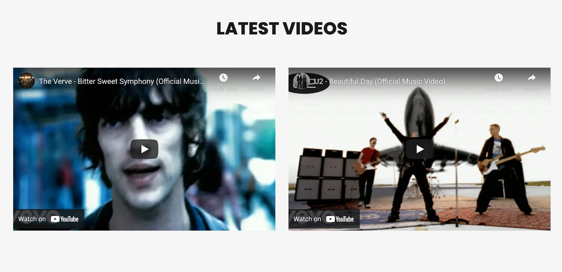
This was a relatively simple section to recreate. For the layout, it took only a Heading block followed by a Columns block. Then, I grabbed a couple of video links from YouTube and pasted the URLs into the editor.
Latest Posts Section
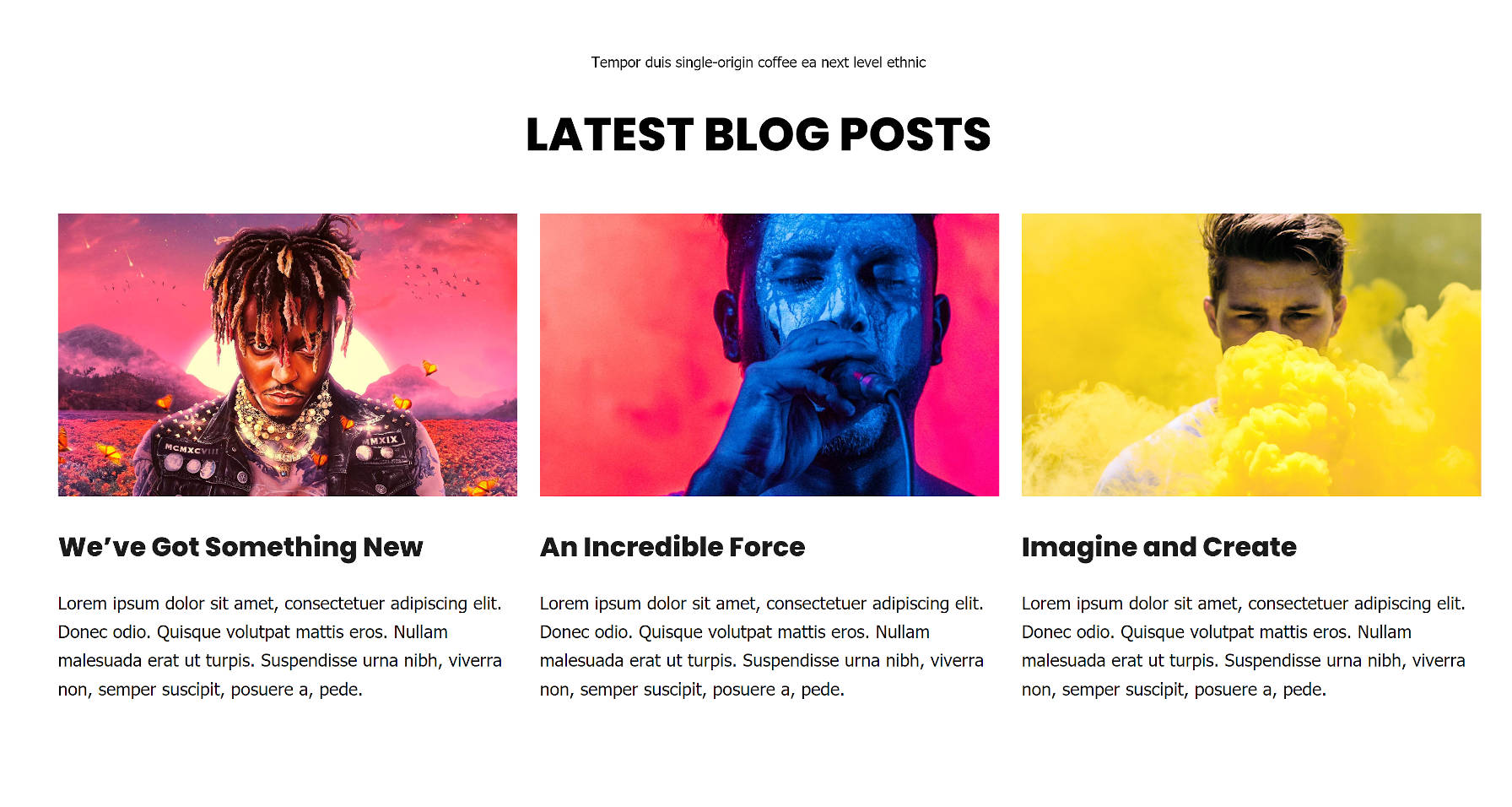
This was the part of the layout that I had the most trouble with. WordPress provides the Latest Posts block, which can be set in a grid. However, Ariele Lite did not correctly handle the columns.
So, I cheated a bit.
I switched to a block-based theme that supports the upcoming Full Site Editing feature. Then, I dropped in a Query block to get more control over the columns of posts. Afterward, I switched back to the Ariele Lite theme.
The original design could be done with the current Latest Posts block, so this is not a block-editor problem.
Footer Sidebar Section
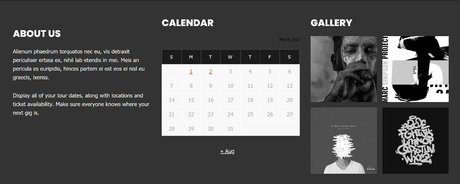
Technically, the footer sidebar is outside the scope of the homepage design. It is a part of the theme’s footer across the entire site. However, I decided to add it since I was already on a roll.
This section requires the Columns block. From that point, it is a matter of dropping in a Heading block for each column. I added a Paragraph, Calendar, and Gallery block to recreate the three “widgets.”
Ariele Lite’s Calendar block design works better on a light-colored background. It was a small pain point that I overlooked. In the long term, WordPress should provide design controls on blocks that are missing them.


