Another year ending (and what a year it was), another new WordPress default theme coming to greet us. And you know that that means: It’s time for an in-depth Twenty Twenty-One theme review.
It was released with the most recent update, 5.6, and can be downloaded today.
Ready to take a peek under the hood? Then let’s do this!
Twenty Twenty-One: An Overview
Alright, let’s start this review with a bird’s eye view on what the new Twenty Twenty-One is about.
Minimalist Design

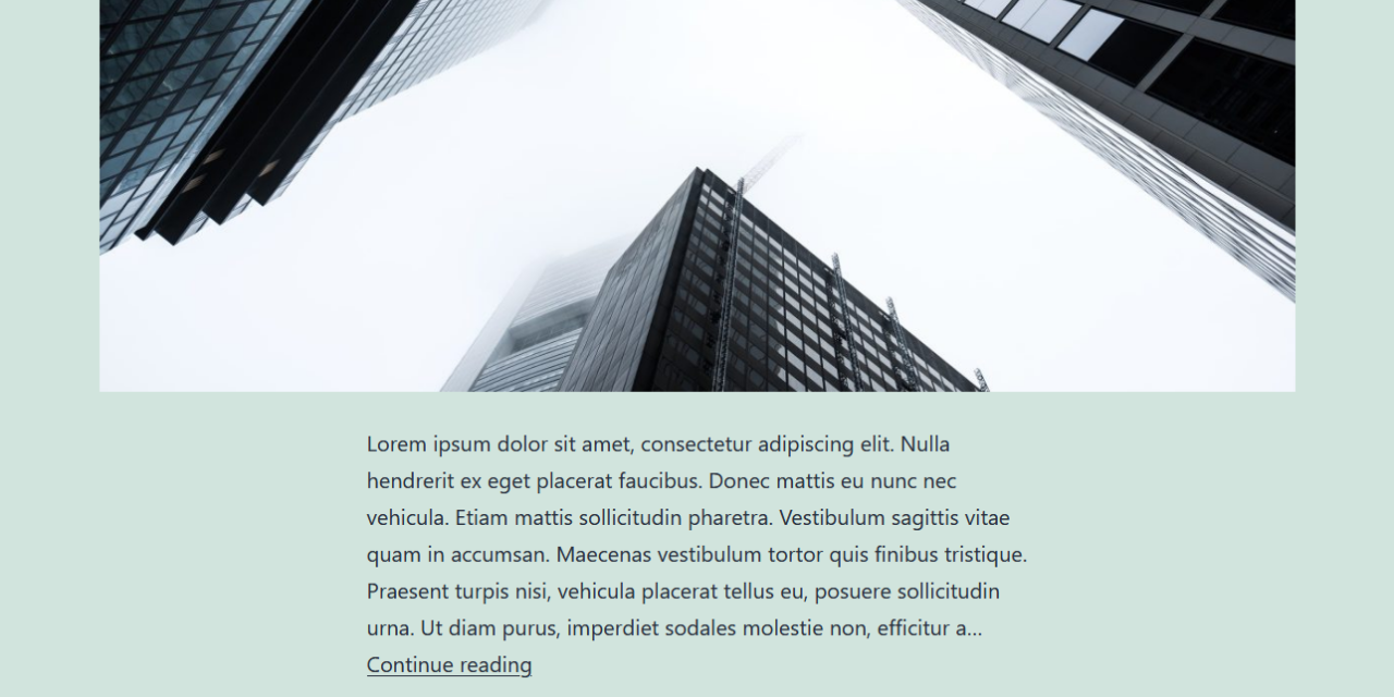
The look and feel of Twenty Twenty-One is quite minimalist in nature. It comes with a single-column layout, a widgetized footer, and two locations for menus.
Like it’s predecessor, Twenty Twenty, the new default theme is built on top of another theme. In the case of Twenty Twenty-One, the basis is provided by Seedlet, a theme published by Automattic.

This choice is deliberate due to the way the ancestor theme uses CSS to makes it easy for web developers to modify it. We will get into that in detail further below.
Aside from basic layout, Twenty Twenty-one offers a simple color palette based on pastel hues because, as design lead Mel Choyce-Dawn puts it “Pastels and muted colors are pretty in right now.” The default is green but you also have additional options, including black and white.

Focus on Accessibility
Besides the minimalist design, Twenty Twenty-One puts a big emphasis on accessibility. In this theme, making it available to users with all abilities is not just an afterthought but a main feature. The developers aim to make it WCAG 2.1 compliant.
One of the more interesting features to achieve that is its dark mode support. More on that below as well.
Taking Full Advantage of Gutenberg
Like other default themes before, Twenty Twenty-One is meant to be used with Gutenberg. It’s only meant to provide a basic canvas that users can customize to their needs using the block editor.
For that purpose, it comes with a wide support for block features including:
- Custom block font sizes and line height
- Controls for font color, background color (including gradients), and link color
- Responsive media embeds
The theme also ships with a number of block patterns that you will get to know in this post.
Easy Customizability
Twenty Twenty-One uses system fonts for its typography, which is a good for performance reasons.
In case you don’t know, system fonts are typefaces installed users’ operating systems. Unlike custom fonts, there is no need to download them from a remote web server in order to include them on your pages. Instead, the browser can directly pull them from the local hard drive.
In addition, Mel Choyce-Dawn said her goal was to provide neutral fonts so the theme would be usable for many purposes and to make it easier to create a child theme. The aforementioned CSS markup is another step toward that direction.
All clear so far? Then let’s dive deeper into what theme has to offer.
Twenty Twenty-One Review: Theme Customization Options
As a first step of the in-depth review, we will have a look at the customization options that Twenty Twenty-One ships with. You find all of them in the WordPress Customizer under Appearance > Customize.
Site Identity and Custom Logo
Under Site Identity, you can set a custom logo, a site icon (aka favicon), and determine whether to display the site title and tagline inside the header.

This is fairly standard. Any logo you add appears centered above the site title, tagline, and menu.
However, when you disable the tagline and site title, it moves to the left and appears in same line as the navigation menu.
The optimal size for the logo image is 300 x 100px. You should also use a transparent background or the same background color as your website for best results.
Colors & Dark Mode
Under this panel, you are able to select the background color from a simple color picker. The aforementioned pre-set color schemes are located at the bottom. Clicking Default gets you back to initial pastel green.

Like Twenty Twenty, the font color automatically adjusts to changes to the background color to maintain sufficient contrast for reading.
The most interesting setting here, however, is the checkbox to switch on support for Dark Mode. When enabled, it will add a toggle button in the corner of your site to switch to a version of your website with a dark background and light text.

The toggle disappears when user scrolls down. Dark mode will also automatically activate when a visitor’s device has it enabled (to find out how to do that, check this post on Wired).
If you are planning to use this featured, make sure to check what your site looks like in dark mode. Especially have a look at the visibility of logos, contrast, image brightness, etc.
Seeing as dark mode is one of the web design trends 2020, it’s cool to see such a seamless integration in a WordPress default theme.
Navigation Menus
The theme has two menu locations: the primary navigation below the header section and another inside the footer.

The latter also supports a social menu. That means when you add links to social networks, Twenty Twenty-One automatically converts them into the respective icons.

This is something that was already present in Twenty Nineteen but it’s nice to know the new theme also supports it.
Twenty Twenty-One Editor Options
Since Gutenberg functionality is one of the main focuses of this release, of course we also have review what Twenty Twenty-One offers here.
Well-Executed Editor Styles
The first thing that stands out is that the theme takes full advantage of editor style sheets. The editing experience looks the same as your front end, custom background color included.

This includes dark mode. When you switch this feature on or off on the front end, it also applies to Gutenberg.

A Wide Range of Block Patterns
As mentioned, the Twenty Twenty-One default theme focuses heavily on the use of Gutenberg block patterns. You find them by clicking the plus symbol to add a new block, choosing Browse all, and then picking the Patterns rider.

Here’s is what the theme has on tap:
- Large text — Exactly what the name says. A large heading block (font size is set to Gigantic by default) stretching across the entire content area.
- Links area — Title/call to action with links to social networks or an email address.
- Media and text article title — Image on the left, title, separator, and paragraph on the right.
- Overlapping images — Three overlapping images vertically aligned.
- Two images showcase — Larger media & text block on the left, smaller, framed image on the right.
- Overlapping images and text — Overlapping vertical elements, both images and text.
- Portfolio list — A list of projects including thumbnails, divided by separators.
- Contact information — Three columns for contact information and social media profiles.
Here are all of the block patterns on one page (note how they all come with sample content):

Of course, everything is fully customizable and the editor also offers the same color palettes as seen in the Customizer. This way, you can make sure the colors all fit together.

By the way, if you want to contribute your own block patterns, you can do so here (requires login to Github).
Developer-Friendly Features of Twenty Twenty-One
As mentioned at the beginning of the review, because of its theme of origin, Twenty Twenty-One also offers interesting features for web developers and designers. This is immediately visible when you open up its style sheet.

As you can see, it is filled with CSS custom properties aka variables.
In case you are not familiar with variables, these are stand-ins for recurring values. So, for example, you can define a primary color for your site at the beginning of the style sheet like so:
--global--color-primary: #28303d;When you now want to add this color to an element, you can use the variable instead of the color declaration.
.navigation { color: var(--global--color-primary); }It’s also possible to assign a variable to other variables:
--global--color-border: var(--global--color-primary);The benefit: If you want to make broad changes to your theme, such as setting a different primary color, you only have to modify a single place instead of doing a search and replace through the entire file.
This makes customizing your theme or child theme a lot more comfortable and quicker. As mentioned earlier, this is one of the main ideas behind Twenty Twenty-One.
Also, while CSS variables are a relatively new feature, they are safe to use as browser support is excellent.

A Look to the Future: Front-End Editing
Ready to have your mind blown? Alright, get ready.
There is a second development version of Twenty Twenty-One called Twenty Twenty-One Blocks. You can find on Github together with Blocl versions for Twenty Twenty and Twenty Nineteen.
If you download, install, and activate Twenty Twenty-One Blocks together with the latest version of the Gutenberg Editor plugin, you find a new option called Site Editor in the WordPress dashboard.

A click on it sends you to a screen where you can edit the front end of your site with a Gutenberg editor-like interface.

You can do things like add social icons to the menu, add and remove spacers, change the position of elements, and more. If you have ever worked with a WordPress page builder, this will seem very familiar.
You can also make changes on a page template-basis. This way, you are able to edit the design of single posts, pages, category archives, or your 404 error page. The same is possible for template parts like your header and footer.

In addition, you are able to modify global styles like colors, fonts, or even the default styling for available blocks.

In short, it lets you completely change the look and feel of your site without any coding. Pretty cool, right?
However, note that this is an experimental feature that won’t make it into WordPress core in the upcoming release. Yet, it’s a chance to have a look at the potential future experience in the WordPress platform.
Final Thoughts: Twenty Twenty-One Review
The release of a new WordPress default theme is always exciting. It’s an opportunity to have a look at best-in-class technology, trends in web design, and new capabilities of the WordPress platform.
Twenty Twenty-One does not disappoint. Under a simple and subdued exterior lies loads of functionality. Block patterns, dark mode support, and the focus on CSS variables and accessibility are just a few of the highlights that put Twenty Twenty-One on the forefront of the current state of the WordPress ecosphere and web in general. In addition, the Block version gives you an exciting view of the possible future of WordPress full-site editing.
Overall, it’s a modern, slick, and technologically advanced theme that’s easily customizable. We are excited to see what others will make of it. The theme is scheduled for December 8, 2020 (together with WordPress 5.6).
What’s your take on Twenty Twenty-One? Anything you are particular excited about in this theme review? Let us know in comments section below!


