Twenty Twenty released last November, so a theme review is long overdue. While it’s nothing overly groundbreaking, it does bring quite a few interesting features to the table. Besides an appealing minimalistic design that is.
If you’re thinking of making the switch to Twenty Twenty, you should know how it holds up against other themes, and whether it’s suitable for your purpose. While it makes a great default starter theme, it might not be the best for everyone.
In the review below, you will find the major positive and negatives of the Twenty Twenty theme. Read over its features and decide for yourself if it has what you need.
An Overview of Twenty Twenty

With the release of WordPress 5.3 came WordPress’ official yearly default theme Twenty Twenty. The update included several hundred improvements to Gutenberg. Consequently, it is appropriate that the theme focuses all around the new editor’s functionality.
Twenty Twenty takes a lot of inspiration from Chaplin, a similarly minimalistic theme designed with the block editor in mind. While Twenty Nineteen was the first theme to be built around Gutenberg, its successor expands on this focus, encouraging you to experiment and build your site from the ground up. It also does a much better job of giving you room to work without being entirely bare-bones.
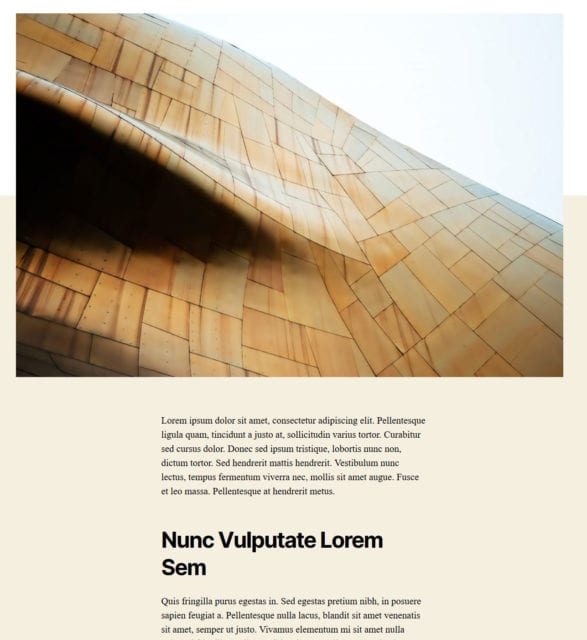
The new theme features a simple but bold design, with a full-width style. This is a first for any default WordPress theme. It lacks a sidebar but includes a header and footer. You can tweak the colors, of course, and built-in editor styles mean you’ll be able to tell generally how your post will look even from within Gutenberg.

Those are the basic stylistic features, but there’s quite a bit more under the hood. Let’s crack open Twenty Twenty and see what else it has to offer.
Twenty Twenty Theme Review – The Positives
Twenty Twenty has a few unique features that make it stand out. It’s not just a basic theme with no substance; while it may look minimalistic on the outside, there are some interesting features buried in the code. This includes its variable font and automatic color contrast.
Let’s take a look at the positives of Twenty Twenty and all the good things it brings to the table.
Flexible Design
One big plus of Twenty Twenty is that its clean design offers unlimited potential. The theme is suitable for just about any kind of website. Blogs and news sites will look best with the focused, centered layout, but it could also reasonably power a portfolio, a business site, or anything you can think of.
The theme’s design is simple, but bold and universally appealing, and this makes it a great starter template. No matter what kind of project you’re trying to create, whether a small static website or something far more complex, Twenty Twenty’s simplicity makes it suitable. That’s why it’s a great default theme for WordPress users.
Readability, Accessibility, and Responsiveness
These days, themes can’t just be pretty on the surface. They also need to be readable, responsive, and accessible.
Too many people design with flashy animations and bright colors without stopping to consider if their site is actually easy to read. Poor font and color choices will contribute to a higher bounce rate. This is especially true for vision impaired users where a lack of readability is intolerable.

You could spend a long time working with other themes to carefully audit how accessible your background’s color contrast is. Or, you could use Twenty Twenty, where all this is already figured out for you.
Cleaner designs lend themselves better to readability and accessibility, and as already mentioned, this theme is all about minimalism. But it’s not just that: its font’s main focus is readability, and it’s very pleasant on the eyes. Even at very small sizes the typeface still looks sharp.

Responsive design might not be the most exciting feature these days, but Twenty Twenty does scale very well and looks great at any screen size.

And one cool extra feature is the automatic color contrast adjuster. For people with vision impairments, higher contrast is necessary to navigate a website. And for all users, a proper amount of contrast helps reduce eyestrain. With Twenty Twenty, all you have to do is pick your site colors and they automatically adjust to an acceptable contrast.

Tools like Contrast Checker existed before, but this theme does it all for you.
Variable Fonts
Twenty Twenty comes with Inter, which uses new and experimental variable font technology. These fonts are built off of the OpenType font format, which brings greater customization to web fonts.
Variable fonts allow you to adjust line width, boldness, and other minute aspects of its appearance using CSS. But it all resides in a single font file, reducing space and allowing you get more diversity out of just one typeface. Inter’s website has a demo you can play with to see for yourself.

If you like Inter but wish it was a bit less bold or a little more spaced out, just tweak how it looks and you’re good to go. You wouldn’t notice just looking at the theme that a majority of it uses the exact same font throughout.
Works Well with Gutenberg
Many themes even now don’t play well with the block editor. Some simply haven’t seen an update since before the removal of the classic editor, while other theme creators just don’t bother making it work nicely with its successor.
With Twenty Twenty, you don’t have to worry about that, as the entire point of the theme is giving you a sandbox to play with Gutenberg. It supports the full width alignment option and every other block in the editor with no strange display issues. Plus, as mentioned, you can see what it will look like right in the back end.

Even if you’re not interested in using Twenty Twenty on your main website, it’s still a great template to put on a staging or local site and start testing out the block editor’s capabilities. If you’ve always wanted to experiment but couldn’t find the right theme for it, this is your opportunity.
Great Base Theme to Build On
Twenty Twenty’s purpose isn’t to provide you with a pre-decorated theme that already looks gorgeous with minimal tweaking. While its simplicity may be appealing to many, it admittedly does take some work to make it yours.
However, that just isn’t its purpose. Twenty Twenty aims to provide you with a template to experiment with, a simple base that gives you something to work off of without having to code an entire theme from scratch. In addition, it’s an uncomplicated default theme for new users to get the hang of WordPress with.
Set up a child theme and go to town with HTML, CSS, and even PHP tweaks, and you’ll find that Twenty Twenty’s best asset is not getting in the way. And seeing as how well it works with Gutenberg, you have plenty of room to customize your site.
While the clean design can work just fine without much more than a little personalization, you’ll get the most out of this theme if you use it as a stepping stone to experiment with plugins and code.
Twenty Twenty Theme Review – The Negatives
While Twenty Twenty has more positives than negatives, every theme has its downsides. There are some features you may not like, or that simply make it unsuitable for you.
Here are a few of Twenty Twenty’s aspects that may have missed the mark. None of them are definite deal-breakers, but as mentioned before, the theme isn’t for everyone.
Simple, Bare-Bones Look
Some people may find Twenty Twenty’s minimalism appealing, but others will dislike how simple it is. It’s not as populated or beauty-focused as other free themes on the WordPress repository, like Hestia or Lyrical. Not to mention the hundreds of gorgeous paid themes out there that look amazing out of the box.

As already mentioned, that’s by design and just not Twenty Twenty’s purpose. It doesn’t come with jaw-dropping design all on its own. You’ll need knowledge of HTML and CSS to achieve that yourself.
While the new default theme is prettier than the objectively more basic Twenty Nineteen, and has seen a much more positive reception by the community, it’s still very minimalistic and not suitable if you’re looking for a theme that has more aesthetic potential without much coding work.
Limited Customization Options
Even within the theme customization screen, there’s not a ton you can do. You have the usual options that can hide and disable certain elements such as the search bar, and of course the ability to tweak colors, or customize widgets like the header and footer.
The automatic contrast adjustment of colors is pretty interesting and you can see it update in real time, but that’s the most exciting thing you’ll find. Compared to other (free) themes that have a richer variety of customization options, it’s a little disappointing.
Slow Variable Fonts
The Inter font has caused some complaints. While it was designed to be as fast as possible, being served through Google Fonts’ quick interface, user reports claim that it can tack on two seconds of load time to your site.
Unfortunately, this is just a reality of using web fonts. Forcing users to download font files from off-server will always be slower. Variable fonts’ dynamic nature probably doesn’t help the load times much either. While web fonts are always a little slower, there have been more complaints about Inter in particular.
Variable fonts also haven’t been extensively tested and are very much experimental technology. Most — but not all — browsers support it (some not fully, or only with extra configuration that isn’t enabled by default), but few sites have made use of them. So they may not be well optimized yet.

There are some suggestions in the thread above you can use to potentially speed up load times a bit. It’s also important to follow general website optimization tips like compressing images to keep your load times under five seconds.
But if speed is something you’re absolutely unwilling to sacrifice, you might want to find a theme that makes less use of heavy web fonts or has the option to turn them off. Also, be sure to speed test your site to find out if its actually the font that slows it down.
Gutenberg-Friendly, Minimal Theme
Twenty Twenty isn’t right for everyone. It makes a great starter theme for those who are just beginning to work with WordPress, with its clean and readable design. It also has quite a bit of potential as a base for those who need a small and unobtrusive template to start with.
And some users might enjoy its minimalism, or its features like Gutenberg support, automated color contrast for accessibility, or full width design. If that’s what you are looking for, Twenty Twenty is good for beginner and advanced users alike.
However, if you’ve already chosen a beautiful theme you really like, or are expecting a lot of customization options, it’s probably not worth the switch. Twenty Twenty isn’t made to be a fully-featured, groundbreaking theme, but to show off the newest core feature: the block editor. If you’re looking for something gorgeous with lots of user-friendly customization options, it might be best to look elsewhere.
Otherwise, make use of its refreshingly simple design as a base to create something great.
Have you given Twenty Twenty a spin? What are your likes and dislikes? Let us know what you think in the comments!


