Every year, WordPress releases a new theme to serve as its default theme — the one that comes with every fresh WordPress installation. As we head into 2023, WordPress has released their latest theme offering into the world, Twenty Twenty-Three, which we will review here.
WordPress co-founder Matt Mullenweg introduced Twenty Twenty Three in his State of the Word address. This theme aims to be fast, lightweight, and accessible, with a focus on simplicity and easy customization. In other words, it’s the perfect blank canvas for your next WordPress project. But what sets it apart from previous years? An intense focus on community involvement.
For that and other reasons, let’s take a closer look at some of the key features of this theme in our Twenty Twenty-Three review.

A Focus on Community
From the very beginning, the strong community has always been a huge asset for the WordPress project. That’s one of the things that makes it so special. And with Twenty Twenty-Three, they’re doubling down on that commitment.

This theme is the result of months of feedback and collaboration from the WordPress community. In fact, they even held a series of workshops to gather input on what people wanted to see in the new default theme.
The end result is something that feels like it was made by the community, for the community. It’s a beautiful example of what can be accomplished when we all work together.
Simplicity Dominates the Design
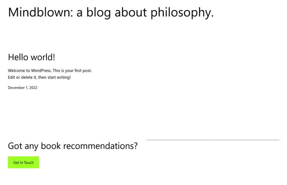
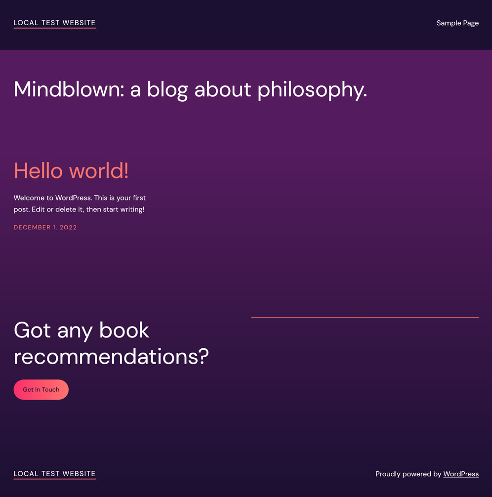
When it comes to the design of Twenty Twenty-Three, simplicity is the name of the game.
The team behind it focused on two things: speed and accessibility. As a result, they’ve created a clean and minimalist design that does away with anything superfluous. And since it’s essentially a simplified version of the Twenty Twenty-Two theme, it’s already familiar and easy to use.
This focus on simplicity extends to both the front-end and back-end design. The goal was to make it as easy as possible for anyone to get started with WordPress, whether they’re building their first site or hundredth.
In that regard, we think they’ve succeeded. Twenty Twenty-Three is beautiful and uncluttered, easy to use, and easy on the eyes. But we’re getting ahead of ourselves. Let’s take a closer look at simplicity in action.
Barebones Layouts Aimed at Flexibility
One of the things you’ll notice right away when you review Twenty Twenty-Three is that there aren’t a lot of pre-built layouts to choose from. In fact, there’s pretty much only one. Open any of the templates, you see a blank canvas and a handful of blocks to work with. From there, it’s up to you to build the layout that you want.

The focus on simplicity means that each layout is easy to understand and customize. And since they’re all based on a grid system, they’re also simple to change on the fly.
If you want to add a new column or move an element around, all you have to do is drag and drop it into place. No need to worry about messy code or breaking things — everything is flexible and straightforward to change.
This might sound like a recipe for disaster, especially if you’re used to more complex designs, but it’s actually quite liberating. It gives you the freedom to create any kind of layout you can imagine, without being constrained by pre-existing choices.
Layout Options
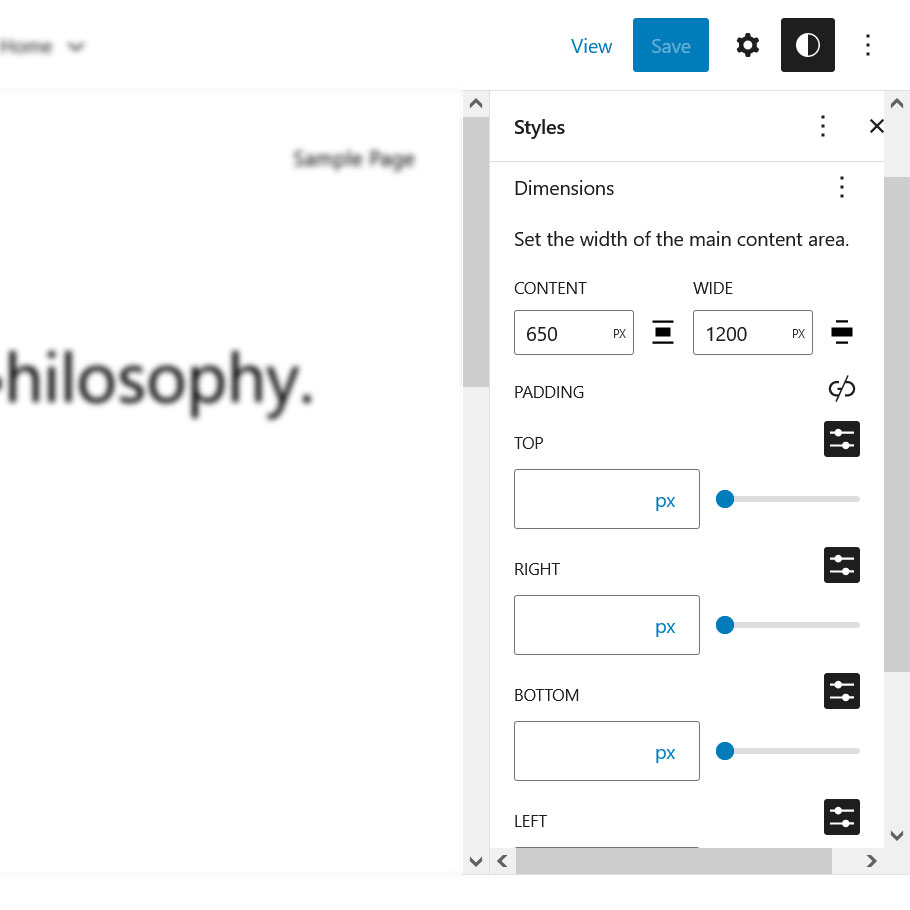
While there is only one default layout, Twenty Twenty-Three does include the usual options to adjust it. Access these by clicking on Layouts in the Styles menu on the right-hand side of the screen.
From there, you can select different widths for the main content area and create different spacing, padding, and block spacing choices.
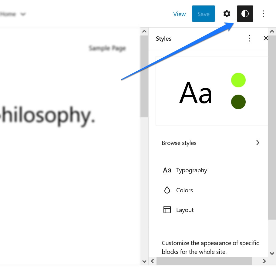
Color Settings
In addition to the layout options, Twenty Twenty-Three also includes functionality to adjust the theme’s colors. You also find them in the Styles menu under Colors.
Here, you can select different hues for the background, text, links, headings, and buttons to change up the look and feel of your site. The theme’s default color styles include shades of white, green, and black. But you can definitely customize this to your liking with the usual settings.

Typography
Next up, let’s review the typography choices that the Twenty Twenty-Three theme includes out of the box. Naturally, you find these by clicking on Typography on the right-hand side of the screen.
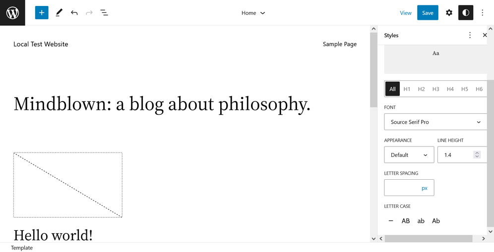
Twenty Twenty-Three comes with a handful of font families, as well as a few different font weights and styles. The supported typefaces include:
- DM Sans — A straightforward sans-serif font that would work great for body text.
- Inter — Another sans-serif font with softer curves. Also a suitable option for body text.
- IBM Plex Mono — A sans-serif font with mono-spacing featuring a typewriter style. Could go well for either titles or body text.
- Source Serif Pro — A delicate serif font that would look fantastic as quotations or titles.
- System Font — The fallback option should your browser not support one of the above font choices.
Typography in the Twenty Twenty-Three theme focuses heavily on the concept of fluid typography. That’s a fancy way of saying that the font size will adjust automatically to best fit the device it’s being viewed on.
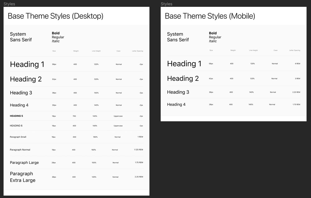
This is a great feature, as it ensures that your content is always easy to read, no matter what device someone is using. And you can use it to establish a minimum and maximum font size value for your site if you wish to give it some parameters.
In addition to fluid typography, Twenty Twenty-Three also includes support for fluid spacing. This means that the distance between lines of text will also adjust automatically to best fit the user device.
Features like these are essential in a time when mobile viewing is at an all-time high. It’s simply inexcusable for a site to not look good on a mobile device in this day and age.
Style Variations
In addition to the individual typography and styling options, Twenty Twenty-Three also includes a few style variations. The are the real highlight of the theme and were created with the contribution of community members.

You find them in the Global Styles menu under Browse styles. Let’s go over them real quick.
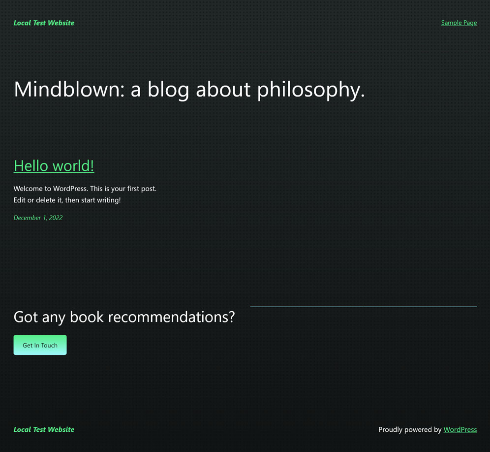
Pitch

This is essentially a dark version of the default theme.
Canary

This style variation sports a yellow color scheme by default and utilizes a single type size and narrow columns.
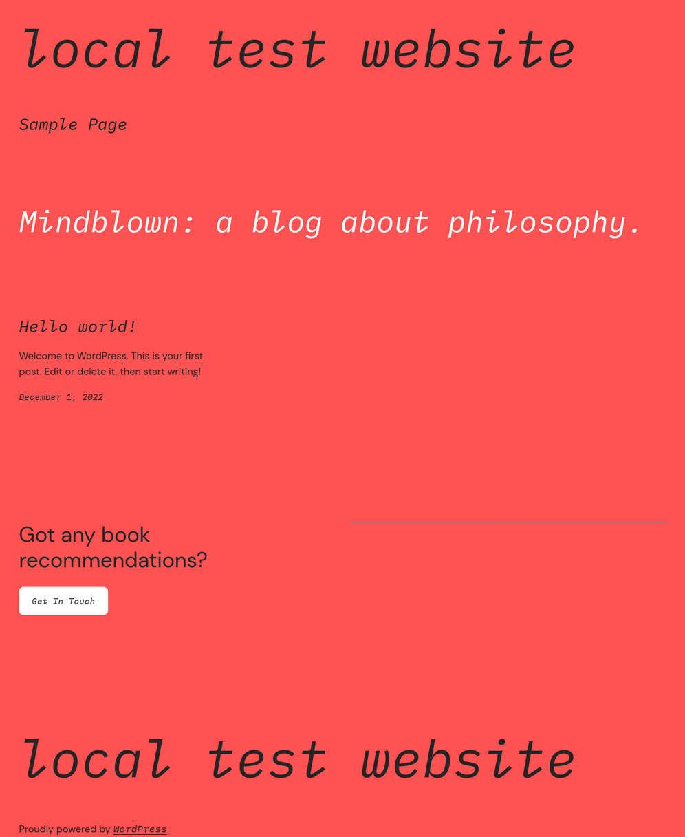
Electric

Here’s another interesting option that features a gray background with a bold-colored text.
Pilgrimage
Another dark spin on the base theme.
Marigold

Marigold offers a softer color palette and straightforward layout.
Block Out
Living up to its name, this theme applies a duotone effect to your images by blocking out a portion of them.
Whisper
This style variation includes a border around the page and some unique styles for buttons and links.
Sherbet

Sherbet is bright and colorful — and it relies on a gradient background, meaning it’s right on trend.
Aubergine
If you’re looking for something darker, Aubergine might be a good fit. Its split-color background is definitely eye-catching.
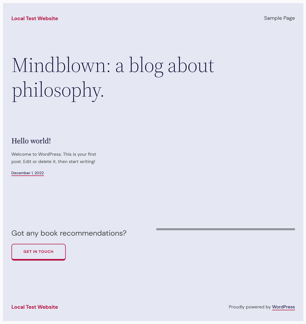
Grapes

And lastly, there’s Grapes, which is a subdued option that would serve a text-heavy site well. You can see all of the style variations in action for yourself on Figma – as well as snag a copy of the base theme.
How to Create Your Own Style Variation
You can also use the Create Block Theme plugin to create your own style variations. After downloading the plugin, use the WordPress Site Editor to create a custom layout, change colors, typefaces, and make any other changes you’d like.
Then when you’re done, all you need to do is create a style variation out of your settings selections. To do this, go to Appearance > Create Block Theme then on the next screen select the bubble next to Create a style variation.
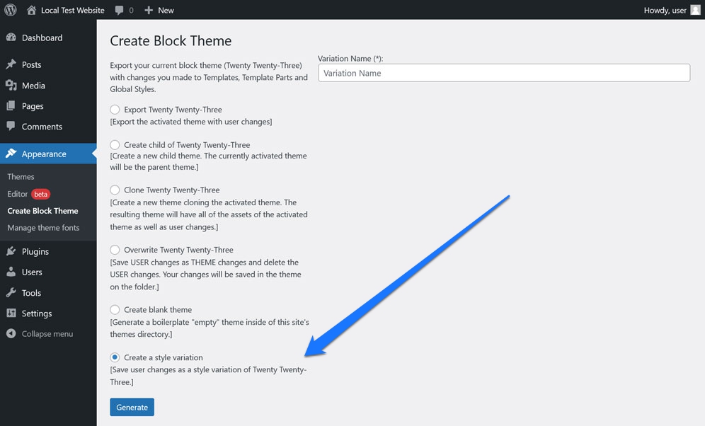
Give it a name then click Create Theme to automatically generate a new .json file on your site.
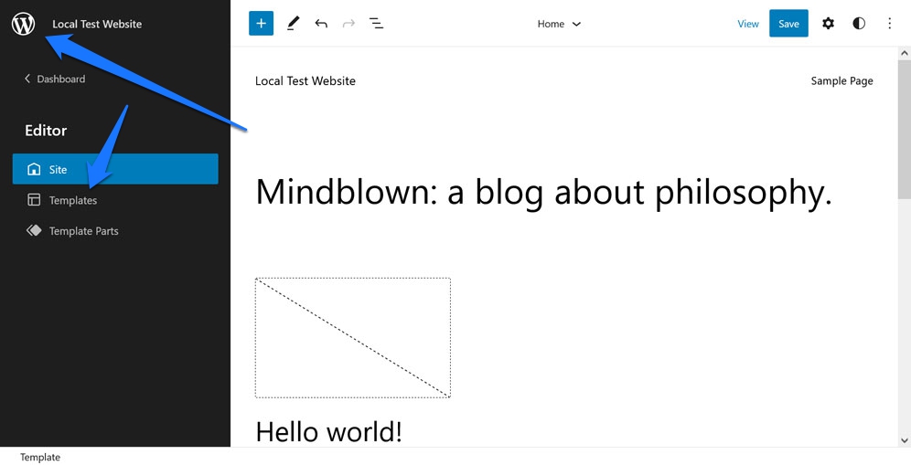
Available Templates
While Twenty Twenty-Three doesn’t include a lot of pre-built layouts, it does come with a handful of templates to help you hit the ground running. You find them in the Templates menu, which you can access by clicking on the logo in the upper left corner of the Site Editor.
From there, you can select from one of the following:
- 404
- Archive
- Blank
- Blog (Alternative)
- Home
- Index
- Page
- Search
- Single
Many of these are default WordPress templates anyway. Those that are unique to Twenty Twenty-Three include Blank, Blog (Alternative), and the one for the 404 error page. You can access the files for these templates in the templates folder as well.
Template Parts

There are four template parts available:
- Comments
- Footer
- Header
- Post Meta
These are pretty self-explanatory and accessible via the Template Parts menu or in the parts folder for the Twenty Twenty-Three theme.
Potential Uses for the Twenty Twenty-Three Theme
Sometimes it’s helpful to put a WordPress theme into a usage context to get a sense of whether or not it’s a suitable choice for your needs. So, what kind of sites would benefit from using the Twenty Twenty-Three theme?
It’s a pretty versatile theme, so it’s suitable for a variety of different types of sites. Here are a few examples:
- A portfolio site for a photographer or other type of visual artist. The theme’s focus on images and its various style options make it a great choice for this type of site.
- A personal blog. The simple layouts and easy-to-read typography make Twenty Twenty-Three ideal for content-heavy sites.
- A corporate website. The clean, professional look of the theme would work well for a company site, too.
- An online store. The WooCommerce integration means that this theme can also power a beautiful online shop.
- A news site. The various layout options and styles make this theme a good choice for a site that relies heavily on text.
As you can see, the Twenty Twenty-Three theme is a versatile and flexible option for a variety of different types of sites. So, if you’re looking for a theme that to create a beautiful and modern website, this one is definitely worth considering.
Final Review of the Twenty Twenty-Three Theme: Is It Worth a Look?
So, does the Twenty Twenty-Three theme measure up?
If you’re in the market for a new WordPress theme, then the answer is definitely yes. The theme is packed with features and options, and it’s every bit as flexible and customizable as you need it to be. Plus, with its focus on images and various style options, it’s a great choice for a wide range of different types of sites.
In addition, the fact that this theme was derived from community involvement gives you all the more reason to give it a try. After all, ideas from devs actively working in WordPress served as the foundation of this slimmed-down theme.
So, if you’re looking for a new WordPress theme, be sure to check out Twenty Twenty-Three. It just might be exactly what you need as we move into 2023 and beyond.
What’s your personal review of the Twenty Twenty-Three WordPress theme? How do you feel about style variations? We’d love to hear your feedback below!


